


SCREENSHOT SURVIVAL 20XX
Posts

@Frogge- I think you could benefit from adding some variety to the long stretches of ceiling tile.
excuse the terrible edit

you know what I'm sayin
----
Big Daddy Longleg's Nightclub and criminal port

(still fixing some details, including the stone path)
really gotta get around to making a gamepage
excuse the terrible edit
you know what I'm sayin
----
Big Daddy Longleg's Nightclub and criminal port
(still fixing some details, including the stone path)
really gotta get around to making a gamepage


I have a few WIPs, maybe I will share sometime~

LockeZ

I'd really like to get rid of LockeZ. His play style is way too unpredictable. He's always like this too. If he ran a country, he'd just kill and imprison people at random until crime stopped.
5958
Dookie, in general I just want to swirl my tongue around the rim of your pixel art, but in this particular picture I'm not sure the onion-topped silos are really doing it for me
Blueperiod, make sure you get rid of the frames where the character blinks out of existance for a moment. I also think it would look better if the tree shook slightly instead of flashing.
Blueperiod, make sure you get rid of the frames where the character blinks out of existance for a moment. I also think it would look better if the tree shook slightly instead of flashing.
LOL at onion silo...any suggestion on improving them? Is it the shape? the bulb? the color?
I am concerned because we plan to reuse some of these "onion tops" in the next city (color swap, daytime, and slightly different application)
I have hired a pixel artist I met on pixel joint and he is the one fleshing out and detailing my maps (that's why the detail is so high). I've gone a bit blind from looking at this thing too closely for too long and the tops don't jump out to me. HELP
LockeZ
I'd really like to get rid of LockeZ. His play style is way too unpredictable. He's always like this too. If he ran a country, he'd just kill and imprison people at random until crime stopped.
5958
I feel like the cyllindrical towers with the onion rooves look fine (great even) in the northeast part of the map when they're part of a larger structure, but the ones that are just sitting by themselves look out of place to me. The fact that they're barely wider than a crate doesn't help. They're too small to be buildings, and visually they look like a section of a building.
There's nothing wrong with the onion dome style rooves. I just don't know what it is they're supposed to be on top of. Tiny little silos the size of garden sheds?
There's nothing wrong with the onion dome style rooves. I just don't know what it is they're supposed to be on top of. Tiny little silos the size of garden sheds?

It looks great, Dookie. Maybe little too polished. I agree with LockeZ, buildings around the bottom part of the port are too small.
@Blueperiod, I'm glad too see you're working on that game. The setting and art direction of it are so fresh. The animation itself looks neat and I already wonder, why I'm supposed to cut down trees.
@Blueperiod, I'm glad too see you're working on that game. The setting and art direction of it are so fresh. The animation itself looks neat and I already wonder, why I'm supposed to cut down trees.

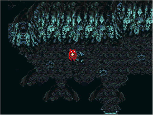
Want some early feedback on a new dungeon - Ferndale Glen, Forest of Fairies.

And the underground areas:

And the underground areas:

Perhaps have stone at the bottom and top of the stairs, since they're made of stone themselves? It would make sense.
Makes me want to mess around with map making again.
Makes me want to mess around with map making again.
LockeZ
I'd really like to get rid of LockeZ. His play style is way too unpredictable. He's always like this too. If he ran a country, he'd just kill and imprison people at random until crime stopped.
5958
I don't think anyone should ever use the RTP vine-cube tiles under any circumstances whatsoever

B-but, LockeZ! Vine cubes!
Also, the onion domes seem to serve more as watchtowers or small guard stations/clerks for the incoming ships. That's how I see them
Also, the onion domes seem to serve more as watchtowers or small guard stations/clerks for the incoming ships. That's how I see them

@Frogge:
Do what Dookie said. Non-playable areas are ripe for lots of graphical tweaks, since their form doesn't need serve any function.
Do what Dookie said. Non-playable areas are ripe for lots of graphical tweaks, since their form doesn't need serve any function.

author=Ramshackin
Want some early feedback on a new dungeon - Ferndale Glen, Forest of Fairies.
I LOVE what you did with the forest color palette! Not enough people playing with color palettes on their tilesets to really set the mood. It looks very ethereal. Can I suggest making the lamps more fairy-colored, and not using any of the blue ground-gems? The yellow and purple ones look great. Example:

(Also, that tile in the center of the archway over the stairs is an empty window.)
This is a dungeon I am creating for a dungeon crawl in a 2k3 game. Sadly, understanding how these tiles go together is a huge pain. It is beyond confusing.

Despite LockeZ's complaints, vine cube usage has risen 300%.
Yeah, the stairs can blend better with the surroundings.
I think you're right about the blue ground gems. I was going for a rainbow flow from top to bottom, which meant blue or green glow in the center, but the color never work with the shade of the grass. Maybe I'll just ditch them. I can play around with the lamp tint too.
Also I totally forget the end tiles in the shrine archway. I swear I had them placed at one point!
author=Liberty
Perhaps have stone at the bottom and top of the stairs, since they're made of stone themselves? It would make sense.
Yeah, the stairs can blend better with the surroundings.
author=Versalia
I LOVE what you did with the forest color palette! Not enough people playing with color palettes on their tilesets to really set the mood. It looks very ethereal. Can I suggest making the lamps more fairy-colored, and not using any of the blue ground-gems? The yellow and purple ones look great.
I think you're right about the blue ground gems. I was going for a rainbow flow from top to bottom, which meant blue or green glow in the center, but the color never work with the shade of the grass. Maybe I'll just ditch them. I can play around with the lamp tint too.
Also I totally forget the end tiles in the shrine archway. I swear I had them placed at one point!

@ramshackin & suzy: Thanks a lot you two!
@dookie & kaempfer: good point! I'll try my best to have some more variety.
@ramshackin 2.0: Really nice map! It seems a little small though, I'm sure that's not the entire dungeon is it? One thing I'd point out is that the vine climbables are a little hard to spot on their own, some kind of marking on the floor would make them way easier to see methinks. It could be anything from a little dirt patch to darker grass, just make it flash out a little more. I really like your green grass blending with the more blueish grass too!

Hello! I'm very new to using RPG Maker and I joined this site two days ago, and so I would love some help with improving my mapping skills. I particularly struggle with indoor areas; I've been told that I make a lot of beginner's mistakes with those. Any feedback that you can give me would be much appreciated! Here are some screenshots, and thank you for your help.


author=LadyTe-chan
Hello! I'm very new to using RPG Maker and I joined this site two days ago, and so I would love some help with improving my mapping skills. I particularly struggle with indoor areas; I've been told that I make a lot of beginner's mistakes in those areas. Any feedback that you can give me would be much appreciated! Here are some screenshots. Thank you for your help!
Well, to start with you are using the wall tiles as a ceiling tile.
Let me see if I can get a few screen shots to show how to use them...
Edit:
Threw these together rather quickly but...


Don't worry indoor maps are easy once you get use to them.

