BUILDINGS!
Posts
Pages:
1
Red_Nova

Sir Redd of Novus: He who made Prayer of the Faithless that one time, and that was pretty dang rad! :D
9192
Anyone know of any nice looking buildings made in RPG Maker? I'm trying to improve my building design to break away from my usual square block of tile process, but all the architecture I've looked up for reference/inspiration doesn't translate well into RPG Maker's perspective.
They can be homes, cathedrals, shacks, whatever. As long as they are buildings, I'd like to see them.
They can be homes, cathedrals, shacks, whatever. As long as they are buildings, I'd like to see them.
Yeah top down is often limited in portrayal. But a starting point is the same as doing cliffs: verticality generally makes things more interesting regardless of functionality. Aside from providing shelter, buildings save space by having stairs and floors so putting in and implying a lot of elevation layers is a good idea. By varying the sizes of those elements you get something that looks inherently interesting.
https://www.spriters-resource.com/resources/sheets/6/6354.png?updated=1460953627
https://www.spriters-resource.com/snes/saga3/sheet/10137/
https://www.spriters-resource.com/snes/trialsofmanajpn/sheet/133286/
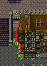
Silhouettes are a pretty good way to break out of the blockyness or at least to fake it. More importantly though this example implies elevation not in the first floor that the player can walk under. So foreground elements that are part of the building that you can walk under are good too. Pillars, courtyards, tunnels etc. Huge problem is when you're only able to walk around the building and not through or over it.

This can tie into setpieces or world building. Imagine a city with no stairs but a lot of ladders, what if buildings had table legs that you could walk under and you entered them from climbing a ladder in the center? Stuff like that I think can spill into good design overall.
Also diagonals, lottsa diagonals. Walls don't have to be straight or flat. Building segments can go into more than 4 directions. Applies to stairs as well, it's annoying but stairs side to side are usually more interesting than north/south ones.
https://www.spriters-resource.com/snes/ff6/sheet/6687/
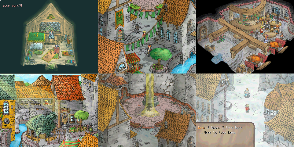
Last and biggest idea is just, don't listen to the grid. Abandon othrographic projection in favor of perspective for dramatic shots (Sunset fudges between the two but generally makes the camera lower angled). Sunset over Imadhal is the best example of this because it doesn't bother placing houses flat and straight on. As long as the walkable areas (mostly) obey the grid. Yeah it's handdrawn but you can still make custom tiles that break the flow once in awhile, and the principles still apply.

Another inspiration I use is Yume Nikki fangames, they use a sort of earthboundy oblique projection and get mileage out of the fact that walls can be diagonal but there's still some shots that work really well. I follow a YM fan account that posts these and whenever I see them I always feel like I'm limiting myself when it comes to thinking about top down projection and space.
(warning image load)
edit: also uploaded some references I think would still be interesting if you were forced to project them gridded top down, but they enforce a the principles listed. https://imgur.com/a/fF5REwj be a neat mapping exercise actually.
https://www.spriters-resource.com/resources/sheets/6/6354.png?updated=1460953627
https://www.spriters-resource.com/snes/saga3/sheet/10137/
https://www.spriters-resource.com/snes/trialsofmanajpn/sheet/133286/
Silhouettes are a pretty good way to break out of the blockyness or at least to fake it. More importantly though this example implies elevation not in the first floor that the player can walk under. So foreground elements that are part of the building that you can walk under are good too. Pillars, courtyards, tunnels etc. Huge problem is when you're only able to walk around the building and not through or over it.

This can tie into setpieces or world building. Imagine a city with no stairs but a lot of ladders, what if buildings had table legs that you could walk under and you entered them from climbing a ladder in the center? Stuff like that I think can spill into good design overall.
Also diagonals, lottsa diagonals. Walls don't have to be straight or flat. Building segments can go into more than 4 directions. Applies to stairs as well, it's annoying but stairs side to side are usually more interesting than north/south ones.
https://www.spriters-resource.com/snes/ff6/sheet/6687/
Last and biggest idea is just, don't listen to the grid. Abandon othrographic projection in favor of perspective for dramatic shots (Sunset fudges between the two but generally makes the camera lower angled). Sunset over Imadhal is the best example of this because it doesn't bother placing houses flat and straight on. As long as the walkable areas (mostly) obey the grid. Yeah it's handdrawn but you can still make custom tiles that break the flow once in awhile, and the principles still apply.

Another inspiration I use is Yume Nikki fangames, they use a sort of earthboundy oblique projection and get mileage out of the fact that walls can be diagonal but there's still some shots that work really well. I follow a YM fan account that posts these and whenever I see them I always feel like I'm limiting myself when it comes to thinking about top down projection and space.
(warning image load)
edit: also uploaded some references I think would still be interesting if you were forced to project them gridded top down, but they enforce a the principles listed. https://imgur.com/a/fF5REwj be a neat mapping exercise actually.
Red_Nova

Sir Redd of Novus: He who made Prayer of the Faithless that one time, and that was pretty dang rad! :D
9192
Great stuff, all of this. I've been thinking about it all day and wondering how to translate this into my game. I'm taking the first few baby steps using the tiles I've already made and tried to focus more on silhouette:

I tried to use wooden beams and roof shingle extensions to stretch out beyond the borders so it doesn't look so much like a giant square. I'll do some diagonal tiles later.

I tried to use wooden beams and roof shingle extensions to stretch out beyond the borders so it doesn't look so much like a giant square. I'll do some diagonal tiles later.
Yeah I'd say top left is the most interesting because of the structure/shapes and that roofs are going to be where you get the most mileage. middle bottom is obviously the least, but even that could use dormer windows or the roof having a more broken up Clerestory shape. The Mansard pyramid-like roofs are okay but strength is obviously is that they're modular and stackable. Middle top would be improved just by shifting the 2nd floor up a tile just so it doesn't look like the tops are merged.
Some terms and variations: https://retipster.com/roofs/ course they depend on the culture/town vibe you're going for but actually the roofs do vary alot even within an area. as an exercise I would jam as many roofs and dormer windows everywhere like to an insane/unrealistic degree just to see what shapes come out.
concept artists do it all the time
https://www.pinterest.ca/pin/473440979585593044/
shingles also don't have to be perfect or even. some could be missing or look like they've been damaged. This top down game art by noiracide i think does a good job at conveying that the buildings feel cobbled and jumbled together. storm damage, constant repair, scaffolding, or even just the house being in the middle of construction is a good excuse to break it up.
Pages:
1


