SUMMER SCREENSHOT SPECTACULAR!
Posts
I've improved it some more!

Phew, took a bit of work but I've got empty shelves, cans on the floor, I've added some poster and a security camera!

Phew, took a bit of work but I've got empty shelves, cans on the floor, I've added some poster and a security camera!
post=86905
I've improved it some more!
Phew, took a bit of work but I've got empty shelves, cans on the floor, I've added some poster and a security camera!
Much better! I like it a lot!
And Cray... Just beautiful.
post=86879
I do like the lava map too, and the magma borders don't really bother me, plenty of professional games don't make everything tile 100% perfect either.
More Lost King spam, This time I just begun working on the new area, the Sky palace:
I demand you release now!
It looks like you've been busting rump working on this game, keep it up!
Thanks D-Bones and Dis! Yeah, I have been working a LOT on this game lately, and I'm very close to releasing a second demo (the first one was YEARS ago!) I have to finish this dungeon, and make some last events, then I?llplay the whole thing to make sure there aren't any fatal errors, and then I will probably release the demo :)
Kenton that looks strangely un-traditional-rpgish and therefore excites me greatly :D
I request that someone ask me to model something moderate in 3D (so more complicated than a house, but more simple than a person) and I will place it in the Lite-C engine and post the video it in this thread.
The purpose is just practice.
I request that someone ask me to model something moderate in 3D (so more complicated than a house, but more simple than a person) and I will place it in the Lite-C engine and post the video it in this thread.
The purpose is just practice.
Make a 3D tree that actually looks like a tree and then upload the model somewhere so I can use it. Wait, never mind. Good looking trees are much harder to make than a person.
They aren't, they just require a lot of processing power to draw in the engine at real time because real trees have thousands of leaves and standard game trees use planes of leaf texture with transparency that sway with time.
A considered, serious suggestion would be appreciated, thank you.
A considered, serious suggestion would be appreciated, thank you.
More complicated then a house and simpler than a person kind of leaves a blank in my mind. Uhhh... Maybe a not overly heavily detailed UFO?
post=87019
Tried some new things here.
Lookin' good, Nightblade. I like the top font.
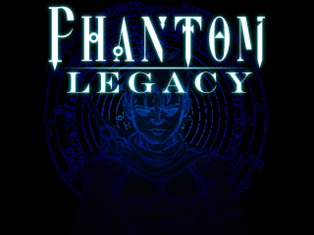
Since there has been some title screen posts, here's my new logo that will probably make up a considerable amount of my title screen:

LaValle - Awesome title screen logo, it's pleasing to the eye in every way!
Nightblade - Great artwork, good font, and excellent choice of colors
kentona - Neat background effect! Pretty good for a title screen, not LaValle or Nightblade level, but pretty good
Nightblade - Great artwork, good font, and excellent choice of colors
kentona - Neat background effect! Pretty good for a title screen, not LaValle or Nightblade level, but pretty good
Those are some really nice title screens
@Kentona: That looks like some hairy man belly! Erm kinda nice!
@Archeia_Nessiah: That tree on the left looks like someone cut half of the leaves off, is it supposed to be like that?
@Eddit: Space station looks cool!
@Nightblade: Awesome! Just...awesome!
@S.F. LaValle: That is a really refreshing title screen!


I've added a security mirror which I think looks kinda odd and I've made the floor the colours of chocolate and banana ice cream! Yellow-ish and brown-ish colours! I also tried Mince Wobley's recommendation and went green!
Which one do you guys prefer?
@Archeia_Nessiah: That tree on the left looks like someone cut half of the leaves off, is it supposed to be like that?
@Eddit: Space station looks cool!
@Nightblade: Awesome! Just...awesome!
@S.F. LaValle: That is a really refreshing title screen!


I've added a security mirror which I think looks kinda odd and I've made the floor the colours of chocolate and banana ice cream! Yellow-ish and brown-ish colours! I also tried Mince Wobley's recommendation and went green!
Which one do you guys prefer?
I personally prefer the browny one. I am all for hot colours, besides, it kind of gives a nicer, warmer atmosphere. But since it's a shooter (as it seems) i think the green floor would give a more.. Cold, deserted... More... More bad lol, sensation. Yes, i believe the bottom one is better for a shooter/terror/ etc. game. (i am completely clueless about your game, by the way, sorry, i just came back.)
Both title screens look awesome, i can't really critique on that.
Archeia, your map realy feels wide and very interesting, i really like it. It gives an "let's explore" feeling, at least to me.
Kentona... Your title screen feels... Weird. I don't know, maybe it is just me.
Cray, i am amazed. It's like if you were making Breath of Fire 3 for the Snes, lol, you project is so exciting. I really love it, I wonder if the animations of the charsets in-battle are fluent as it seems. Well, it's a matter of time, until i can finally see it ^-^


