


SUMMER SCREENSHOT SPECTACULAR!
Posts


Streetballa- from now on, if you want to post an image, to make it visible to all on the forums do it like this:
[img]Paste the image URL here[/img]


I decided to play around with the RTP a bit and what do you know? It can look pretty! :D
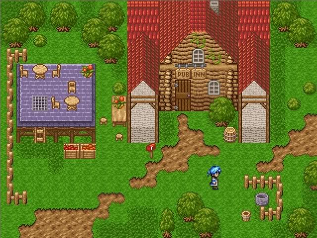
Really, I'm super surprised.
Really, I'm super surprised.


Those are some really crisp graphics! I like it.
@meh_ch: RTP rocks. Don't let anyone tell you otherwise.
@meh_ch: RTP rocks. Don't let anyone tell you otherwise.

archerrin, the water depth in the middle screenshot doesn't look right. The river stays level with the ground, but it has two little waterfalls.

The shadows the hero cast in the first screen just look awkward.
Also the little potted tree things stand out way too much.
Also the little potted tree things stand out way too much.
@meh_ch:
Can't think of much constructive things to say, but it does look nice and pleasant. c:
@archerrin:
I really like the feel of the smooth look you're going for there. The RTP components do stand out as being overly textured in comparison, though; perhaps lowering their contrast/halfing their palette might help.


I gotta say, those graphics are incredibly stylish
edit: didn't see ya there, Skie Fortress, but I like the graphics you're using as well
edit: didn't see ya there, Skie Fortress, but I like the graphics you're using as well
archerrin: Looks very nice, only thing I would suggest apart form what others have said is to maybe alter the location markers in the bottom left. I think that text would look a lot better if it was centred on the green background rather than rising above it slightly.
Skie Fortress: Nothing to add. Looks amazing.
Skie Fortress: Nothing to add. Looks amazing.

