


SHOW ME YOUR SCREENSHOTS - FALL EDITION
Posts
post=104198
@Archeia_Nessiah: cool style, thou the chars dont really fit to the background
The reason why the characters are lighter than the background is to see them better and going ABS while blending in with the bg is kinda bad and will be bad for poor blurry eyed people like me =w=;
Also very nice interface you have there!
I'll quote this instead:
post=104198
@Archeia_Nessiah: cool style, thou the chars dont really fit to the background
@tardis: looks aweszome, though the pipes don't seem to fit the style perfectly (because of their colorization)
Nazislaughter!
(may contain some engrish!)


Bloody swastikas and nazislaughter? Do want.
edit: content lol

One map, 401 events.
edit 2:
I lied- after fixing some tile errors, it's 406 events now.
edit: content lol
One map, 401 events.
edit 2:
I lied- after fixing some tile errors, it's 406 events now.


mog... that scene is fucking intense.
i can't wait to see that in-game. i bet it's incredible.
and god damn that's a sweet dragon.
i can't wait to see that in-game. i bet it's incredible.
and god damn that's a sweet dragon.


I know I ain't no Liberty nor Kentona when it comes to mapping RTP, but I felt like just messing around with it once again. I noticed my average mapping sucks outside of RTP, but that could be just me...
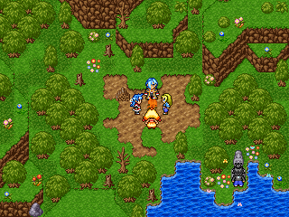

Not bad, not bad at all. It's pretty good Jakester. Are those dead trunks edits or rips? Either way they suit pretty well - maybe a bit of a palette adjustment and they'd look just like the RTP.


Feld, I don't think the re-colouring on that faceset has been done all that well. Otherwise, awesome.


Meh, I barely got to be home lately and my Sphere was facing the consequences. I barely touched my game in the last month or so, and when I did, I only improved the battle system and stuff like that. Now I added a HP bar for the enemies and it got me thinking about the player's HP display. I found out that while playing, I barely notice when my HP goes down because I don't really look up there. I think that adding a colored HP bar might help a bit, because I'll see it's color even when I'm not looking and I'll know - green is good, yellow is less than good, orange means be carful and so on... But I still think about moving it back to the old position at the bottom-center of the screen, where it's much closer to the action and I can check it out without moving my eyes away from the fight. What do you think?
Sorry about the wall of text lol.
Edit: More like fence of text, nevermind.
post=104440
Not bad, not bad at all. It's pretty good Jakester. Are those dead trunks edits or rips? Either way they suit pretty well - maybe a bit of a palette adjustment and they'd look just like the RTP.
I got 'em from a Breath of Fire 2 chipset I got from this place:(http://necro.shardweb.net/) before it died.
My worse enemy is trying to edit the RTP charsets with certain poses. =/
post=104415
That looks amazing, tardis.
A NEW CHALLENGER APPEARS
The animation is off.
The frames are currently
1 - 2 - 3 - 1 - 2 - 3
When they should be...
1 - 2 - 3 - 2 - 1

Alternatively, the upbeat could use its own frame with wings slightly more folded, that way it actually looks like flight.
post=104509
Fence of text by East.
I actually like the new HUD better. Perhaps you could have the display at the top enlarge and flash a certain colour when it reaches a certain HP level (e.g, have it flash red when your HP level is low, etc)? Or you could have an icon of the player's face where the old HUD position was (or you could have it next to the player) that flashes red on low HP (or yellow on medium HP, etc)?
Custom graphics, starting to look much better. The bottom of the uhh.. waterfalls? still need some work so the shape looks better around the edges but it's good enough for the moment imo.
(ps I know everyone just loves sewers but given the subject material there isn't a whole lot I can do ;P )

Plus, trying to learn how people can make such awesome lighting and to be able to make it look like a dark sewer, but not something I think I am good at yet. Work in progress..

Too dark? :P
(ps I know everyone just loves sewers but given the subject material there isn't a whole lot I can do ;P )
Plus, trying to learn how people can make such awesome lighting and to be able to make it look like a dark sewer, but not something I think I am good at yet. Work in progress..
Too dark? :P

I like the new hud, but I don't see why it couldn't be moved down to the middle. It worked for both Secret of Mana games for the SNES!
I'd rather it stay at the top corner, actually.
Why isn't there an HP bar? It could grow in length as more HP is earned!
Why isn't there an HP bar? It could grow in length as more HP is earned!

