


SCREENSHOT SESAME STREET (40TH ANNIVERSARY EDITION)
Posts

Well, to be more specific, the graphics for that game are bad in the sense that it hurts the eyes and it's kind of hard to understand what I'm looking at as opposed to something that's simply poorly drawn.
I think it's more important to think really hard about the graphics so that the player can understand what they're looking at as opposed to just shooting for artistic quality. A pile of polygons won't really make any sense if they're jumbled around with odd textures like that. I mean for one, could it have hurt the guy to use 2D sprites for trees (at least I think those are trees, it's hard to tell) or crisscross sprites (breath of fire 3 style) so that the map isn't cluttered and jumbled?
Also I love LEGOs.
I agree that it's important to be visually coherent but doesn't a lot of that have to do with the type of game it is? iirc The Real Texas is about exploring an environment so in that context the overall tone and look of the world in total, the sum and arrangement of objects and textures rather than the individual components, is more important than whether or not the objects stand on their own (as opposed to something like an arcade game where you'd need to pay more attention to function). In this case I think the rough textures of the leaves and wall almost give an impressionist vibe which I think is pretty neat.
Anyway, I just thought it was interesting because it seems like there are more games using rough 3d or even polygon textures, which is probably due to having better tools available but I kind of wonder if it has something to do with more people having grown up playing playstation games etc rather than NES ones. Like how a lot of indie devs who grew up in that era use the rough minimalist pixel art of early arcade stuff as a deliberate aesthetic and it seems like this could pass on to 3d as well.
anyway, uh, i should probably post a screenshot by this point. heres an old one
I have absolutely no idea what is going on in the above screen but I am sure it is completely awesome in context.


post=116997
...Like how a lot of indie devs who grew up in that era use the rough minimalist pixel art of early arcade stuff as a deliberate aesthetic and it seems like this could pass on to 3d as well.
...
... And there's a(few) right and a(few) wrong way(s) to do this.
...The Real Texas is about exploring an environment so in that context the overall tone and look of the world in total, the sum and arrangement of objects and textures rather than the individual components, is more important than whether or not the objects stand on their own...
I like knowing where I'm walking in adventure games.
post=117035
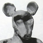
oh hell yes a claymation adventure game
do it, man. do it all the way.
That's right.


Coder wtf?
Whenever I scroll the page up and down you screenshot's tiles appear to be moving.
Optical Illusions ftw? O-o
Whenever I scroll the page up and down you screenshot's tiles appear to be moving.
Optical Illusions ftw? O-o

post=116178What I currently have for my skill/menu system. It looks pretty ugly atm to be honest (still learning). Maybe I should try and put something on the background so it doesn't look so bland.

Oh hey, I upgraded your screenshot

*apologize if this is against the rule or something (i.e the quoting)
Complaints are welcome - fire away.

I would try replacing the orange/yellow with blue/light blue, or maybe even forest green/green. I don't think the warm colors fit.
The Warm colors are way too loud. I'm fine with the gradient, but you should choose cooler colors. The background isn't suppose to be the main focus of the menu, it's the items.


