


RANDOM ART TOPIC
Posts

author=Creationoh, i have a name for myself? haha that's a surprise!
Oh! A comment from the Great Master Boo! I am humbled.
no problem. the screenshot looks very cool, you're probably right in that it wouldn't fit if you got rid of the outline. i would suggest less blending in that case and more blocked colours, particularly on the trunk.
i'm finding this hard to explain, i would do a quick photoshop to show what i mean, but i'm using someone elses laptop right now haha.
seeing the screenshot i wouldn't worry about changing it too much, or the style could look inconsistent.

Alright, following your criticism:
* I reworked the trunk of the tree, added some colors, messed around to give it more texture (boo).
*I tried to clean up the lines (boo).
*I changed the leaves altogether to make it look less like the Zelda tree (Seraph & Felix20).
I really hope you like the new version because it took forever to do the leaves! Again, some feedback would be nice so that I can improve it further.
Before/after:
Oooh, I like though the leaves seem a bit different from the screenshot style but maybe thats just me lol
looks great! I would actually suggest using even darker lines/a bigger colour difference between the light and dark parts on the trunk because it still looks a little bit blurred, like there isn't enough contrast.
the leaves look cool, the lighting is perhaps a bit iffy though. umm...take this as an example:

the leaves on trees are usually done in sort of...blocks, and then shaded to that particular block. You've sort of shaded as though it's an entire ball, making it look more like a bush on top of a trunk than a tree.
you don't have to change it according to this though, i can see that the leaves must have taken a long time to do. it looks pretty good the way it is, just some feedback :)
the leaves look cool, the lighting is perhaps a bit iffy though. umm...take this as an example:
the leaves on trees are usually done in sort of...blocks, and then shaded to that particular block. You've sort of shaded as though it's an entire ball, making it look more like a bush on top of a trunk than a tree.
you don't have to change it according to this though, i can see that the leaves must have taken a long time to do. it looks pretty good the way it is, just some feedback :)
author=Creation
Before/after:
i actually prefer your last version
i wouldnt fuss with minute details. imho in "tile art" object form should take priority over its texture otherwise you end up with a grainy texturesoup environment (i.e. you just need good "blobs")
^^^ the "tutorial" image seems pretty solid
im sorry this is probably rather intrusive but:

i made some humble scribbles over your tree to illustrate my point i only hope it helps you
i made some humble scribbles over your tree to illustrate my point i only hope it helps you
at that point he thinks: well im already here and i have imageshack open.......................,,,,,

I didn't want to post as I only had one thing to say:
I like it. Reminds me of that dude from KOF.
I'll use this as an excuse to thank you for this edit which does indeed look better.
I like it. Reminds me of that dude from KOF.
I'll use this as an excuse to thank you for this edit which does indeed look better.
*double post!
I'm painting the main character of my game right now and I think the eye suck (I'm working on the eye at the moment).

As usual I'm looking for loads of criticism (rip it apart) so that I can improve. Thank you!
I'm painting the main character of my game right now and I think the eye suck (I'm working on the eye at the moment).
As usual I'm looking for loads of criticism (rip it apart) so that I can improve. Thank you!
I don't like Onions >_ <
Other than that it looks great, the eye is pretty good. I'd probably make the colored part of the eye bigger, but thats just me.
Is it just me or do those eyebrows make it look more like villain than a main character.
Other than that it looks great, the eye is pretty good. I'd probably make the colored part of the eye bigger, but thats just me.
Is it just me or do those eyebrows make it look more like villain than a main character.


*-*
OEEE
SOME MORE CONCEPT ART <3
I loved making this. (not done.)
BTW you'll see the story of this couple unfold on the Valedictory event <3 <3 <3 <3 <3
And...
Creation, when I come home I'll crit if you want :D

author=boobledeeboo
looks great! I would actually suggest using even darker lines/a bigger colour difference between the light and dark parts on the trunk because it still looks a little bit blurred, like there isn't enough contrast.
the leaves look cool, the lighting is perhaps a bit iffy though. umm...take this as an example:
the leaves on trees are usually done in sort of...blocks, and then shaded to that particular block. You've sort of shaded as though it's an entire ball, making it look more like a bush on top of a trunk than a tree.
you don't have to change it according to this though, i can see that the leaves must have taken a long time to do. it looks pretty good the way it is, just some feedback :)
Whats your source for this image? It's amazing, and something I will probably use to learn how to texture plants.

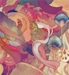
One of my newest creations, I dont know Im kind of sad how it turned out, I dont know its kind of sucky, I really dont know how to improve it...
You know, I've been looking at that picture for a while and I can't really figure out what's wrong with it.
I guess for one thing it's really, really blurry which kind of bothers me. There's also a black stroke right on top of her right wing which bothers me as well. Also, I don't know why, but in some spots we can really see a jagged pixelated outline. Hope this helps.
I had a question for you guys. What is a good forum to get feedback for art? I'm looking for a forum specialized in digial art with a lot of activity. I checked Concept Art but I don't think my level is high enough to show anything there...
Any suggestions?

@Newblack: Nice. Very creative scribbles, you should try to polish them... My favorite is the scuba-diving octopus.
@SorceressKyrsty: Not bad. I really don't see a problem with the eyes, I think you're good at drawing faces actually, but you still got some trouble with the length and position of legs and arms, and need more practice drawing clothes as well.
@Felix20: Well, I could give you some feedback, but it would be useless because pirate dinos don't NEED arms.
@Oh_no_im_melting: Whoa! Very nice job. It looks really professional, I like the sketchiness of it all and how you still managed for different textures and materials to look realistic enough. My only qualm with it would be that it is way too dark.
@JosephSeraph: Not bad at all, I like the colors and design you use. You have a very distinctive style. Keep it up!
@Bonehead11: Hey, that is really good, especially if you're just starting with digital painting... Like Creation said, it is kind of blurry, so what you need to do is to give more definition to shapes, textures and stuff. You may also need to work at bigger resolutions and to try with other brushes to achieve different kind of effects, because until now it all looks like if it was done with the same brush and a very small scale.
@Creation: Well, to begin with I think you need to take extra care of your lineart, because sometimes is rather messy or just plain jagged, if you aren't too good drawing free-hand you can always try with vectors. For the coloring I think you should stick to solids, I mean trying not to blend them so much; as well as using less contrast. Lastly, don't worry too much if your drawings look like Zelda or Mario, that's just silly.
Here's an example of the direction I think you should take:

that looks really good alterego.
and although it's true that you shouldn't worry about it looking like zelda or mario, It's perfectly fine to try to give it a unique look
in my opinion at least ;)
and although it's true that you shouldn't worry about it looking like zelda or mario, It's perfectly fine to try to give it a unique look
in my opinion at least ;)
@alterego:
I really appreciate the way you take some time to give some feedback on everything which has been posted. I've never seen that before on forums and I think it's a great attitude which I will try to emulate.
Your edit looks fantastic. I have no experience/theoritical knowledge when it comes to coloring so I just use my instinct. I tend to use a main color and a lighter and darker variant of that same color to shade whatever it is I'm painting.
I thought contrast was good to give perspective to something? Perhaps I'm contrasting too much?
About the lineart, I don't understand. I use Manga Studio and the lines look fine in the software but they seem to become jagged when I export to photoshop. Maybe I should use something for lineart.
PS: I do use Zelda for reference (perspective). I wouldn't want it took too similar though because it defeats the purpose of going custom.


