


THE SCREENSHOT TOPIC RETURNS
Posts


author=dethmetal
Crusade looks like it'd be a terrible competitive game. I'm sure it's fun, but I doubt they made it specifically with that in mind. It's just a few games making it, IIRC, so it'd be hard for them to make tons of interactive stages I'm guessing.
The game is obviously being directed to the casual audience, but that doesnt means we cant balance the game and Advanced Techniques and stuff. In fact, we have a BackRoom that's in charge of balancing the game, we even have online tournaments.
And we are adding a lot of new interactive stages, JAklub, one of our coders figured out how to make morfing stages in Game Maker :P


author=chana
I'll definitely call that a runthrough! otherwise smooth if not very varied.
What would be varied? I have puzzles in there in between enemy segments.
Yeah a tower followed by a cave. Perhaps I should make the furnature more varietied or changing the tower walls? I even changed the floor tiles in the tower to make it seem changed.
I'm currently working on a side Project with my own original graphics based on my old childhood comics. Now the sprites aren't perfect as they were made by me. Here's a shot of a character charging up. The graphics for the RTP have been edited to suit my own artistry. I know it's not that good but it's the best I can do as I don't make graphics.
Note: Purpose of screenshot wasn't for extreme detail and design skill. It was for testing my graphic editing and designing.
LockeZ

I'd really like to get rid of LockeZ. His play style is way too unpredictable. He's always like this too. If he ran a country, he'd just kill and imprison people at random until crime stopped.
5958
@ShortStar: In the cave it's not a big deal because totally natural caves are automatically super boring (and shouldn't be areas in games), but in the tower most of the rooms seem to be really pointless - if they're not empty, they just have jars in them. When building a manmade dungeon I always try to imagine what the purpose of each room was originally, and design them accordingly, even if the area is in ruins now.
@LockeZ Yeah I try to imagine it that way too. Guess I just stopped caring. So... don't do caves because they're boring or do mines which are more man made. And yes a lot of the rooms in the tower are pretty pointless til I put treasures in them.
I'll add more to it later to diversify.
I'll add more to it later to diversify.
LockeZ
I'd really like to get rid of LockeZ. His play style is way too unpredictable. He's always like this too. If he ran a country, he'd just kill and imprison people at random until crime stopped.
5958
You can make the caves less boring by putting things in them.
And I don't mean, like, moss and mushrooms and mining picks. I mean things that matter. Ruins of a dwarven city, or a fountain that's the source of the world's magic energy, or a room filled with torture devices and with walls covered in blood, or an opening that leads to the netherworld, or a tower that sunk into a fissure in the earth and fell on its side, or an orcish army that's set up a bunch of tents in the caves and created an underground war camp. Or all of the above, in one area.
Not only is the Cave of Genericness a boring zone that does nothing to enhance your game's story and theme, but seriously, if it's just a dumb normal mineshaft, why are the heroes even visiting it?
On the other hand, I know and admit that filler areas are totally way easier to create, and sometimes you just want to make a dungeon without having to make an experience.


@Clareain_Christopher
The sprites and atmosphere are great, but I am having a hard time following the architecture of that place from the screenshot; it looks like a collection of very abstract shapes. If that's what you're going for, it's fine.
@obsorber
I'm not sure if it was intentional or not, but graphics in that screenshot are actually quite similar to the visuals on the MSX Engine, an old Japanese computer from the 1980s:
http://en.wikipedia.org/wiki/MSX
The console is remembered by many with fondness, so the style has kind of a unique appeal.
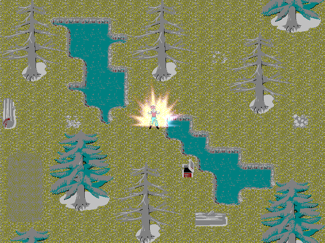
@Sana
Very nice and vibrant! Really, it's sold mapping that looks great, no criticism! The only thing that is a bit odd are the small trees with the high roots, as they look a bit like they are floating above the ground.
The sprites and atmosphere are great, but I am having a hard time following the architecture of that place from the screenshot; it looks like a collection of very abstract shapes. If that's what you're going for, it's fine.
@obsorber
I'm not sure if it was intentional or not, but graphics in that screenshot are actually quite similar to the visuals on the MSX Engine, an old Japanese computer from the 1980s:
http://en.wikipedia.org/wiki/MSX
The console is remembered by many with fondness, so the style has kind of a unique appeal.
@Sana
Very nice and vibrant! Really, it's sold mapping that looks great, no criticism! The only thing that is a bit odd are the small trees with the high roots, as they look a bit like they are floating above the ground.
author=LucidstillnessHaha, yeah they do seem a bit odd don't they? They're from the VS tilesets, so idk if you know about it or not, but they're made like that so they can be seen underwater~ :)
@Sana
Very nice and vibrant! Really, it's sold mapping that looks great, no criticism! The only thing that is a bit odd are the small trees with the high roots, as they look a bit like they are floating above the ground.
I'll think of changing 'em sometime if need be though. :D

Yeah, those grey trees are more suited for mangroves, swamps or overall just placed over a body of water. Perhaps try another kind of 1x2 tree for grass?
Apart from that, your screenie is wonderful. Nice mapping!
Apart from that, your screenie is wonderful. Nice mapping!

@obsorber that looks absolutely terrible.
edit: hard to elaborate on the general terribleness but I'll try.
The shadows make no sense. The palette looks like someone threw up over everything and is surveying the landscape through alcohol-inhibited eyes. The shadows are lighter than the objects creating them. You can tell the character is resized since you've destroyed any semblance of pixel continuity and careful placement and in that respect he fits in perfectly with vomit world.
Designing? What designing? If you tried to even suggest this as a design and I was your boss I would fire you ass faster than you can say "But"
Colours and continuity are important, dammit!
Its based on classic style to fit with my skill level at graphic design which I already stated wasn't that good so you've pretty much pointed out the obvious. The graphics are the RTP that has been de-colourized to fit my game.
And yes, the character sprites have been created by me in a certain size. Then I have re-sized them for the game. I can't sprite so I create large sized templates from my own way of drawing and reside them.
I was never aiming to make a colorful game but one that emphasized classic styles from the old consoles with my own original works within it. I enjoyed them and am not obsessed with graphics so much but game-play elements, story and presentation. Now days everyone thinks graphics are what makes a game good and forget the other important prospects which is why so many games which are great go unnoticed.

