


THE SCREENSHOT TOPIC RETURNS
Posts

author=dethmetal
@dudesoft - some of those charsets are a little mismatched. Some are a lot taller than others and it just looks sloppy. Adding to the sloppy look, it appears that you may have made them with the charset generator. Honestly I'd recommend using different ones..
It's for the Gamingw Chain-Game. I really don't care. :P
LockeZ

I'd really like to get rid of LockeZ. His play style is way too unpredictable. He's always like this too. If he ran a country, he'd just kill and imprison people at random until crime stopped.
5958
If you don't care what the game looks like why are you posting screenshots of its graphics? I mean, I'm not offended by the fact that you don't care, I just wonder why you'd want to show it in the thread designed to give you feedback about your graphics.

He cares enough to post it here, but doesn't care enough to be particularly moved by what people have to say about it or how it looks.
I mean come on I know you aren't dumb.
I mean come on I know you aren't dumb.
LockeZ
I'd really like to get rid of LockeZ. His play style is way too unpredictable. He's always like this too. If he ran a country, he'd just kill and imprison people at random until crime stopped.
5958
If you care about something, you should listen to feedback! If you don't like being told what's wrong with your work, then that means you don't care about your work being any good.
In completely unrelated news, I cannot figure out why authority figures always seem to have a problem with me. I can only conclude that they don't care about whether the orders they give me are any good or not.
(End snide banter.)
In completely unrelated news, I cannot figure out why authority figures always seem to have a problem with me. I can only conclude that they don't care about whether the orders they give me are any good or not.
(End snide banter.)

I appreciate the feedback, but frankly there's no time to sprite all the highschool kids. I have way bigger fish to fry, like animated cutscenes. I was just a little proud to get Yin in a screenshot :D
I've got a week left before pass off. Lots to do!
I've got a week left before pass off. Lots to do!
author=dethmetalauthor=PneumaticIt's a Theodore chipset. I'll upload it for you if you like. It's very underused imo.
@dethmetal: That's really good looking, love the multiple levels of elevation.
Chipset looks really good too, what's it from, or is it custom? It's hard to tell at that zoom level.
sure, would love to see it if you don't mind.

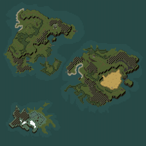
@Dethmetal: http://rpgmaker.net/media/content/users/658/locker/world.PNG
Cool looking map. I like the shape of the continents, but I think is a bit weird to see entire forests so close to the coastline. And regarding the different eights, I’m ok with them too as long as they are not too pronounced. I’d say one tile high is enough.
@Cray: http://i51.tinypic.com/11v7e46.jpg
Nice! I love that rm2k3 feel you have in those screens; however, I’m not too much of a fan of that system skin. I think the scan-lines are too big/stand out too much. Perhaps you should try to tone/scale them down a little; it will probably look better that way.
@Dudesoft: http://rpgmaker.net/media/content/users/90/locker/successtest3.png
That looks pretty cool, dudesoft. I can see how you’re not willing to fix the charasets, it would be too much of a hassle, but other tiny things that you can fix, you should, like editing that cabinet, or making the room three tiles high; it looks weird with only two.
author=Pneumaticauthor=dethmetalsure, would love to see it if you don't mind.author=PneumaticIt's a Theodore chipset. I'll upload it for you if you like. It's very underused imo.
@dethmetal: That's really good looking, love the multiple levels of elevation.
Chipset looks really good too, what's it from, or is it custom? It's hard to tell at that zoom level.
no problem; using the cliffs effectively is a little tricky at first though


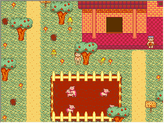

calunio - it's a little.. blinding. I think it's because basically everything on the screen is heavily saturated with yellow and the grass pattern is hard on the eyes @_@ ... though I wouldn't call that 'too empty' for just one screen.
edit: Just zoomed way in, and it seems better at realistic gamesize... though is still very yellow.
edit: Just zoomed way in, and it seems better at realistic gamesize... though is still very yellow.
I threw in a yellow tint, so the place would feel slightly... depressing. The tint is subtle, and comes and goes in intervals of 6s, so it's subtle.
LockeZ
I'd really like to get rid of LockeZ. His play style is way too unpredictable. He's always like this too. If he ran a country, he'd just kill and imprison people at random until crime stopped.
5958
The yellowing of the fenceposts and bricks aren't very subtle in that screenshot. Guess I'd have to see it animated to get the full effect, but maybe you could post a screenshot of it when the tint is at minimum? And I think that should be enough for us to get the idea.
EVIL CASTLE.
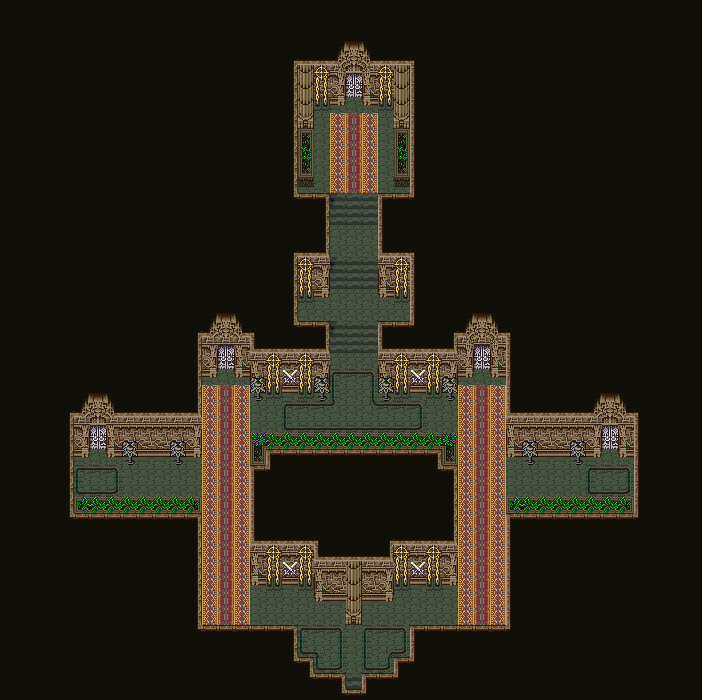
Yes, evil. It's just not supposed to look evil. Imagine the Empire from FF6, only not as dark and brooding looking. These guys are evil and they know it (as does everyone else), but they just don't show it. It's one of those "worst kept secrets" sort of things.
Yes, evil. It's just not supposed to look evil. Imagine the Empire from FF6, only not as dark and brooding looking. These guys are evil and they know it (as does everyone else), but they just don't show it. It's one of those "worst kept secrets" sort of things.
author=geodude
it doesn't look evil enough. flowers are not very evil. more evil!
Will it help if I say that the resident Lord, who looks after the military, is a scary looking dark knight?
Cool map but the flowers in the top room don't match in style and though the carpet is really cool it feels out of place.

