


THE SCREENSHOT TOPIC RETURNS
Posts

I updated the screen with a results message, I guess it makes more sense.
There is actually a background, but the tiles are covering it. :P
He's wearing his birthday suit cause he stays like that the entire game. :)
There is actually a background, but the tiles are covering it. :P
He's wearing his birthday suit cause he stays like that the entire game. :)
LockeZ

I'd really like to get rid of LockeZ. His play style is way too unpredictable. He's always like this too. If he ran a country, he'd just kill and imprison people at random until crime stopped.
5958
Maybe show a picture of a mine entrance or some other mining-related picture in that black space to the left.

"Path of Justice 2" is in production. Publicly, that is. If you ever played the first one then you'll remember how ungodly difficult it was. Yeah, POJ2 won't be like that.
Here's a screeny-thing...

Here's a screeny-thing...

Lately I have trouble with anything that isn’t a cave or forest, so I forced myself to finally make a town or two. They’re not big I know, but it’s a start! I'm just glad I'm doing something.
I think most of it looks decent, but I didn’t know what to put in the bottom left so I literally copied pasted the house above. I think it looks okay. I have two entrances because the park I wanted there looked totally rubbish. Should I have kept it?
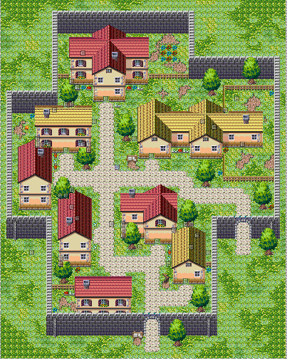
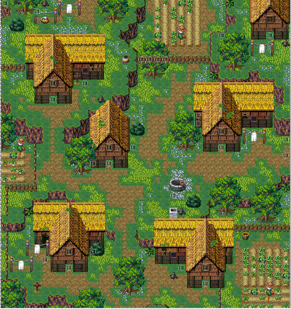
I think this one looks good too. Kind of a generic farming village. The house at the top right can’t be accessed, I just had some space to fill. =/
Those are stunning, LWG. You've got an interesting thing going on, it's complex looking but really simple in terms of design.
I like it!
I like it!
Mitsuhide, I like the new screenie. The Mystic Quest aspect helps define what's going on and where we're going.
LWG, you're a godsend.
I'm actually looking for a decent town chipset for a ramshackle type village. What/where is that from?
LWG, you're a godsend.
I'm actually looking for a decent town chipset for a ramshackle type village. What/where is that from?
Hey thanks you three. Appreciate it! =)
Dyhalto, that chipset is First Seed Material, sometimes called REFMAP or Mack and Blue. All their graphics, including that chipset can be found right here on their website:
http://www.tekepon.net/fsm/modules/refmap/index.php?mode=map#map1
Dyhalto, that chipset is First Seed Material, sometimes called REFMAP or Mack and Blue. All their graphics, including that chipset can be found right here on their website:
http://www.tekepon.net/fsm/modules/refmap/index.php?mode=map#map1
LWG, I like both of them, I don't think you have any trouble designing towns, they looks perfectly good to me :)
Here are the last 2 screenshots from my Lost King game (for those who still remember it, you should be happy that I'm pretty close to finishing it)
This is a ghost town, where you can cross to the underworld, a parallel undead version of the town, I have yet to add npc's though.

and the underworld version

Here are the last 2 screenshots from my Lost King game (for those who still remember it, you should be happy that I'm pretty close to finishing it)
This is a ghost town, where you can cross to the underworld, a parallel undead version of the town, I have yet to add npc's though.
and the underworld version

@Mitsuhide: Not bad, the banner at the top with the city as the backgrond is a very cool touch. Maybe the size of the font is too big, but if you don't plan to have long names in your game I guess it's ok. What I really think can be greatly improved, though, is the mapping. The shapes of the landmasses are too straight and squarey, they should look more "natural" if you know what I mean
@Little Wing Guy: Both maps look good already, but in the first one, why don't you try to place the outer wall further away from the houses? I don't quite like how the it takes the shape of such small a town, it feels kind of cramped to me. And in the second, the only thing that really bothers me are the copypasted houses. But maybe I'd also take out most of the tall grass. It's too bright. xP
@Cray: That looks sweet! I like the color scheme of the underworld version of the town, it's pretty wacky. I see you added a few bones here and there but I think the differences should be more drastic, how about spiderwebs, blood, fires, cracks on the houses, etc? I noticed as well that the rocks and flowers stayed the same but they should change too, or perhaps disappear completely.
Thanks guys, I'll probably start a gamepage now that I'm close to finishing it, I'll think about the spiderwebs and stuff, shouldn't be too hard, I have already some of them done :)
Here's the last area I'm currently working, Deadraven pass, it's supposed to be a creepy small passage trough the mountains.

Here's the last area I'm currently working, Deadraven pass, it's supposed to be a creepy small passage trough the mountains.
oooh. I like that misty effect at the bottom of the cliffs. Especially with the treetops emerging from it.
Obligatory screenshot nitpick : Your tombstone is off center from the path.
Obligatory screenshot nitpick : Your tombstone is off center from the path.

new Screenshot conserning the water plant (I was worried about a engine i was working, gladly it worked, so, the next boss is gonna be a water boss ;D)
Finished version of the old Screenshot

New Screenshot, now with a fully functional starway XDDDDDDD

Finished version of the old Screenshot
New Screenshot, now with a fully functional starway XDDDDDDD

Felipe_9595: That look pretty cool ! What's the name project (Resident evil ?) ?
Asylopole (Rpg maker XP - lot of screenshots inside)
Asylopole (Rpg maker XP - lot of screenshots inside)
author=alterego
@Mitsuhide:Not bad, the banner at the top with the city as the backgrond is a very cool touch. Maybe the size of the font is too big, but if you don't plan to have long names in your game I guess it's ok. What I really think can be greatly improved, though, is the mapping. The shapes of the landmasses are too straight and squarey, they should look more "natural" if you know what I mean.
That feeling unnaturalness disappears once you get further east on the overworld...but, yeah, I've already edited the western island there (the one in the screenshot) to feel a bit more natural.
author=Rockmik
Felipe_9595: That look pretty cool ! What's the name project (Resident evil ?) ?
Asylopole (Rpg maker XP - lot of screenshots inside)
Thanks^^^ is called "Resident Evil: After History"


