


THE SCREENSHOT TOPIC RETURNS
Posts

I mean using the shift click method to make it work instead of having to fiddle with graphics out of engine. No edits this time around~

@bulma
I would make that light blue color a bit darker, since it hurts my eyes.
That's just me though.
The TV is also too square. Shave off a couple of pixels at the edges.
The picture on the TV also doesn't fit with the screen?
Or is the TV just the smaller square and there is something behind the TV?
I can't quite make it out.

Anything I should change?
I would make that light blue color a bit darker, since it hurts my eyes.
That's just me though.
The TV is also too square. Shave off a couple of pixels at the edges.
The picture on the TV also doesn't fit with the screen?
Or is the TV just the smaller square and there is something behind the TV?
I can't quite make it out.
Anything I should change?

@SnowOwl- the trees look out of place, other than that it looks great
author=LockeZThis is how I feel about VX rtp tiles all the time.
Oh man. There are square tiles and then there are square motherfucking tiles
@SnowOwl I like that little tree you have right there, why nor dupilcate that around? I like,the tower but it doesn't seem to fit to me, though I don't know the context of the scene.
It was supposed to be a shrine of some sort, but I guess considering the setting (northern Europe medieval time) it's not very appropriate.
LockeZ

I'd really like to get rid of LockeZ. His play style is way too unpredictable. He's always like this too. If he ran a country, he'd just kill and imprison people at random until crime stopped.
5958
Oh, I thought it was a bus stop.

I'm trying to make an inn room that can fit 8-9 students. Beside the spacing and layout issues, I am not sure if the carpet suits the wall's color. :P

Oh, and how about my last map? Is it alright? :D
Oh, and how about my last map? Is it alright? :D
At the bottom left there is that table going over that other table?
Or is that a shelf that's supposed to be higher?
Looks fantastic SnowOwl. Nice flow
author=kory_toombs
At the bottom left there is that table going over that other table?
Or is that a shelf that's supposed to be higher?
That's suppose to be a shelf overlapping the table. :P
It works, though bunks would be a better option. It's a thing, trust me. They're uncomfortable as hell, but 10 teens to a room is uncomfortable in other ways so at least we were preoccupied with that instead. (School camps - great but uncomfortable experiences.)
If you have either a light blue/very dark blue carpet or pale cream wall colour, replace. Otherwise throw a rug in there, perhaps. Not the bright-blue-oh-god-my-eyes one though.
Also, >.<)b for wall overlaps. Good job. Bet you could make the bottom beds covered by the wall too (at least the bottom half of them) but as it is, it's not too bad.
I don't have any blue tile carpets, so I tried changing the wall tiles. :P

I think the beds look better this way. :-?
I think the beds look better this way. :-?

The overall design looks good, I also really like the walltile color. That being said, are the beds supposed to be like sleeping bags? Or like actual beds with frames? If it's the latter, then you might need to tweak the bed graphic a bit.
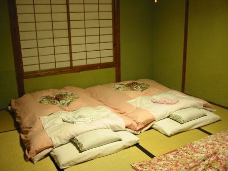
No, they are basically just like this
http://bookednet.files.wordpress.com/2011/10/ryokan2.jpg?w=450&h=337
http://bookednet.files.wordpress.com/2011/10/ryokan2.jpg?w=450&h=337
snowowl, those are awesome graphics. Shrine definitely gave eastern vibe so it's good you removed it.
i really like the look of the cliffs.
i really like the look of the cliffs.

