


THE SCREENSHOT TOPIC RETURNS
Posts
@bulma I suppose it does depend.
Here's some screenies of what I'm working on:

Yes, four screens. Just because.
And the corresponding picture:

Not all that happy with the picture :/
Here's some screenies of what I'm working on:
Yes, four screens. Just because.
And the corresponding picture:
Not all that happy with the picture :/
If you are doing a retro-styled game you need to work on getting your pixel sizes consistent, because otherwise it looks ugly and incoherent.
For the bottom screenshot, the image looks weird because while the bed is in perspective, the floor doesn't follow it. Also the guy's arms don't appear to be attached to the character, but part of the bed. Edit the floor to make it fit in perspective and edit your character to make his arms look attached and it should be fine.
For the bottom screenshot, the image looks weird because while the bed is in perspective, the floor doesn't follow it. Also the guy's arms don't appear to be attached to the character, but part of the bed. Edit the floor to make it fit in perspective and edit your character to make his arms look attached and it should be fine.
LockeZ

I'd really like to get rid of LockeZ. His play style is way too unpredictable. He's always like this too. If he ran a country, he'd just kill and imprison people at random until crime stopped.
5958
I kind of think that's a guy sitting at a table, but I really can't tell what it is at all. I can just sort of make out the back of the chair; that's my only clue that there's a table. And the wizard hat is honestly my only clue that there's a guy. Otherwise it looks more like a red slime with huge blue eyes creeping up onto a crate.


LockeZ
I'd really like to get rid of LockeZ. His play style is way too unpredictable. He's always like this too. If he ran a country, he'd just kill and imprison people at random until crime stopped.
5958
the rest of the thread
...
...
I guess the evergreens are weirdly fuzzy? But they're evergreens, so it kinda makes sense.
I do see one thing that I would actually bother to change: the backdrop is really bizarrely dithered. What is going on with that? There are big green dots up in the clouds and stuff. It's already intentionally blurry, so I think you could just blur it about ten more times in photoshop and it would fix that.
...
...
I guess the evergreens are weirdly fuzzy? But they're evergreens, so it kinda makes sense.
I do see one thing that I would actually bother to change: the backdrop is really bizarrely dithered. What is going on with that? There are big green dots up in the clouds and stuff. It's already intentionally blurry, so I think you could just blur it about ten more times in photoshop and it would fix that.
Quite right about the dither part, I edited it.
Not sure what you mean by the evergreens, but since you mentioned them I noticed their color was a bit off, so I changed that instead.
Not sure what you mean by the evergreens, but since you mentioned them I noticed their color was a bit off, so I changed that instead.
LockeZ
I'd really like to get rid of LockeZ. His play style is way too unpredictable. He's always like this too. If he ran a country, he'd just kill and imprison people at random until crime stopped.
5958
I don't even know how to describe what I mean about the evergreens, and it's probably my imagination. Backdrop looks good now.

Hi (Hai?) Everyone.
I was going to leave the posts to speak for themselves and vanish for a bit to work on my maps and chipsets some more, but I just want to say I appreciate the feedback and constructive criticism I'm hearing, so thank you so much all.
Shaddow- Bear in mind these particular ruins are not just the victim of standard decay, but rather the site of a very serious disaster (errant misuse of meteo or ultima, or perhaps a run as Bahamut mating grounds). But, that being said I amy have overdone it with the amount of 'ruin' I put it through, this map looks a little messy and further maps will hopefully have a cleaner look to them.
Arandomgamemaker- I agree about the set looking monochrome, the choice was somewhat deliberate though I've since reeditted to let a bit more color in. Keep up the good work on the game of your own, it looks like your working on something about a generation back from what I'm doing. I will admit I'm not sure about the cutscene though, I kind of feel it stands out where everything else seems to mesh together very well.
00range0- I'm probably going to try and emulate the ff3j battle system as much as I can using the rm2k3 editor. Battles are probably not going to be random though, but we'll see how this all shakes out when we see.

SnowOwl: That's a fantastic screen and map. The building's top line is a tangent with the cliff's edge, something that should be avoided in my opinion. I'd also make the whole cliff not as straight as it is. Other than that I can see no flaws.

How does this look for an inn entrance? :D

I was basing it off this one, at 4:24
http://www.youtube.com/watch?v=w-l6PKOR0Gc&list=SPE3DB8EB1E7516939
I'll add more items on the table if the layout is okay. :P
I was basing it off this one, at 4:24
http://www.youtube.com/watch?v=w-l6PKOR0Gc&list=SPE3DB8EB1E7516939
I'll add more items on the table if the layout is okay. :P


Detective, the problem with your maps (mainly the first one) is that you space the rooms badly. Imagine walking into that inn entrance; that'd be one bigass open-plan room, especially considering it looks like a traditional inn. Try breaking the room up into segments a bit more, like I can tell you've got an area for the desk and also that little lobby area with the sofas - but they look like one big room, and I suppose they might be, but it's filled it with too many gaps. See how you've done it in that hallway shot where the walls are brought slightly forward to separate rooms: that is good. Do that to segment maps and show that it's a map made up of rooms, rather than one big room filled with random stuff.
Also, yes those lines around the carpet do look weird because it makes it look as though the carpet has been fitted to the whole room. Try using a hard flooring like stone or wood, and then using square rugs to denote key pieces of the room or bring attention to the segments I mentioned earlier.
This is something I whipped up in two minutes to show what I mean, so please don't mind the ludicrously over the top clutter and hideous carpet clashing ( EWEWEW WHAT WAS I THINKING):
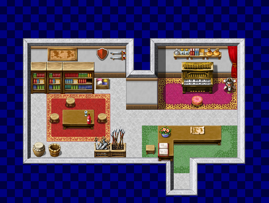
edit: in my haste I did not properly shift-click that green rug on the right, but it's meant to look as though it extends down under the wall as it does on the left.
Notice the three key segments of this room? The green carpet area is obviously the front desk, the red is the lobby area with seating and entertainment, and admittedly that pink area is just filling up space - but the room is balanced, and it fits nicely into that rectangle without seeming like some erratic cave formation.
And it takes up half as much space to boot. Not to bring real world logic into RPG Maker, but buildings in real life would only be so big if the owner was some crazed millionaire who liked to waste space. Given that this looks like a traditional inn, it probably shouldn't be so huge (or if it is, it should be filled with more knick-knacks).
Also, yes those lines around the carpet do look weird because it makes it look as though the carpet has been fitted to the whole room. Try using a hard flooring like stone or wood, and then using square rugs to denote key pieces of the room or bring attention to the segments I mentioned earlier.
This is something I whipped up in two minutes to show what I mean, so please don't mind the ludicrously over the top clutter and hideous carpet clashing ( EWEWEW WHAT WAS I THINKING):
edit: in my haste I did not properly shift-click that green rug on the right, but it's meant to look as though it extends down under the wall as it does on the left.
Notice the three key segments of this room? The green carpet area is obviously the front desk, the red is the lobby area with seating and entertainment, and admittedly that pink area is just filling up space - but the room is balanced, and it fits nicely into that rectangle without seeming like some erratic cave formation.
And it takes up half as much space to boot. Not to bring real world logic into RPG Maker, but buildings in real life would only be so big if the owner was some crazed millionaire who liked to waste space. Given that this looks like a traditional inn, it probably shouldn't be so huge (or if it is, it should be filled with more knick-knacks).
@ J-L
Thanks, I edited it again. Edges are a bit less straight and the buildings edge isnt exactly at the edge of the cliff.
Thanks, I edited it again. Edges are a bit less straight and the buildings edge isnt exactly at the edge of the cliff.


@Mr D: 
Here's how you can reduce the size. Main points are as follows -
Window is illogically placed. Is your building a T-shape with a garden outside one area? It doesn't make sense for a modern building.
Passage too wide. Why need that much space? Each tile equates to about two steps in real life.
The third bench obstructs the view of the receptionist and waiting area.
Unnecessary filler with trees. You've made a habit of this. One or two trees in a room tops.
Chair for receptionist.
Overlay with the walls to make things seem deeper. Move the chairs down in the tile so that they overlap things like the table at their ends. It adds depth.
Too much filler. White space is as important as filled space. You've got too much white space in one area, not enough in the other. It's a delicate balance. Allow the walls to breathe a little. Mines a bit too bare, but you've covered every wall with something - proven in that I couldn't get a blank piece of bottom certain wall parts to copy/paste.
Both areas are unevenly too large. A two-length door is fine for the opening. Put it in the middle of the wall. Move the reception table to follow. The side board isn't necessary when up against a wall.
Most swanky places have a colour scheme that works together. Brown/Blue/Green is a big no-no. If you want homely, go brown with the furniture and a pale cream for the walls. If you want to give a sterile feel, use blue for floor and pale blue for the walls. The green gives a rather... quirky feel and usually wouldn't work for a business unless they want to really stand out. Especially with the star deco on the side. That screams more children's room. A dark green carpet with white/black furniture would probably work better in that case, though if going for full quirky, perhaps a non-clashy purple instead. (I actually know of one business with green/purple colour - pale light green walls, deep purple carpet, a purple/green wall murial and purple chairs. It's government owned so it can afford to drive customers crazy with that scheme.)
You are doing a lot better than when you first began, but you still have a long way to go. Don't give up! You're improving with each map you make.

I rather like the look of the DS tiles, but they are a little fiddly to mess with. Still, a little effort can make them look pretty neat~
Here's how you can reduce the size. Main points are as follows -
Window is illogically placed. Is your building a T-shape with a garden outside one area? It doesn't make sense for a modern building.
Passage too wide. Why need that much space? Each tile equates to about two steps in real life.
The third bench obstructs the view of the receptionist and waiting area.
Unnecessary filler with trees. You've made a habit of this. One or two trees in a room tops.
Chair for receptionist.
Overlay with the walls to make things seem deeper. Move the chairs down in the tile so that they overlap things like the table at their ends. It adds depth.
Too much filler. White space is as important as filled space. You've got too much white space in one area, not enough in the other. It's a delicate balance. Allow the walls to breathe a little. Mines a bit too bare, but you've covered every wall with something - proven in that I couldn't get a blank piece of bottom certain wall parts to copy/paste.
Both areas are unevenly too large. A two-length door is fine for the opening. Put it in the middle of the wall. Move the reception table to follow. The side board isn't necessary when up against a wall.
Most swanky places have a colour scheme that works together. Brown/Blue/Green is a big no-no. If you want homely, go brown with the furniture and a pale cream for the walls. If you want to give a sterile feel, use blue for floor and pale blue for the walls. The green gives a rather... quirky feel and usually wouldn't work for a business unless they want to really stand out. Especially with the star deco on the side. That screams more children's room. A dark green carpet with white/black furniture would probably work better in that case, though if going for full quirky, perhaps a non-clashy purple instead. (I actually know of one business with green/purple colour - pale light green walls, deep purple carpet, a purple/green wall murial and purple chairs. It's government owned so it can afford to drive customers crazy with that scheme.)
You are doing a lot better than when you first began, but you still have a long way to go. Don't give up! You're improving with each map you make.
I rather like the look of the DS tiles, but they are a little fiddly to mess with. Still, a little effort can make them look pretty neat~
author=SnowOwl
@ J-L
Thanks, I edited it again. Edges are a bit less straight and the buildings edge isnt exactly at the edge of the cliff.
I'm glad you felt that the map could be improved even more. The result is even better. Keep the good work up!
LockeZ
I'd really like to get rid of LockeZ. His play style is way too unpredictable. He's always like this too. If he ran a country, he'd just kill and imprison people at random until crime stopped.
5958
Oh man. There are square tiles and then there are square motherfucking tiles
Detective, follow Libby's advice and seriously cut out those empty tiles. If you see a long line of tiles with NOTHING on them, just get rid of them.
And try bringing in some alcoves with those walls, where the wall comes out a bit to really separate the areas like in the map I made.
And try bringing in some alcoves with those walls, where the wall comes out a bit to really separate the areas like in the map I made.
I thought the green was cute and went well with the brown carpet. :P
I intended on making the building similar to that. The window was there so it would look kinda like the one in the video. Same goes with those shoes. Guess I should remove them completely? :-?

Ah, I forgot the chair for the receptionist. I'll add that.
Then I think I'll also have to make the hallways from the other maps smaller. :-?
author=Princess
Window is illogically placed. Is your building a T-shape with a garden outside one area? It doesn't make sense for a modern building.
I intended on making the building similar to that. The window was there so it would look kinda like the one in the video. Same goes with those shoes. Guess I should remove them completely? :-?
Ah, I forgot the chair for the receptionist. I'll add that.
Passage too wide. Why need that much space? Each tile equates to about two steps in real life.
Then I think I'll also have to make the hallways from the other maps smaller. :-?

