


THE SCREENSHOT TOPIC RETURNS
Posts
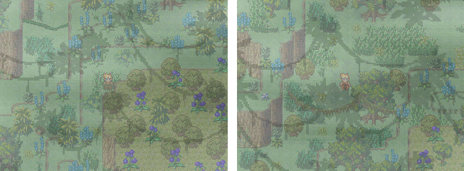
I decided to make a canopy myself (I understand your confusion, Lockez. For a minute I actually did search for mac and blue forest "shadow overlay canopys")
I am super pleased with how it turned out, though I'm not sure if I am using it in the game the best way I could. Here are the latest screens. One of the same area that has been posted in the other screenshots and one other random area.
I know this thread kind of turned into "Demi makes a mountain jungle" but it has been very informative. Thanks for all the help!
Edit: If anyone wants to use or look at the Jungle overlay I made, I put it in my locker.
It is huge.
LockeZ

I'd really like to get rid of LockeZ. His play style is way too unpredictable. He's always like this too. If he ran a country, he'd just kill and imprison people at random until crime stopped.
5958
That now looks ridiculously good
I wouldn't worry too much about taking over the thread, as a lot of the advice is surely helpful to other people too. I know the idea of the shadow overlay was helpful to me.
I wouldn't worry too much about taking over the thread, as a lot of the advice is surely helpful to other people too. I know the idea of the shadow overlay was helpful to me.
Quick note: The cursor arrows beside the icons in lower left corner have already been brightened up/fixed, but I took this screen earlier and I'm not on the computer with the game on it so I can't post that updated screen yet. But yeah..
The BG is a work in progress, I'm just mainly focusing on the actual CBS right now, and I've been working/editting that chipset, so I still need to add more variety to it.
I'm also editting the sprites to give them more of a battle pose, I have just been using them as is for now.
Credit for the awesome charsets that I editted (some slightly, and others not so slightly) from Antifarea's open source sprites. You can check those out in the creative corner. (A more proper credit will be listed in the game itself, but I wanted to give a mention here, too.)
I like where that screenshot is going! The UI itself is nice, but the font is not my favorite. The capital letters are so big and it makes the lowercase letters really small. It isn't that bad, however. Also, you can search google for Pixel Fonts and you can find some really nice fonts that are designed to only be a few pixels big.
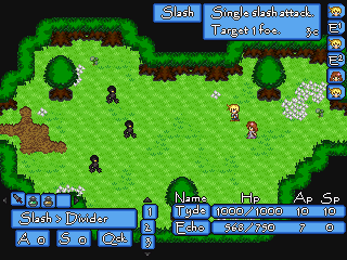
The CBS seems to have some originally in it, rather than just a skinned version of a regular battle system. I see an FFX-esque turn monitor in the top right. Very nice, that was a fantastic way to do turns rather than waiting around for each person to get their turn. Speeds things up nicely.
I like the idea of having two resources rather than just MP (AP and SP) but would you be willing to shed some light on how those work? Are they just two separate types of MP or something else entirely?
I'd like to hear more about how the system works in general because it looks interesting! Keep it up!

@Demicrusaius
The overlays really do enhance things. I suggest including some more patches of dirt, since jungles and forests don't tend to have much grass on the ground (the trees hog all the sunlight). I really like the variety of foliage you used. It looks like a very sophisticated map.
@Solid89
That's a very original looking CBS! as ashriot said, the turn order indicator is very nice. I would recommend a different font though, and perhaps a less saturated menu background, as I find the text a little hard to read.
Here's an update from me. This is a screenshot from a late in the game area called The Goddess Tower (I like to work on all the areas at the same time if I can). This area starts out looking clean and sanitized but gradually undergoes a startling transformation as the heroes ascend it. Here is what the first floor will look like:

The tower is supposed to be 'relentlessly' white, but that can be pretty hard on the eyes after a while. Hopefully these grays are more appealing. This is also my first time spriting pillars, so I'd like to get some feedback on that.
The overlays really do enhance things. I suggest including some more patches of dirt, since jungles and forests don't tend to have much grass on the ground (the trees hog all the sunlight). I really like the variety of foliage you used. It looks like a very sophisticated map.
@Solid89
That's a very original looking CBS! as ashriot said, the turn order indicator is very nice. I would recommend a different font though, and perhaps a less saturated menu background, as I find the text a little hard to read.
Here's an update from me. This is a screenshot from a late in the game area called The Goddess Tower (I like to work on all the areas at the same time if I can). This area starts out looking clean and sanitized but gradually undergoes a startling transformation as the heroes ascend it. Here is what the first floor will look like:
The tower is supposed to be 'relentlessly' white, but that can be pretty hard on the eyes after a while. Hopefully these grays are more appealing. This is also my first time spriting pillars, so I'd like to get some feedback on that.
author=Lucidstillness
The overlays really do enhance things. I suggest including some more patches of dirt, since jungles and forests don't tend to have much grass on the ground (the trees hog all the sunlight). I really like the variety of foliage you used. It looks like a very sophisticated map.
Thanks! I did come to the same conclusion and dirted it up. I really do like this map quite a bit because it has lots of over/unders and alternate elevations.
Your map doesn't look too hard on the eyes for me. It could use a little more white, I think, to really sell what you're going for. What about statues, art, vases, windows or carpets? What is the purpose of the Goddess Tower and why is it there? How is it used and what might be inside?
I like the idea of gradual transitions to a darker and (I'm assuming) more sinister atmosphere. The area just seems a little empty to me.
author=ashriot
I'd like to hear more about how the system works in general because it looks interesting! Keep it up!
As would I. You keeping the game page a secret? I think it looks great and I actually like the font, but if I had the option in game, I would change the message system set to something less bright.
Edit: Dang-it, tried to quote an edit but it ended up being a double post. I'll put myself in time out.
LockeZ
I'd really like to get rid of LockeZ. His play style is way too unpredictable. He's always like this too. If he ran a country, he'd just kill and imprison people at random until crime stopped.
5958
If the shallow platforms on the ground are supposed to be circular, the curves on the tops and bottoms of the pillars should match.
Personally I would use at least two types of ground in the area - the magenta-grey ground that you're using there, and an actually white ground tile. Without seeing the tiles used in a real area it's hard to say whether you'd need more variety than that.
Personally I would use at least two types of ground in the area - the magenta-grey ground that you're using there, and an actually white ground tile. Without seeing the tiles used in a real area it's hard to say whether you'd need more variety than that.

@Lucidstillness: The grays are fine, I think, but those little oval things on the ground are the wrong perspective. At a normal ortho view, if something circular in shape is laying flat on the ground then it should be or almost be a perfect circle.
@Solid89: I agree with Ashriot about the font, I don't think it really fits the rest of the ui very well.
@Solid89: I agree with Ashriot about the font, I don't think it really fits the rest of the ui very well.
Thanks guys. They're actually supposed to be small white tables, but looking at them now they are in the wrong perspective. I'm glad that was caught before I expanded the tileset with two different perspectives! I think I'll put together an object tilesheet just to compare everything easily.
EDIT: Come to think of it, that's the same table sprite Creation said was out of perspective before. I didn't believe him! Nooo!
But anyway, I can't actually explain what the deal is with the Goddess Tower without giving away the plot of the entire game, but suffice it to say that it's creepy and would probably get me an M rating in the actual industry (hurray for the Internet!)
LockeZ
I'd really like to get rid of LockeZ. His play style is way too unpredictable. He's always like this too. If he ran a country, he'd just kill and imprison people at random until crime stopped.
5958
The tables look "better" to me than the pillars. The pillars are almost a circle which is clearly wrong. An exact 45 degree perspective might be somewhere in between the two? Or might be the tables, I dunno, I am not good with geometry or perspective (as you could probably tell from my game if you were)
Yes, I have a similar problem with the perspective in RPGs. In true perspective, there is a vanishing point where all lines converge, but with RPG Maker sprites everything is eternally parallel, which makes it difficult for me to gauge what 'looks right', even when following the RTP guidelines. For that reason, I think it would be helpful to post a screen of miscellaneous objects to see if anyone can catch any flaws I am overlooking:

Thanks in advance!
(Edit: I did adjust the pillars into a more oval shape, as you can see.)
Thanks in advance!
(Edit: I did adjust the pillars into a more oval shape, as you can see.)
The pillars look fine to me but the tables look more like signs. I'm not sure how to fix it. Maybe you could try editing the RTP so that it's whiter?
Good point. I'll try putting more of an edge around the table so that it is obvious the legs are at an angle.
Thanks for the feedback!
Thanks for the feedback!
author=Demicrusaius
the tables look more like signs. I'm not sure how to fix it.
Maybe if you made the legs longer and the top surface shorter.
I could try that too! The way the RTP handles it is to make the border of the table more pronounced, so that's what I'll try first.
Thanks!
Thanks!

author=Demicrusaius
I decided to make a canopy myself
Now, for some strange reason it looks MUCH worse, I dunno... I liked it better without the overlay...but it's your call.
I suppose it doesn't look too bad, at a second look, but I dunno...
author=Solid89
CHIBI SPRITES! This looks pretty rad. :P

@Demi is it possible to just remove that fog overlay? it makes it harder for me to look over things since there's already the leaf/vine thing. or maybe make the opacity of the shadows lower. I didn't think that the uh lighting of the area could make that strong of a shadow.
The fog is tied into the story, but the vine overlay could probably be lighter. I'll tinker with it some more. I don't often use overlays like that so I am unsure how to best apply them.
Thanks for all the feedback and advice, it helped out a lot. :)
I spent some time on it today, mainly just editting the graphics. I changed the font, I liked the other one but I definitely see how it wasn't as user-friendly as a sleeker or more basic pixel font. Changing the font took quite awhile though cause all the battle menus are picture based. I took a screenshot during the same type of battle to show the difference/comparison.

Does the new look better than the old? :/
Ashriot- Thanks for the reply and advice on the font. :) The Ap and Sp are pretty much like two sources of MP, except each is used for a different set of abilty type. Both are gained per turn (or with certain abilities/items), similar to games like Skies of Arcadia. I'm a big fan of that type of system. ^_^
I'm glad you enjoy the CTB turn system as well. :D
Demicrusaius-Thanks for your advice also. :) I made the menu colors a little darker, is it easier on the eyes?
Its been kinda a secret I 'spose, though I plan on having a game page soon, hopefully within the next couple of weeks. I've been mainly focusing on the CBS, but now I just need to start working on more chipsets (adding more variety and things to the base of each chip I have) and finish spritework.
I spent some time on it today, mainly just editting the graphics. I changed the font, I liked the other one but I definitely see how it wasn't as user-friendly as a sleeker or more basic pixel font. Changing the font took quite awhile though cause all the battle menus are picture based. I took a screenshot during the same type of battle to show the difference/comparison.
Does the new look better than the old? :/
Ashriot- Thanks for the reply and advice on the font. :) The Ap and Sp are pretty much like two sources of MP, except each is used for a different set of abilty type. Both are gained per turn (or with certain abilities/items), similar to games like Skies of Arcadia. I'm a big fan of that type of system. ^_^
I'm glad you enjoy the CTB turn system as well. :D
Demicrusaius-Thanks for your advice also. :) I made the menu colors a little darker, is it easier on the eyes?
Its been kinda a secret I 'spose, though I plan on having a game page soon, hopefully within the next couple of weeks. I've been mainly focusing on the CBS, but now I just need to start working on more chipsets (adding more variety and things to the base of each chip I have) and finish spritework.

