


THE SCREENSHOT TOPIC RETURNS
Posts
LockeZ

I'd really like to get rid of LockeZ. His play style is way too unpredictable. He's always like this too. If he ran a country, he'd just kill and imprison people at random until crime stopped.
5958
Sanosuke, that video is ridiculously sexy for an RPG Maker game. The custom interfaces are incredible looking. My only advice is that combat seems quite slow. Is that just because the video recording software is lagging the game, or does it actually take a full three seconds to attack once with a spear and watch the enemy bounce back and take damage, and several times that long to cast a spell? You may wish to speed the animations up if possible, unless that's just lag.

@Sanosuke_
Wow, all that coding sounds very impressive! I especially like the idea of background fluctuations in the world market and NPC activity, as little details like that really add to the believability of a setting (not to mention the replay value).
The menus look gorgeous by the way.
Wow, all that coding sounds very impressive! I especially like the idea of background fluctuations in the world market and NPC activity, as little details like that really add to the believability of a setting (not to mention the replay value).
The menus look gorgeous by the way.

Work in progress map, it's a mock up but those sprites are the ones going into the game.
edit: except Rin, he's getting a makeover because the anatomy is off and some of the shading (hand) is whack.
edit2:I'll fix the trees later 8V
LockeZ
I'd really like to get rid of LockeZ. His play style is way too unpredictable. He's always like this too. If he ran a country, he'd just kill and imprison people at random until crime stopped.
5958
That's a map? It looks more like a battle background. Is it a playable map, or just for a cut scene? It's really pretty, but doesn't look like a terribly interesting area to walk through unless you're planning on filling it with objects later.
As always, I hate giant circle shadows. They never even look like shadows to me. They always just look like the ground is wet. My brain subconsciously discards the possibility that they might be shadows because there are no objects of that circular shape for them to be shadows of.
As always, I hate giant circle shadows. They never even look like shadows to me. They always just look like the ground is wet. My brain subconsciously discards the possibility that they might be shadows because there are no objects of that circular shape for them to be shadows of.

I like those tiles, the trees could take a little reshaping at their top, the water is quite purple but why not.

A video about my game Mike M SPACE, an adventure game without any fights, only exploration and enigms.

author=Kp
A video about my game Mike M SPACE, an adventure game without any fights, only exploration and enigms.
magnifique
Ahh you are making Moon Oddity, too. Keep up the good work.
Wait, did you also make The Best Game in the World? I think it was removed from RMN but there are videos of it on your YouTube page.
I was just researching Sunset over Imdahl and The nothingness, and I fall on this! I really like the graphics, it's too bad the character can only move sideways, could this be changed eventually?


which of these three sets of trees look the best for this screenshot? It's supposed to be an abandoned camp in the woods.
LockeZ
I'd really like to get rid of LockeZ. His play style is way too unpredictable. He's always like this too. If he ran a country, he'd just kill and imprison people at random until crime stopped.
5958
I like #1 the most as the trees become hard to distinguish from each-other, creating a sort of naturally meshed-together canopy instead of a row of spheres. The second one isn't bad though. I don't like the small trees (I almost never like 2x2 or 1x2 trees) but that is only my personal preference for de-chibification whenever possible.
Maybe use a mix of different trees?
Maybe use a mix of different trees?
Yeah the chibi looking ones are ok, but I'm learning how much better stuff is out there, ha. I'm leaning towards the one on the top left, mostly because of the setting. I tried mixing the trees and the colors just don't match.
author=tpasmall
I tried mixing the trees and the colors just don't match.
One trick I use is to have an image open with only the colors you want in the palette. Then paste the other image in and it will automatically take the same colors from the palette that you want. Does that make sense? There are other ways to alter colors too that don't take much effort. You don't have to settle for just one! But I agree with LockeZ.
@SorceressKyrsty
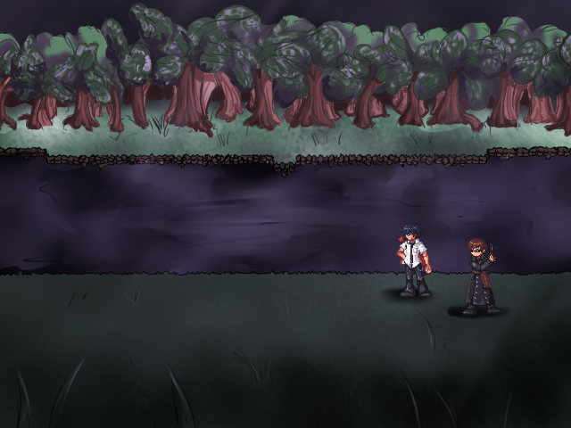
I like your choice of colour palettes for the background. I recommend making the far bank look less square, and actually lowering its detail, since it looks more detailed than the foreground. I know the trees are unfinished, and they look okay so far, but there seems to be too big a space between the front row and the back row. I would also refrain from drawing individual blades of grass on the map, as they make the characters look out of perspective. I'd use a texture for the grass instead. The purple water also seems a bit off, since there rest of the image doesn't have a reddish tinge.
@UPRC
The beaches look good, though one problem I have with that tileset in general is that the coast tiles break up the pattern of the waves. This is really a quibble though.
@Kp
Wow, that looks very cool! I'm a big fan of those kind of 'Earthboundish' sprites, and the locations and characters are very imaginative. The horizontal walk seems rather odd, but it is amusing to look at.
@tpasmall
I would go with the one on the top left, for the reasons LockeZ mentioned.
Sharing a screenshot from The Nothingness, by Teo Mathlein (Sunset Over Imdahl)
http://rpgmaker.net/media/content/users/4243/locker/thenothingnesss.png
http://rpgmaker.net/media/content/users/4243/locker/thenothingnesss.png
author=Lucidstillness
@SorceressKyrsty
I like your choice of colour palettes for the background. I recommend making the far bank look less square, and actually lowering its detail, since it looks more detailed than the foreground. I know the trees are unfinished, and they look okay so far, but there seems to be too big a space between the front row and the back row. I would also refrain from drawing individual blades of grass on the map, as they make the characters look out of perspective. I'd use a texture for the grass instead. The purple water also seems a bit off, since there rest of the image doesn't have a reddish tinge.
The purple water is because it's been infected with Decay. And the trees will probably always cause me issues- trees are the bane of my existence >.>
The far bank is square because this was drawn over a mode7 warped map so it still has tile-like stuff and any dramatic change in the bank would make the loop very obvious.
I have an idea for the trees on the far bank but we'll see how it goes.


