THE SCREENSHOT TOPIC RETURNS
Posts
OOOOOOOOOHHHH That would be MAD cool : )
If you want i can send you one (Lol at the Script and Script script confusion XD)
If you want i can send you one (Lol at the Script and Script script confusion XD)
No problem.
Is the part where someone says '???: And the corpse in the lobby is a product of
your "Sick Mind" ??.' being said by the voice, or the father?
Because it says it's the father, but that makes no sense.
Is the part where someone says '???: And the corpse in the lobby is a product of
your "Sick Mind" ??.' being said by the voice, or the father?
Because it says it's the father, but that makes no sense.
This is a screenshot of a map I'm currently working on, from my project Numina. The territory is called "Nebelpfade" which translates into "fog paths", but I guess I'll have to look for a more stellar name for the English translation ;D A fog-shrouded, slightly gloomy place. Where you always have to carefuly think about your next step, in order not to fall into the bottomless abyss:

The clouds are partly animated, some of them are below the player, while others "hover" above the player.

The clouds are partly animated, some of them are below the player, while others "hover" above the player.
author=Deacon Batista
The light is nice, but the door looks weird with the wall...
New screen from me:
Ah the vampire game...?
author=stardust
This is a screenshot of a map I'm currently working on, from my project Numina. The territory is called "Nebelpfade" which translates into "fog paths", but I guess I'll have to look for a more stellar name for the English translation ;D A fog-shrouded, slightly gloomy place. Where you always have to carefuly think about your next step, in order not to fall into the bottomless abyss:
The clouds are partly animated, some of them are below the player, while others "hover" above the player.
That is a beautiful map.
LockeZ

I'd really like to get rid of LockeZ. His play style is way too unpredictable. He's always like this too. If he ran a country, he'd just kill and imprison people at random until crime stopped.
5958
Areas in RPGs have a long tradition of having unpronouncable names. Leaving it as "Nebelpfade" for the English version seems fine.
If you insist on translating the name, I would suggest that "mist" sounds better than "fog" - it implies a more mysterious effect.
I like the way the fog is layered so that the southern cliff covers part of it. It gives a great feeling of depth.
If you insist on translating the name, I would suggest that "mist" sounds better than "fog" - it implies a more mysterious effect.
I like the way the fog is layered so that the southern cliff covers part of it. It gives a great feeling of depth.
@Lucidstillness: http://i446.photobucket.com/albums/qq183/Lucidstillness/Photos/comparison.png
I like the new coloring style; Is pretty good, specially if it was your first try. But the center of balance of that character is a bit off. I thought I'd better point that out before you polish it even more. =P
@Kp: http://nsa28.casimages.com/img/2011/11/08/111108023809269007.png
I was gonna say the purple one is the best choice, but you've probably already decided on that. But I'm sure even that one is too dark for most monitor. Try to chose lighter/more contrasting colors.
@SorceressKyrsty: http://i260.photobucket.com/albums/ii21/SorceressKyrsty/omgGAMPALY.png
The window skin is pretty neat, and the sprite and portrait aren't bad either; you have been improving lots. - But the background is like, too rigid? The way the trees are arranged, the shape of the river canal, it all looks rather unnatural. Also, the character looks like he's standing on top of the window, but that's just something silly I noticed.
@Mr.Nemo: http://rpgmaker.net/media/content/users/593/locker/arbiterbackinstyle.png
I agree with the others, there's a lot of empty space in that map. Notice how there's no space for a person to walk between the couch and the curtain in the room from that video. Try to imitate that.
@Lotus_Games: http://img208.imageshack.us/img208/2472/edengatesample.png
Those are very nice screens, but something I don't quite like of them is how the many windows, menus, etc. are too different from each other. Also, the mix of 2d anime graphics with realistic 3d graphics is a bit too clashing IMO... I mean, none of this looks too bad, but if you could give everything a more cohesive look, it would be a plus for your game.
@stardust: http://s14.directupload.net/images/111112/e9dva8s2.png
Hey, nice map! And the fog is not too bad if you managed to animate it. But I think the blandness of the rtp actually takes away from the kind of atmosphere you're going for in here. Have you considered some other graphics or making edits of your own? Just some different types of grounds, and making the cliff-face look a lot rougher may do the trick.
author=LockeZ
Areas in RPGs have a long tradition of having unpronouncable names. Leaving it as "Nebelpfade" for the English version seems fine.
Completely agree. Exotic names just seem to fit better in RPG's. If you want the name to look more English-acceptable, just change the f to an h. 'Nebelphade' or 'Nibelphade'.

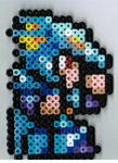
I finally finished getting the fire emblem one set working! Gah, took me a long time. Well, this is just a pic from a side project, but it works.
@chana Thank you!
@LockeZ You do have a point there, especially when it comes to JRPGs. Maybe I'll try finding a name with mist, it does sound a lot more appropriate. Thanks for the feedback! =)
@alterego I actually like the blandness of this set, it goes along well with the toned down color palette of this particular section of the map. There are a few green spots, with trees, flowers and other plants, all rtp-edits. But on the other hand, I'm still experimenting with different additions to the set. So I guess I could also try out some new things regarding the cliffs.
@tpasmall That's a good option. I guess the hardest part would be the "pf" in "Nebelpfade" which is pronounced like a emphasised p (like in stop) closely followed by a smoother "f" or "ph" sound...like in fade ^^ Or I'll just leave the correct pronounciation to the player ;)
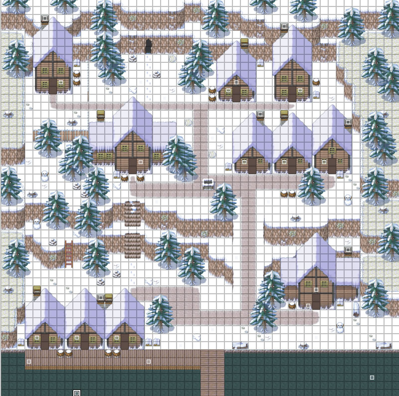
@ShortStar I like snow maps and I think the cliffs go kinda well. But I think you should change the form of the snowgrass-patches. They look to rectangular in my opinion. Maybe you could try out a slightly more rounded edit of standard the rtp-snowgrass, I've seen them somewhere.
ShortStar, try varying those trees up a bit. Even in an evergreen forest trees die and I know there are stumps and two different types of dead trees in that tileset. There doesn't have to be many, just enough to give it a bit of variety.
@alterego
Thanks! You're right about the center of balance. I think I'll put her right leg out a bit to compensate for that, though I'll probably only ever be using the top half since it's a conversation portrait. (This is what I get for working with rough sketches first, lol.)
@Felipe_9595
The lighting effects are really fantastic. The only thing that seems a little off is that the tops of the furniture look to be of a different shade and texture than the rest.
@Deacon Batista
WAY too mighty! The mapping is good as always. The only thing that is a bit weird is how different the colour of the tree in the foreground is from the rest of the foliage. A pretty minor quibble though.
@stardust
the mist effect is very nice, and I'd like to see it animated. I think it would look even better if you found a way to blend the sides of the mountains more seamlessly into the fog, so it is harder to tell where the map ends and the panorama begins.
@facesforce
Ah, NES saturation! Seriously though, it looks very faithful to the style, though I would consider desaturating the colours a bit. You might also want to make the water a solid blue, as the white lines really hurt my eyes to look at.
@shortstar
Those are some very high quality maps. As stardust and SorceressKyrsty have recommended, I would vary the ground patches and the trees a bit, and perhaps add a few more curves to the cliffs as well. It is fine the way it is though.
My turn. I took the plunge and decided to change up my world map into a menu system:

What's this? Lucidstillness made a menu world map after raving about how great old school RPG maps were? Well, I decided that for the game I was working on now, regions were more important than connecting everything together. Instead of there being a ton of areas to explore, there are a number of larger areas to explore, so this system really makes more sense.
Once an accessible area is selected, the player is transported to that specific region, which will have it's own sub areas (usually a few towns and dungeons). This keeps things nice and simple, and avoids the problem of gigantic spaces on a map. The interface itself isn't finished, but you can see where I'm going with this.
The map itself is a kind of a painted relief style, sort of like if a Renaissance painter had access to satellite imagery, lol. You can also see my new menu skin in this pic, complete with a new font (well, Tahoma).
Thanks! You're right about the center of balance. I think I'll put her right leg out a bit to compensate for that, though I'll probably only ever be using the top half since it's a conversation portrait. (This is what I get for working with rough sketches first, lol.)
@Felipe_9595
The lighting effects are really fantastic. The only thing that seems a little off is that the tops of the furniture look to be of a different shade and texture than the rest.
@Deacon Batista
WAY too mighty! The mapping is good as always. The only thing that is a bit weird is how different the colour of the tree in the foreground is from the rest of the foliage. A pretty minor quibble though.
@stardust
the mist effect is very nice, and I'd like to see it animated. I think it would look even better if you found a way to blend the sides of the mountains more seamlessly into the fog, so it is harder to tell where the map ends and the panorama begins.
@facesforce
Ah, NES saturation! Seriously though, it looks very faithful to the style, though I would consider desaturating the colours a bit. You might also want to make the water a solid blue, as the white lines really hurt my eyes to look at.
@shortstar
Those are some very high quality maps. As stardust and SorceressKyrsty have recommended, I would vary the ground patches and the trees a bit, and perhaps add a few more curves to the cliffs as well. It is fine the way it is though.
My turn. I took the plunge and decided to change up my world map into a menu system:

What's this? Lucidstillness made a menu world map after raving about how great old school RPG maps were? Well, I decided that for the game I was working on now, regions were more important than connecting everything together. Instead of there being a ton of areas to explore, there are a number of larger areas to explore, so this system really makes more sense.
Once an accessible area is selected, the player is transported to that specific region, which will have it's own sub areas (usually a few towns and dungeons). This keeps things nice and simple, and avoids the problem of gigantic spaces on a map. The interface itself isn't finished, but you can see where I'm going with this.
The map itself is a kind of a painted relief style, sort of like if a Renaissance painter had access to satellite imagery, lol. You can also see my new menu skin in this pic, complete with a new font (well, Tahoma).
I like it.
I personally wanted a world map, but to do it like this, but mix it where each region is a giant world map.
I personally wanted a world map, but to do it like this, but mix it where each region is a giant world map.


