


THE SCREENSHOT TOPIC RETURNS
Posts

@Commissar_Thule: http://rpgmaker.net/media/content/users/19200/locker/GPic_1.png
Those screens look awesome! I love the amount of detail and variety in them, despite the simple graphics. Are those custom, by the way? Please, make a game page! I need to see more! ...Oh, and do I spot a FF6 reference? ...Maybe not. =P
KP: http://www.youtube.com/watch?v=2khsX3r81qg
That looks, interesting. I wonder what your game is going to be about... But again, everything it's too dark! make it a bit clearer, please. Also, I don't think is right you display the message windows just for a "..." use emote bubbles for that instead.
@Tau: http://img.photobucket.com/albums/v212/Caiser/Dragons%20Tear%20Album/DragonsTearScreen10.png
The only real issue that I see with your screen is that the character stands out a tad much. Is not a big deal though, but it's also very easy to change. All you need to do is soften its sellout a little.
Also, lol at the difference of opinions. =P

Yeah I'm surprised at the difference of opinion on such a simple screenshot. Thanks for all the comments guys, the tileset is theodore so everything should be matching up, so the comment on the trees I just don't see.
The Suikoden II comparison I love haha.
The Suikoden II comparison I love haha.

That's the strange thing - the better something looks, the more critical we get. If I were to post some screenshots of games using Dragon Warrior chipsets, people would say it looks good and then not get into it.
EDIT:
I was also thinking about how people are complaining that MW3 looks "dated", and I'm like "really? It looks fucking gorgeous. You kids never had it so good get off my lawn where's my werther's original"
EDIT:
I was also thinking about how people are complaining that MW3 looks "dated", and I'm like "really? It looks fucking gorgeous. You kids never had it so good get off my lawn where's my werther's original"

author=SorceressKyrsty
ShortStar, try varying those trees up a bit. Even in an evergreen forest trees die and I know there are stumps and two different types of dead trees in that tileset. There doesn't have to be many, just enough to give it a bit of variety.
I tried that a few times but people just wondered well why's that tree dead? I said for variety then got argued with... so whatever. :-)

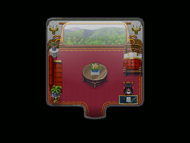
Never used lighting effects before! Tried to make some kind of rich glitzy subway cabin. Off from law school (Hahvard) and into a Firm :> (no Phoenix Wright bro)

It looks very refreshing, as well.
Other than the black border around the part with the window. (The part to show he wall/ceiling) It throws it off because the window is so thin. It just looks like it would make a deformed looking train if looking at it from the outside. If that makes sense to you all.
Other than the black border around the part with the window. (The part to show he wall/ceiling) It throws it off because the window is so thin. It just looks like it would make a deformed looking train if looking at it from the outside. If that makes sense to you all.
@Miracle - I really like that! The candle seem to disappear in the walls, though. And just below each candle set there is a few pixels "missing" in the decorative parts of the wall. Also, it's hard to tell that the black chick has eyes. Everything else is great :)
So I'm trying to create a chipset from a live action show. Thoughts? I'd like some feedback before I spend too much time on this. I know the angle of the curves isn't perfect but I'm not worried about that. I'm wondering how to handle the perspective of the left/right walls.

So I'm trying to create a chipset from a live action show. Thoughts? I'd like some feedback before I spend too much time on this. I know the angle of the curves isn't perfect but I'm not worried about that. I'm wondering how to handle the perspective of the left/right walls.
author=ThiamorI kind of get what you mean. Shorten the floor or heighten the wall. I'll try and work on perspective Dx Thank you!
Other than the black border around the part with the window. (The part to show he wall/ceiling) It throws it off because the window is so thin. It just looks like it would make a deformed looking train if looking at it from the outside. If that makes sense to you all.
author=Link_2112Yeah I noticed that candle issue of them hiding in the wall. Thought the dark shading on some parts would be sufficient but guess not >< The parts that are "missing" are pretty much nonexistent, that's where it stops XD But I guess if it looks unfinished I could add some more, right?
@Miracle - I really like that! The candle seem to disappear in the walls, though. And just below each candle set there is a few pixels "missing" in the decorative parts of the wall.
author=Link_2112Ugh yeah that was a worry. Don't know what to do now but I'm sure I can figure something out. Thank you! :> So nobody called out my lighting so I'm guessing it's fine. Great XD
Also, it's hard to tell that the black chick has eyes.
Also Link honestly I would start with the room structure before I start adding furniture or whatever. It's tons easier to remake a desk or chair than it is to edit the walls or ceiling (that's just me Dx) But you seem like you have a good handle on it, and it's nice to see more people making their own graphics. :>

author=Miracle
The parts that are "missing" are pretty much nonexistent, that's where it stops XD But I guess if it looks unfinished I could add some more, right?
I wonder if we're talking about the same thing now. In the bottom corners of each side of the window are 2 curved lines. At the apex of the upper line it almost looks like the outlining pixels got cut off. Every other part has an outline except that one little section. Since it's right in the middle it does look unfinished.
Ugh yeah that was a worry. Don't know what to do now but I'm sure I can figure something out.Is there a reason her eyes are entirely purple-ish? Is that how everyone looks? Is she "different"? I would think you could use the bottom pixel (or two) as the pupil and have the rest showing white, or at least a brighter color.
So nobody called out my lighting so I'm guessing it's fine. Great XD
Yeah, the effect is cool. If you want to get all literal, it lacks shadow mostly on the center table. How did you create the effect?
Also Link honestly I would start with the room structure before I start adding furniture or whatever. It's tons easier to remake a desk or chair than it is to edit the walls or ceiling (that's just me Dx) But you seem like you have a good handle on it, and it's nice to see more people making their own graphics. :>
Well I started with the big curved center piece, almost as a test to see how well I could do it. That will be on the upper layer. I want to make sure things will line up with events while looking like the original set. I'm thinking the room structure will be whatever is functional after every else is set it place? I'm really not sure what I'm doing though, this is a first for me :/
author=NewBlack
@Link_2112 - You're making a TNG fangame? O_O
Mayyyyyyyybe o.O

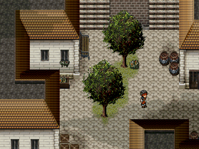
Messing around with the RTP trees and tried to make them bigger than they normally would and I was just wondering, how bad do they look? To me, kinda bad. >.<''


author=Miracle
Never used lighting effects before! Tried to make some kind of rich glitzy subway cabin. Off from law school (Hahvard) and into a Firm :> (no Phoenix Wright bro)
Beautiful. Not overpowering, really good stuff. Maybe lower the picture slightly? The source of the light would cutoff at the top of the window.

I actually kind of like them. They'd have to fit a very specific style to work, though, so be prepared to remain consistent.
Jakester- they look very bad.
the problem is that the pixels are huge and it's immediately noticeable. the pixels of those trees are bigger than the pixels from the other graphics so it's really offputting. if you wanna grab some bigger trees maybe you can jack them from some RMXP tiles?
the problem is that the pixels are huge and it's immediately noticeable. the pixels of those trees are bigger than the pixels from the other graphics so it's really offputting. if you wanna grab some bigger trees maybe you can jack them from some RMXP tiles?

author=Deacon BatistaThe windowskin is killing me. Bright-ass red blood dripping down over some orange and blue text? Argh. Everything else is charming enough.
The light is nice, but the door looks weird with the wall...
New screen from me:
author=MiracleElegant! My only advice would be to increase the transparency of the light effect slightly, or smudge the edges with an eraser, to get rid of the "hard" diagonal lines coming out from the side of the window; it's also a few pixels too high (light is shining out from above the window). RE: lacking shadowing on the table - when I'm doing a light effect, I usually use the "eraser smudge" trick on top of items that should have some shading. You don't need to add shading, you just need to 'remove lighting' ... if that makes sense.
Never used lighting effects before! Tried to make some kind of rich glitzy subway cabin. Off from law school (Hahvard) and into a Firm :> (no Phoenix Wright bro)
author=ShortStaryou are completely incapable of taking any kind of criticism. I see this exact same comment from you all the time. "Well I did that and somebody else didn't like it so whatever." wah wah wah wah wah why are you still on RMN
I tried that a few times but people just wondered well why's that tree dead? I said for variety then got argued with... so whatever. :-)
author=Mr.Nemoif you edit my sprite poses I'll mak your gam
then again, i spend all my time on this project editing spriteposes and such (same as always that is) instead of mak gam :(

With the big trees, don't just blur them, or keep them at 2x. Since they're a bigger resolution, you should go back in and work around the edges to make it smoother, by putting pixels in between the larger "pixels".


