


THE SCREENSHOT TOPIC RETURNS
Posts

@Amorciad : I really like that background,
Felipe : lovely desigh and colours (a little lesss the green).
Felipe : lovely desigh and colours (a little lesss the green).

author=Large
I'm not sure what to say, all the fonts are the same type and size in that screen. You may be referring to the difference in size between the Upper Case and Lower Case letters and if so that was done on purpose...
The check the "o", "p" and "q" in lower case, for example. They're aligned to the bottom line; that looks awkward, as regularly, they're aligned to the top line.

That's because there's no descender height used, the baseline is being used as the absolute bottom for all characters whether it has a tail or not. And it looks awful because of it.

@Far_Oz: http://imageshack.us/photo/my-images/259/loz2012.png/
Nice screens! I don't see much of a problem with the similarity between your maps and the locations from the original games, after all, there's only so much you can do with those chipsets. But the waterfall in this particular screen bother me a bit, I don't think it should go all the way down in a single stream like that. It should flow more naturally according to the terrain, if you know what I mean. xP
@Large: http://i88.photobucket.com/albums/k192/Large114/SS2.png
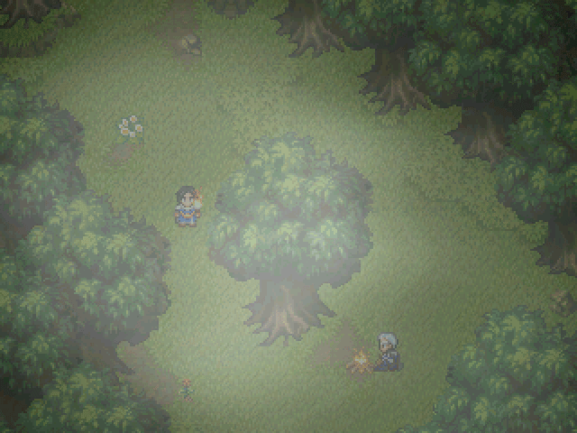
This screen looks kinda odd to me, there are two visible sources of light, but there is only one washed out point of light in the center of the screen. Is that supposed to be moonlight or something? If it is I suggest you to use shade of blue instead of grey for the overlay picture. And maybe a halo of light above the torch and fireplace as well to aid the atmosphere?
I also watched your video and I liked it a lot. I'm agree with Darken about the text speed, though. What's happening in the background is kinda more interesting that the cryptic monologue, so I'd like to read it fast and just keep watching. Versalia is also right about that long "...." is kinda too much of a waste of time and space for so little. ...Oh, and did you forget to translate that last "Hombre encapuchado" by any chance?
@LicidStillness: http://i446.photobucket.com/albums/qq183/Lucidstillness/Photos/greatoutdoors.png
Not bad! I love the rocky wall texture, except in its slanted, diagonal variant; it looks too plain. It doesn't help either that the edges of the ground elevations are too 'rigid' when they should look more 'organic' like the border of the water border. The grass also looks too plain, like it was artificial grass or even a carpet. Lastly, the trees aren't that bad, but I think that's the wrong kind of 'leaves' you should be using. You can clearly see the rocks in the walls, and even the blades of grass in the tall grass, but not the leaves on the trees, those are just a mess of pixels. Do you know what I'm trying to say? ...Anyway, I know this is a WiP and that making custom graphics is very difficult, so don't take this the wrong way.
@Ashley_Lacure: http://rpgmaker.net/media/content/users/17550/locker/Test1.png
The mapping isn't that bad, I'd even say you're making good use of the RTP. But I still find it kinda difficult to tell where you're supposed to go in those screens. There's no visual clue for the player to know this; the trees are all over the place, and those pits on the ground can be easily confused with the rocky walls... I suggest you to keep the trees out of the way, and try to make a more distinctive dirt road or something. Also, obscuring the bottom of the pits may be a good idea to tell them apart more easily.
@Felipe_9595: http://i43.tinypic.com/28t7yhv.png
That looks... well, bad. First of all, the obvious mirrored nature of the stage makes it look, 'life-less', not to mention that many of the elements that form a part of it are just re-sized versions of the same object. I mean, if at least those trees in front of everything would match the resolution of everything else, it would be less of a deal that they obstruct the visibility of the player.
Also, when you have seen a screen of a fighting game, you have practically seen them all. The only thing that changes are the backgrounds, and those aren't often a key element of the game... Don't find it strange if people don't come running to comment your screens.
Nice screens! I don't see much of a problem with the similarity between your maps and the locations from the original games, after all, there's only so much you can do with those chipsets. But the waterfall in this particular screen bother me a bit, I don't think it should go all the way down in a single stream like that. It should flow more naturally according to the terrain, if you know what I mean. xP
@Large: http://i88.photobucket.com/albums/k192/Large114/SS2.png
This screen looks kinda odd to me, there are two visible sources of light, but there is only one washed out point of light in the center of the screen. Is that supposed to be moonlight or something? If it is I suggest you to use shade of blue instead of grey for the overlay picture. And maybe a halo of light above the torch and fireplace as well to aid the atmosphere?
I also watched your video and I liked it a lot. I'm agree with Darken about the text speed, though. What's happening in the background is kinda more interesting that the cryptic monologue, so I'd like to read it fast and just keep watching. Versalia is also right about that long "...." is kinda too much of a waste of time and space for so little. ...Oh, and did you forget to translate that last "Hombre encapuchado" by any chance?
@LicidStillness: http://i446.photobucket.com/albums/qq183/Lucidstillness/Photos/greatoutdoors.png
Not bad! I love the rocky wall texture, except in its slanted, diagonal variant; it looks too plain. It doesn't help either that the edges of the ground elevations are too 'rigid' when they should look more 'organic' like the border of the water border. The grass also looks too plain, like it was artificial grass or even a carpet. Lastly, the trees aren't that bad, but I think that's the wrong kind of 'leaves' you should be using. You can clearly see the rocks in the walls, and even the blades of grass in the tall grass, but not the leaves on the trees, those are just a mess of pixels. Do you know what I'm trying to say? ...Anyway, I know this is a WiP and that making custom graphics is very difficult, so don't take this the wrong way.
@Ashley_Lacure: http://rpgmaker.net/media/content/users/17550/locker/Test1.png
The mapping isn't that bad, I'd even say you're making good use of the RTP. But I still find it kinda difficult to tell where you're supposed to go in those screens. There's no visual clue for the player to know this; the trees are all over the place, and those pits on the ground can be easily confused with the rocky walls... I suggest you to keep the trees out of the way, and try to make a more distinctive dirt road or something. Also, obscuring the bottom of the pits may be a good idea to tell them apart more easily.
@Felipe_9595: http://i43.tinypic.com/28t7yhv.png
That looks... well, bad. First of all, the obvious mirrored nature of the stage makes it look, 'life-less', not to mention that many of the elements that form a part of it are just re-sized versions of the same object. I mean, if at least those trees in front of everything would match the resolution of everything else, it would be less of a deal that they obstruct the visibility of the player.
Also, when you have seen a screen of a fighting game, you have practically seen them all. The only thing that changes are the backgrounds, and those aren't often a key element of the game... Don't find it strange if people don't come running to comment your screens.

I think the stages a pretty crucial element in a smash game, is not like every stage in the game is a a flat stage a la SF.
Also, this was the previous version xDDD ( i think we made a big improvement)

Oh and, in the bg You can see Frieza and Picollo fighting.
Also, this was the previous version xDDD ( i think we made a big improvement)
Oh and, in the bg You can see Frieza and Picollo fighting.
Oh yeah. Improvement indeed.
There were two sources of light. I changed that, because it wasn't playing properly, the way I wanted it (Engine limitations). However, in the screenshot, I had placed the 2 light sources; they were there, but kind of absorbed each other somehow. I couldn't get them to work. I removed the torch, so the hero is no longer generating light. BTW, it was not moonlight; it's the light generated by the fire the other NPC has going on, but you can't see it properly because of the static screenshot. (Animated in-game).
Thanks. I tweaked the speed and flow of the text a bit; it is important after all, as well as the actions happening at the same time. Don't worry, you'll see the consecuences and a few of the characters will pop up again. The long "........" was changed to the standard "...", but, and help me here a minute, while I do have the "..." emoticon in a bubble animation over a character's head, I don't want to place it on this guy's head. I feel it would subtract "gravity" from the scene. What do you think?
And yes, :P, I forgot to translate the last part, but that's been fixed.
author=alterego
@Large: http://i88.photobucket.com/albums/k192/Large114/SS2.png
This screen looks kinda odd to me, there are two visible sources of light, but there is only one washed out point of light in the center of the screen. Is that supposed to be moonlight or something? If it is I suggest you to use shade of blue instead of grey for the overlay picture. And maybe a halo of light above the torch and fireplace as well to aid the atmosphere?
There were two sources of light. I changed that, because it wasn't playing properly, the way I wanted it (Engine limitations). However, in the screenshot, I had placed the 2 light sources; they were there, but kind of absorbed each other somehow. I couldn't get them to work. I removed the torch, so the hero is no longer generating light. BTW, it was not moonlight; it's the light generated by the fire the other NPC has going on, but you can't see it properly because of the static screenshot. (Animated in-game).
author=alterego
I also watched your video and I liked it a lot. I'm agree with Darken about the text speed, though. What's happening in the background is kinda more interesting that the cryptic monologue, so I'd like to read it fast and just keep watching. Versalia is also right about that long "...." is kinda too much of a waste of time and space for so little. ...Oh, and did you forget to translate that last "Hombre encapuchado" by any chance?
Thanks. I tweaked the speed and flow of the text a bit; it is important after all, as well as the actions happening at the same time. Don't worry, you'll see the consecuences and a few of the characters will pop up again. The long "........" was changed to the standard "...", but, and help me here a minute, while I do have the "..." emoticon in a bubble animation over a character's head, I don't want to place it on this guy's head. I feel it would subtract "gravity" from the scene. What do you think?
And yes, :P, I forgot to translate the last part, but that's been fixed.
Not even a screenshot or gamepplay video XDD But what do you think about this song? Leonardo Zuccarelli compsoed it for our Upcoming Duck Hunt Stage.

@Lotus_Games
VERY nice background and great use of transparencies. I'm not a huge fan of the font though, since I think the turquoise on black might make the text hard to read. You might want to consider reducing the saturation or just desaturating all together.
@Felipe_9595
Your sprite work is very nice! I do agree though that your background clashes with the lower-res sprites, and the mirror effect is pretty obvious at the moment.It honestly looks like some professional games the way it is, but I think it would look better if it were less symmetrical.
@alterego
No need to worry! Honest feedback is always the most valuable feedback, so please don't worry about the possibility of my being discouraged.
I have been working on some curved sections of the map, and so far I think they are a definite improvement. Here is the latest screen:

Spriting curved textures is pretty tricky, so I'll be tweaking the walls a lot. The tree in the last pic was a conifer, so I couldn't really sprite its needles any larger without the relative scale being off. The deciduous tree should look like it has leaves larger than the blades of grass, but if things still seem out of scale I could always increase the size of the trees.
I'm not entirely sure what the trouble with the grass is. I've checked a number of different RPGs, including the RTP stuff, and they all pretty much do grass the same way I've done it. Perhaps the tiling is off? Or maybe the area is just too barren and could use some more detail? Again, I'm not sure, but it is something I will keep in mind.
While I'm posting screens, here are two other things I've been working on. I took LockeZ's advice and added a slight colour tone to the castle tileset. I think a bit of blue does make the area seem more lively:

The second is this lava texture:

I like the way the colours came out, but it has the same problem as most one-tile textures; a clearly visible pattern. I'm not sure how to fix this; maybe I'll just break it up and avoid large patches.
Oh, and I'm still 'fiddling' with the enemy system. I'll report back when I have something to show in that regard. :)
Thanks again guys!
VERY nice background and great use of transparencies. I'm not a huge fan of the font though, since I think the turquoise on black might make the text hard to read. You might want to consider reducing the saturation or just desaturating all together.
@Felipe_9595
Your sprite work is very nice! I do agree though that your background clashes with the lower-res sprites, and the mirror effect is pretty obvious at the moment.It honestly looks like some professional games the way it is, but I think it would look better if it were less symmetrical.
@alterego
No need to worry! Honest feedback is always the most valuable feedback, so please don't worry about the possibility of my being discouraged.
I have been working on some curved sections of the map, and so far I think they are a definite improvement. Here is the latest screen:
Spriting curved textures is pretty tricky, so I'll be tweaking the walls a lot. The tree in the last pic was a conifer, so I couldn't really sprite its needles any larger without the relative scale being off. The deciduous tree should look like it has leaves larger than the blades of grass, but if things still seem out of scale I could always increase the size of the trees.
I'm not entirely sure what the trouble with the grass is. I've checked a number of different RPGs, including the RTP stuff, and they all pretty much do grass the same way I've done it. Perhaps the tiling is off? Or maybe the area is just too barren and could use some more detail? Again, I'm not sure, but it is something I will keep in mind.
While I'm posting screens, here are two other things I've been working on. I took LockeZ's advice and added a slight colour tone to the castle tileset. I think a bit of blue does make the area seem more lively:
The second is this lava texture:
I like the way the colours came out, but it has the same problem as most one-tile textures; a clearly visible pattern. I'm not sure how to fix this; maybe I'll just break it up and avoid large patches.
Oh, and I'm still 'fiddling' with the enemy system. I'll report back when I have something to show in that regard. :)
Thanks again guys!
I like the first screenshot, but the grass is off. Perhaps is the lack of defining features on the light green type of grass, or the big difference between both colors.
Lava seems repetitive..
Lava seems repetitive..
Hmm. I could try making the grass more closely match the tall grass in colour and see if that makes it look less artificial. I'll also see if I can add more variations to the grass as well.
The lava is something I just started the other day. While everything lines up correctly, it is easy to see the pattern. I'm going to try and tweak the light and dark areas to make the pattern more homogeneous.
Thanks for the feedback!
The lava is something I just started the other day. While everything lines up correctly, it is easy to see the pattern. I'm going to try and tweak the light and dark areas to make the pattern more homogeneous.
Thanks for the feedback!


author=TDS
Got bored and wanted to make a quick script.
(The horrible faces are the scripts fault)
Oho, Radiant Historia, right?
You're not lying, that game is excellent in nearly all aspects. Shame it's handheld status will probably keep it under the radar.
LockeZ

I'd really like to get rid of LockeZ. His play style is way too unpredictable. He's always like this too. If he ran a country, he'd just kill and imprison people at random until crime stopped.
5958
@Lucidstillness: Looking at Tales of Phantasia (SNES), which has a kind of similar no-outlines mostly-realism style of graphics to yours (but lower res), I notice that the tall grass and short grass are always exactly the same colors as each-other. Where the tall grass is dark green, the short grass is the same shade of dark green. The only difference is that the short grass appears to just be a smudge of colors, while the tall grass has visible blades.
If you want to liven up your grassy areas more, you could add small tufts of taller grass.
I think your curved walls look good when you use them to prevent there from being a corner, but not so good when they curve the wrong direction and there's a sharp corner. I hate to say it but in addition to the concave and convex curves, you may need four more curves in... like, half-and-half tiles. So they switch from concave to convex halfway through the tile. This is confusing to try to describe without drawing pictures, but hopefully you at least see what I mean about the corners.
Or, alternately, much more simply, you could just design all your cliff walls in patterns that never have these corners. That sounds way more reasonable... at least to someone like me who hates pixelling.
I always kinda hate how liquid tiles look. The pattern is always way too obvious because they're way harder to break up than land tiles. My lava just looks like this:

On the other hand, your trees are so good. They look like photos.
Oh, also, my advice was really to tint some of the tiles in the grayscale ruins, not all of them. Tinting all of them doesn't look bad but kind of ruins the point (to me), which was to add a little more contrast to the area. This is more of what I had in mind: checkered tiles pure grayscale, statues tinted red, everything else tinted blue.

Ah, I gotcha. Thanks LockeZ, I'll give those ideas a try. One problem I seem to be having is scale; the tall grass looks a bit too tall compared to the regular grass, but the player is still supposed to be able to walk around in it, partially obscuring the sprite. Maybe I'll try making the blades thinner.
I think I'll go with a kind of jade colour for the checkered tiles in the 'Grayscale Ruins', since I've always been fond of greenish checkered tiles. I also rather like the name "Grayscale Ruins" (maybe a gray dragon lives there, setting up a delicious pun!)
I think I'll go with a kind of jade colour for the checkered tiles in the 'Grayscale Ruins', since I've always been fond of greenish checkered tiles. I also rather like the name "Grayscale Ruins" (maybe a gray dragon lives there, setting up a delicious pun!)


