


THE SCREENSHOT TOPIC RETURNS
Posts
LockeZ

I'd really like to get rid of LockeZ. His play style is way too unpredictable. He's always like this too. If he ran a country, he'd just kill and imprison people at random until crime stopped.
5958
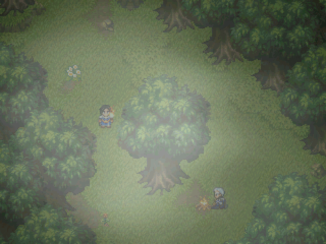
Not a fan of the pixelated trees either. I know there are RTP-style trees in that size, though, that you can steal appropriate with permission from other people's projects.


@Faroz - Amazing work as usual, don't think I've seen that second screenshots tile used so efficiently before, kudos. Is that a mini menu in the corner?

Oh hey look at that, the 100th page in this thread!
Oh hey look at that, the 100th page in this thread!

@Far_Oz : really like the waterfall and the far off landscape in the top one, the rest is more known but very well used.
@Tau : like that tileset and that map, nice room.
@Tau : like that tileset and that map, nice room.

Testing portraits for my game.
alterniabound sprite edits h0nk h0nk
@Far_Oz Really nice work, Romancing Saga 3 sprites always remind me of Dragon Warrior 4: Renaissance.
Though Indogutsu has probably truffle-shuffled away from RM scene since his ragequit.

Haha, yeah, that guy who didn't want any critique ^_^
@ Nightowl:
Lol, the artwork is eppic, but where did you get that ugly chipset from?
The textbox is okay, but I personally have a problem with blue textboxes.
@ Tau:
I know the chars ;-) Glad you know how to map with that carpets.
@ Far Oz:
"Call of Duty"? Sounds familiar, but don't know where it comes from.
The maps are definitely above average. From which commercial game are the chipsets by the way? Have seen them some times, but don't know where they are from.
I started hating the overused REFMAP tilesets so I decided to use that chipset. Might replace it with something simpler looking.
As for blue textbox, I was planning to replace it so it isn't staying.
As for blue textbox, I was planning to replace it so it isn't staying.
There are tons of nice chipsets styles out there from commercial games. So I don't know why people don't really see many alternatives to Refmap.
I personally used Refmap and RTP in the past and now I won't use it again, because it would bore me.
I personally used Refmap and RTP in the past and now I won't use it again, because it would bore me.

Far_Oz, I would actually call that a bad use of rips. Despite the maps looking FANTASTIC, they also look almost exactly like the areas those chipsets are ripped from in their respective games. Tsk tsk no no.

Hello... please rate and comment! ;)
Quick scene near the beginning of my project:
A rather large picture, sorry. It's just the map, I'm not showing the actual lightning or wild life (enemies) or hero:

Quick scene near the beginning of my project:
A rather large picture, sorry. It's just the map, I'm not showing the actual lightning or wild life (enemies) or hero:

author=Versalia
Far_Oz, I would actually call that a bad use of rips. Despite the maps looking FANTASTIC, they also look almost exactly like the areas those chipsets are ripped from in their respective games. Tsk tsk no no.
What matters is others like it. 1 dislike to the other 2 to 3 likes, means they did pretty good.

ThiamorVersaliaWhat matters is others like it. 1 dislike to the other 2 to 3 likes, means they did pretty good.
Far_Oz, I would actually call that a bad use of rips. Despite the maps looking FANTASTIC, they also look almost exactly like the areas those chipsets are ripped from in their respective games. Tsk tsk no no.
http://lmgtfy.com/?q=plagiarism
author=CrazeThiamorhttp://lmgtfy.com/?q=plagiarismVersaliaWhat matters is others like it. 1 dislike to the other 2 to 3 likes, means they did pretty good.
Far_Oz, I would actually call that a bad use of rips. Despite the maps looking FANTASTIC, they also look almost exactly like the areas those chipsets are ripped from in their respective games. Tsk tsk no no.
yeah like it's not plagiarism using rips in the first place o_...o
Rips are not really a problem, but originality might be. I think the first SS is very similar to... Legend of Mana. And the second is clearly Chrono Trigger, a VERY similar setting called "Ocean Palace", which is super close to "Imperial Palace" (as shown in the SS).
In any case, the screens look very good.
How about mine?
In any case, the screens look very good.
How about mine?

I don't hate people who use things from other games or franchises. As long as it's not for profit. Or the company says hey NO!
Then let a person make what they want. SMBX technically Plagerism then. Since mario is a licensed character.
Also here is my a meh screen shot from the tmnt area of the game I am working on.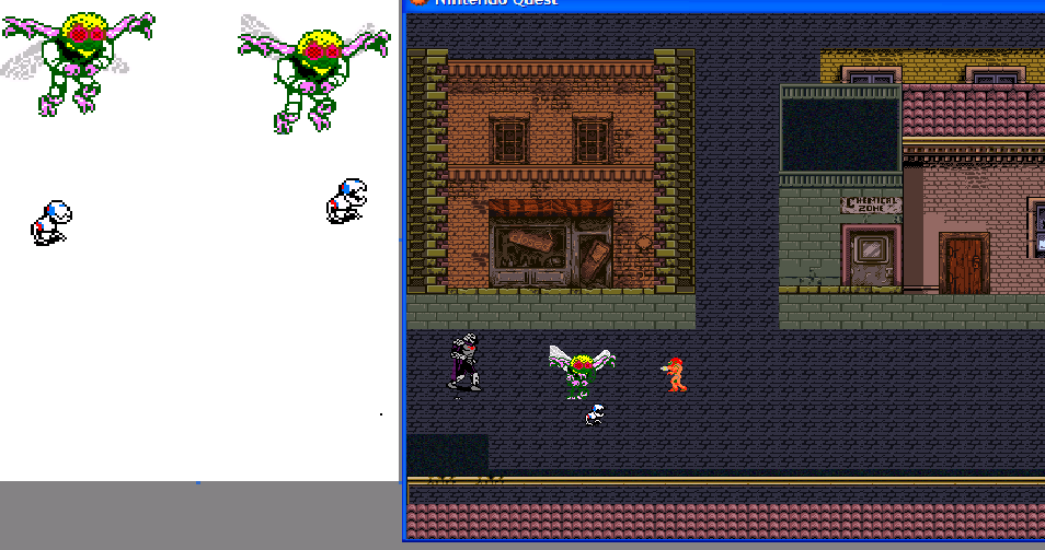
I'm not that great of a mapper yet I think it's "Ok" looking.
Then let a person make what they want. SMBX technically Plagerism then. Since mario is a licensed character.
Also here is my a meh screen shot from the tmnt area of the game I am working on.
I'm not that great of a mapper yet I think it's "Ok" looking.
The map looks OK if you're trying to achieve that oldschool NES-type of feeling (which I'm assuming you are). The sprites clash heavily though. Too many different styles and shading.
Well is that a terrible thing wouldn't it be better for the characters to be visible Also Baxter is only going to be in this singular part and shredder appears later. So it's doesn't bug me too much.
Baxter was recolored to look a bit more like his TV counterpart.
Samus is just a stand in character for the avatar atm.
Yes I am going for a Nintendo look.
If I could get some advice that would be great.
Baxter was recolored to look a bit more like his TV counterpart.
Samus is just a stand in character for the avatar atm.
Yes I am going for a Nintendo look.
If I could get some advice that would be great.
I like the style, reminds me of TMNT II for NES, one of the best games in that console...
I made a short video of the intro of my game. Feedback?
I made a short video of the intro of my game. Feedback?
THAT LOOKED AWESOME! Your a real pro at this goodness.
I still need to figure out how cut-scenes work.
That was astonishing.
I still need to figure out how cut-scenes work.
That was astonishing.

