THE SCREENSHOT TOPIC RETURNS
Posts
Hey!!
I'm back from my exams+All the games here are stellar!
Keep up the good work!
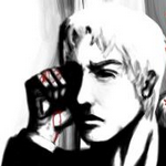
I got my laptop back and I was editing Phoenix wright Characters for a new Russian Roulette scene.


And I was making a manga for my current project.


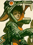
Not sure about the cover thou.I'll change it.
I'm back from my exams+All the games here are stellar!
Keep up the good work!
I got my laptop back and I was editing Phoenix wright Characters for a new Russian Roulette scene.


And I was making a manga for my current project.


Not sure about the cover thou.I'll change it.
LockeZ
I'd really like to get rid of LockeZ. His play style is way too unpredictable. He's always like this too. If he ran a country, he'd just kill and imprison people at random until crime stopped.
5958
Is this supposed to be a parody of Sweet Bro and Hella Jeff
author=LockeZ
Is this supposed to be a parody of Sweet Bro and Hella Jeff
This is the best comment.
author=LockeZSeconded, but needs more falling down the stairs and bros.
Is this supposed to be a parody of Sweet Bro and Hella Jeff
YAY!I changed the Cover for Issue1+I made the back cover+I'm still not done with Issue#1 but I made a cover for Issue#2+I made the entry page for ISSUE#1


Other than that, it seems cool enough but you might want to improve your grammar.
I liked the original Issue #1 more, it seemed more clear and loved the dark background.
I liked the original Issue #1 more, it seemed more clear and loved the dark background.
author=Nightowl
Other than that, it seems cool enough but you might want to improve your grammar.
I liked the original Issue #1 more, it seemed more clear and loved the dark background.
SHIIIIIIIIIIT!!
That's a mistake,sorry.
Here you go!
Page 4 and 5!\


The Luca kid in these,I've designed after Snowe from Star stealing prince.
Page 4 and 5!\


The Luca kid in these,I've designed after Snowe from Star stealing prince.
I also think it's a good idea to hide large images/barrages of images in spoiler tags. Please try to keep the topic easily viewable!
I was planning on making this game in B&W but after trying it out in color it really does look much better u.u
I like B&W but find it limiting in creating new sprites. Not enough range.
This is just after a bit of coloring and I am wondering mostly about how it looks with some things outlined in black and some not. NPC's will be in black and important objects, while background items will blend in more by being outlined in their own color. Some might say it clashes but it also is kind of interesting...I think.
Some stuff still needs to be changed, like the black outlines on palm trees and shells.
B&W
Color
@ Link 2112 - The added color depth DOES look a lot more fresh and stunning than the B&W version (hehehe, kinda reminds me of Mystic Quest a little :D), but I dunno... The black and white version does remain truthful to the original look you were trying to go through and I still prefer it more than the color one. But...I guess it's your call... Maybe you can have a way or implement a feature that allows both? I like the B&W version myself, though.

Haven't shown anything in almost 7 weeks. I'll try and do better and not spam the crap out of the SS thread with pointless menus and such (although, NOACCEPTANCE772 is doing a pretty good job as it is :D).
Playin' around with the game's "Username Selection Screen" a little. There are still a few problems with it, but this is pretty much it. Unlike Monopolo, though, you can enter symbols and lower case letters (lame, I know).
At least it's something.
@Brent: It sure looks nice, but can we actually use our real keyboard or must we select the letters on screen? If the latter, maybe using the alphabetical order would be preferable?

Roguelike project on 2k3. I'm currently working on all the HUD pictures and the boring stuff coding. Gab windows run whenever you find something or defeat an enemy.
The portrait's base was Lyndis from Fire Emblem and the HUD is greatly inspired from the Ys games.

Roguelike project on 2k3. I'm currently working on all the HUD pictures and the boring stuff coding. Gab windows run whenever you find something or defeat an enemy.
The portrait's base was Lyndis from Fire Emblem and the HUD is greatly inspired from the Ys games.


