


THE SCREENSHOT TOPIC RETURNS
Posts
LockeZ

I'd really like to get rid of LockeZ. His play style is way too unpredictable. He's always like this too. If he ran a country, he'd just kill and imprison people at random until crime stopped.
5958
author=KingArthur
Great scot do I need a better windowskin though (and possibly an appropriate font). (屮゜Д゜)屮
You're on your own with the windowskin thing, but here's a site with some classic game fonts. I use the Chrono Trigger font at size 18, which puts it at the same resolution as the 2K3 tiles. Lots of other options too.

author=LockeZ
You're on your own with the windowskin thing, but here's a site with some classic game fonts. I use the Chrono Trigger font at size 18, which puts it at the same resolution as the 2K3 tiles. Lots of other options too.
That's a lot of fonts to choose from, going to have some fun in there. Many thanks, LockeZ~


Windowskin conversion of the system graphic from Legion Saga 3 = Done~
Still not sure about the font, I tried some of the fonts from LockeZ's link but they all came out half-decent. ;_;
Might just stick with Mona (the font I'm currently using) since I love its readability and support for Japanese characters if I use any.
EDIT: Typo.
I've been working on a sort of practice game in Ace, and thought I'd share some screens in here first before making a game page for it.
Where the game(and the mystery) begins.
Find a slimy friend...and name it!
Cross gaps with a Grapple Rope!
A look at the fairly vanilla menu.
Battle Time!
Hooray for touch encounters...Now with RTP graphics!
Some more (meh) mapping and...different forms for our monster friend?
This isn't really a very serious project, but I've been having quite a bit of fun making it thus far.
Where the game(and the mystery) begins.

Find a slimy friend...and name it!

Cross gaps with a Grapple Rope!

A look at the fairly vanilla menu.

Battle Time!

Hooray for touch encounters...Now with RTP graphics!


Some more (meh) mapping and...different forms for our monster friend?


This isn't really a very serious project, but I've been having quite a bit of fun making it thus far.

so far so good...

making my battle sytem for F.O.E.V now, working on the ATB system, i'm not having it TOO similar to FF13... but i just ran into a nasty show picture bug if i subtracted 100 hp from actor one (candle) will look into x.x
especially since its similar to that kinda battle system, somewhere must be using that picture... silly me
the actors share a bar too, big difference..
I was right... i fixed it nvm, tedious coding leads to big mistakes, BIG time!
@Aqua: Do you keep track of what each Picture is used for? I always write them down on my production document:
50: Message box
49-47: HP numbers
etc.
It helps a lot ^^
50: Message box
49-47: HP numbers
etc.
It helps a lot ^^
Ah, an CBS inspired by FFXIII (The outlook, attack and TB system) I like it!
Some of the words are a bit blurred, but other than that, it's sexy lookin'.
*...Wants to make a CBS in 2k3*.
Some of the words are a bit blurred, but other than that, it's sexy lookin'.
*...Wants to make a CBS in 2k3*.
author=AquaXranoX
so far so good...
(piture)
making my battle sytem for F.O.E.V now, working on the ATB system, i'm not having it TOO similar to FF13... but i just ran into a nasty show picture bug if i subtracted 100 hp from actor one (candle) will look into x.x
especially since its similar to that kinda battle system, somewhere must be using that picture... silly me
the actors share a bar too, big difference..
I was right... i fixed it nvm, tedious coding leads to big mistakes, BIG time!
I like how everything looks as a whole, but all of the HUD elements look kind of scattered randomly around the screen. Everything should be a a little lower I feel because, as it stands now, the HP bars and command menu look like they want to try gobbling up the character sprites.
Also with the bar at the bottom... I'd suggest making new pictures to show what attacks are in queue rather than simply reducing the magnification of what you seem to be using for the command list. I can barely even read where it says attack and could only tell that this is what the bars at the bottom say because it's evident that they're the resized command list bars.
yeah the hp bar, and the magnification! yeah i just was seeing what coordinates to put for it, i'm redoing those , since i had to reduce the ATB bar, My first CBS! thanks for the info you guys.
@Avee yeah i put a lot of comments in it, the only problem, is that i'm already like on... show picture 46 >.< now that's gonna be a handful! may need that hyper patch thing for the pictures for the queue with their transitions, i can see that caterpillar tutorial with tracking previous coordinates good in this!
For FF13, imagine how much parallel processes you'd need just to be similar, i had to watch it over and over to understand what it's like (never played FF13 before)
@Essenceblade yeah i'm redoing the blurry ones at the bottom, didn't think it would be that big! hehe
EDIT!!
@UPRC wait wait... i forgot that i had another character, its a max three characters, thats why the big space.. so that missing space is where the last/ 3rd character goes
This thing is so confusing, the way the characters move based on that system..is like continuous till there's more ability .
I have to take this one at a time...
Twice in a row :C

Hope this time i get a comment XD its supposed to be the Forest Maze from SMRPG
@Aqua, that , without the colour limit would look a lot better.
Hope this time i get a comment XD its supposed to be the Forest Maze from SMRPG
@Aqua, that , without the colour limit would look a lot better.

It looks ok, but what are those little fruit trees doing on the hedge, if it's a hedge? also that same green patch is cut too squarely left and right, imo.
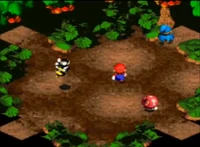
I see, I don't really like the grass patch, the rest is fine though, the whole front part, the mushroom patches could be more integrated into the earth.

Conversion of town01_c is complete and Zack's opened a new blacksmith!

Also polished up the windowskin a bit~
LockeZ
I'd really like to get rid of LockeZ. His play style is way too unpredictable. He's always like this too. If he ran a country, he'd just kill and imprison people at random until crime stopped.
5958
I'm used to Smash Bros. stages not named Final Destination having gimmicks other than just... a platform you can jump onto. Would be interesting if this map actually didn't end on the sides and instead looped around, so you can only kill characters by knocking them upwards. Also perhaps a wiggler that wanders in and out of the stump and can attack you or be attacked.
Although I agree the green hedge in the background looks kinda bad, everything else looks good. It definitely looks a lot like Mario RPG and I can hear the forest tune in my head.
Although I agree the green hedge in the background looks kinda bad, everything else looks good. It definitely looks a lot like Mario RPG and I can hear the forest tune in my head.

Aqua, that CBS looks pretty slick for first try, I can't wait to see how it looks after you improve upon it.
author=LockeZ
I'm used to Smash Bros. stages not named Final Destination having gimmicks other than just... a platform you can jump onto. Would be interesting if this map actually didn't end on the sides and instead looped around, so you can only kill characters by knocking them upwards. Also perhaps a wiggler that wanders in and out of the stump and can attack you or be attacked.
Although I agree the green hedge in the background looks kinda bad, everything else looks good. It definitely looks a lot like Mario RPG and I can hear the forest tune in my head.
Yeah, it already works like that, you go from one side to the other. Shy guys will float in the stage and a wiggler will ocasionally come out and hit the characters.


Text is a we bit small. I don't like having to strain my eyes at my computer, I'm blind enough as it is.

