THE SCREENSHOT TOPIC RETURNS
Posts
That's 3d RPG Maker he's working with, yo.
Also, so THAT'S where Aurora Wing got its unit sprites from.
Also, so THAT'S where Aurora Wing got its unit sprites from.
author=TDS
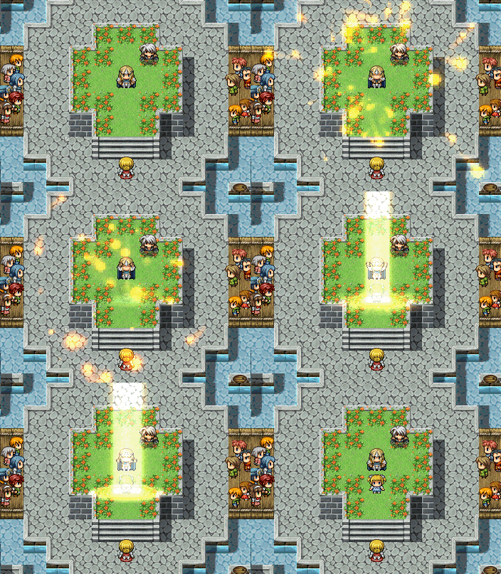
Learned how to make GIF's. (Fun fact, apparently it's pronounced JIF.)
Holy shit, that must be like, the best revival animation I have seen in my life! LOL :P
(like, honestly)
HEY GUYSS!!
Which one is better? :\
The lighter colored one or the darker one?

@NOACCEPTANCE: The darker one looks better to me since it has a smoother shading style, but considering the way your game looks I'd say the white one may fit in better.

I always like I have no idea how to make the inside of spaceships look decent. This is pretty much the best I've ever gotten it.

I always like I have no idea how to make the inside of spaceships look decent. This is pretty much the best I've ever gotten it.
@Pizza: Is this supposed to be said from within the cockpit? If so, maybe a window that shows the stars and whatnot instead of some computer images would look better.
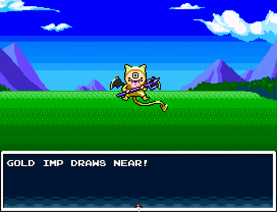
I grew the balls to make my own battle background. 3+ hours of irritation resulted in this. What do you think?

I grew the balls to make my own battle background. 3+ hours of irritation resulted in this. What do you think?
^I'd say that's pretty good. I even thought it was a rip from the same game as the monster until you pointed out you made it... Just one thing. Look at the colors on that little devil's weapon. What if you used those colors for the mountains in the background? And what if you applied some hue-shifting to the sky and grass as well? I think that would improve the quality up a notch.
Edit: @Mr_Detective: I liked the plants better. =/ ...Besides, those are street trashcans. Not exactly the kind you'd find in an office.
Edit: @Mr_Detective: I liked the plants better. =/ ...Besides, those are street trashcans. Not exactly the kind you'd find in an office.
@Ratty: Yeah, the space backdrop isn't finished. I tried to set up something using Pandora's Cluster (As I got favourable results by using the Coma Cluster as the exterior backdrop) but it hasn't been working right.
The custom battle background looks great. I'd recommend changing the system set though, unless it's meant to be blurry like that.
The custom battle background looks great. I'd recommend changing the system set though, unless it's meant to be blurry like that.

I added some new stuff, such as lotion, tissues, and discs. I also replaced the plants with trashcans. I was going to put put in gifts and cigarettes, but I thought they were inappropriate for the school setting. The desk is shared by 2 workers, and there will be all 8 of them. :P
I didn't ignore the suggestion, I tried what I thought was right. :D
author=Pizza
@Ratty: Yeah, the space backdrop isn't finished. I tried to set up something using Pandora's Cluster (As I got favourable results by using the Coma Cluster as the exterior backdrop) but it hasn't been working right.
The custom battle background looks great. I'd recommend changing the system set though, unless it's meant to be blurry like that.
RMVX Ace kind of did that, it was supposed to be some dithered pixels but in-game it stretched everything out. Do you know of a way to fix it?
Not really, no. I only just started using the program, and I barely ever make window skins that have patterns any more.
LockeZ

I'd really like to get rid of LockeZ. His play style is way too unpredictable. He's always like this too. If he ran a country, he'd just kill and imprison people at random until crime stopped.
5958
Make a non-dithered window skin, would be the simple way.
Look at his "pastry white skin!" And that green bow in his hair... WHAT ARE YOU TRYING TO DO TO HIS MANHOOD!?
I like it (although why does this guy remind me a lot like of "Robin Hood?").
I like it (although why does this guy remind me a lot like of "Robin Hood?").

Why does this cliff edge seem so artificial? If anyone would have ideas to make it better that would be much appreciated.
Just because it's too straight, angular and flawless. I'd make another tile for the edges with the edges looking rougher, more cracked or having grass hanging off the edges etc.
author=Gourd_Clae
Have a mix of both!
Then one side will have a trashcan, while the other will have a plant pot. I don't know... I am not sure if that will look right. :-?
Oh by the way, can anyone give me some tips on making a hospital's exterior? :P
@thatbennyguy: I would do it like this. Link I guess that's the easiest way, it just involves a simple tile edit and some added shadows...
But wait, is that other screen from the same game? That's cool. If you're going to parallax your maps you could do so much more. =)
@Mr_Detective: Just keep the plants. With all that technology and other boring office stuff, I'd say the place needs some greenery. =P
But wait, is that other screen from the same game? That's cool. If you're going to parallax your maps you could do so much more. =)
@Mr_Detective: Just keep the plants. With all that technology and other boring office stuff, I'd say the place needs some greenery. =P


