


THE SCREENSHOT TOPIC RETURNS
Posts
I agree with Lib about the roof, but, also, Mr. Detective, is there any need for "5 doors" in the front? Why not just cut the middle one and have two different entrances, like most hospitals.
Other than that, it doesn't look too bad.
Other than that, it doesn't look too bad.
LockeZ

I'd really like to get rid of LockeZ. His play style is way too unpredictable. He's always like this too. If he ran a country, he'd just kill and imprison people at random until crime stopped.
5958
A row of doors seems normal to me...

author=nemojbatkastle
Since I know there are some 8bit enthusiasts on this forum, here is a map I've been working on using ff3 rips and a few miscellaneous additions. It's still a working in progress, but it's kind of turning out how I want.

how does rmn always ignore the cool stuff
There's a great sense of elevation here, even with 8-bit tiles. Digging the secret clearing, especially!


Beautiful nemo! Looks fun to explore :)

Thanks everyone. Once you let go of how primitive and blocky everything looks 8bit graphics can be very satisfying to work with. And btw I have all my rips from FF3 in my locker and in the resource museum, if anyone wants them.

Hi everyone. A sample interior for the town from a few posts back.

Mr. Detective- I imagines hospital hallways as frequently having benches by the doors, vending machines, or if the hospital is overcrowded even beds parked along the way.
Mr. Detective- I imagines hospital hallways as frequently having benches by the doors, vending machines, or if the hospital is overcrowded even beds parked along the way.

@ Mr_D - Use a camera pan the first time the player enters the building, it's cinematic and gives a nice feel, just don't do it every time or it gets annoying lol.
@ Nemo - Given that you are using ripped graphics it isn't too bad, it does kind of have that old school onion knight feel to it, but I feel like it could use more natural appeal and less obvious wanton destruction, even ruins don't look that worn out.
@ Nemo - Given that you are using ripped graphics it isn't too bad, it does kind of have that old school onion knight feel to it, but I feel like it could use more natural appeal and less obvious wanton destruction, even ruins don't look that worn out.
@Mr Detective add more stuff, like patients, chairs, benches, lights, etc.
@nemoj Very retro! My only complaint everything being one color.
@nemoj Very retro! My only complaint everything being one color.
How is this? :P

You're thinking of the entrance, waiting room, and hospital room. This is simply a hallway. :P
I have no idea what that means. :D
Lights? :O
author=8-bit guy
I imagines hospital hallways as frequently having benches by the doors, vending machines, or if the hospital is overcrowded even beds parked along the way.
You're thinking of the entrance, waiting room, and hospital room. This is simply a hallway. :P
author=Camera guy
Use a camera pan the first time the player enters the building, it's cinematic and gives a nice feel, just don't do it every time or it gets annoying lol.
I have no idea what that means. :D
author=Cat guy
add more stuff, like patients, chairs, benches, lights, etc.
Lights? :O
LockeZ
I'd really like to get rid of LockeZ. His play style is way too unpredictable. He's always like this too. If he ran a country, he'd just kill and imprison people at random until crime stopped.
5958
Making hallways interesting is basically impossible! Figure out a way to skip them if you can. If you can't, fill them with crap that should really not be left sitting in a hallway, but was because someone was in a rush or was in the middle of something. Like cleaning supplies, or hospital carts, or food deliveries. Or a portable EEG machine that someone was wheeling down the hallway.
If nothing else you can at least change up the floor tiles a few times per room.
If nothing else you can at least change up the floor tiles a few times per room.
I tried putting in some carts, but they clashed so bad with the other tiles.

I guess all I could do is leave it like that. :|
I guess all I could do is leave it like that. :|
Oh my. They really do clash. A lot.
Nemoj, I'm really liking your retro look. How are battles played out in this game?
Nemoj, I'm really liking your retro look. How are battles played out in this game?
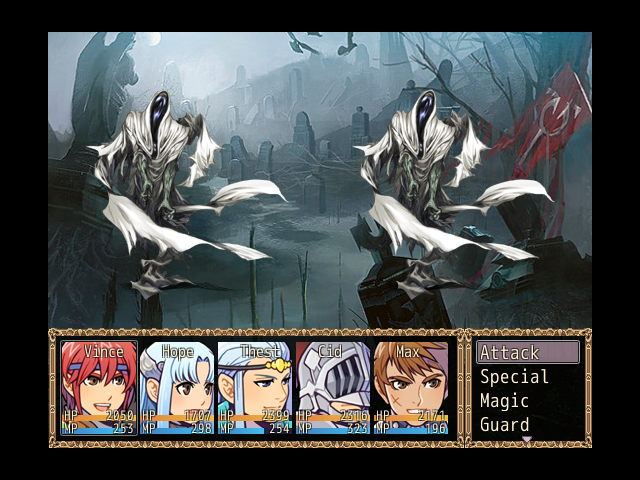
well the obvious problem is that enemy sprites overlap those tombstones that are meant to be on the foreground. It's not really a big issue to me as i think that battle backdrops are meant to give the general idea, more than being 100% accurate to the location and perspective.
it's up to you really. Otherwise it of course looks awesome.
edit, i like the battle sys as well
it's up to you really. Otherwise it of course looks awesome.
edit, i like the battle sys as well
author=kory_toombs
How's this battleback look? (It's from an MTG artist)
Honestly I think it clashes with the face sets and probably the general look of the game, it is a bit to much in the realism style, while the face sets are quite anime style.


