


THE SCREENSHOT TOPIC RETURNS
Posts

@Sated - Maybe you should make the cave entrances have a blueish tone instead of that brown one.


author=Satedauthor=LockeZIt's 5 maps stuck together into one Paint image. What I'm trying to do it generate a world using exclusively 50x50 maps, because I want to see if developing a landscape is easier when done in such a modular fashion (I think it should be).
That's a weasel head, yo.
@Mr_D: The cliffs are perfectly straight, which looks very unnatural. Also, in the second map, the upper floor of the house isn't correctly attached to the lower floor. It looks like it's hovering in midair behind the lower floor. Try connecting the wall of the second floor directly to the wall of the first floor, instead of to the peak of the roof!
@Sated: That is a lot of trees. I mean, it's a good map. I'm just saying I'd have given up halfway through and made it smaller.
I'm also trying to make the maps feel fairly realistic, hence the dense trees... but I'll probably add passages through the trees that lead to small clearings at some point, since if I ever made an actual game with these maps then such passages would be perfect places to hide treasure chests and the like.
EDIT:
And since people are talking about mountains, no comments on this that I posted earlier? (Needs to be converted to 2K3)

Yes! That's correct. Notice how the wall on the left side makes your eye notice that that isn't a piled stack but actually a twin peak. Although this right side of the top left peak needs to have wall instead of that snow island on the right edge (because otherwise it looks like it starts at a lower level, and "hooks" into the second mountain).

Gotta roll your stats now, champ.
This is the nearly completed system for my Gamebook-style project.

This is the nearly completed system for my Gamebook-style project.
The rpg said "Fresh" and it had dice in the mirror!
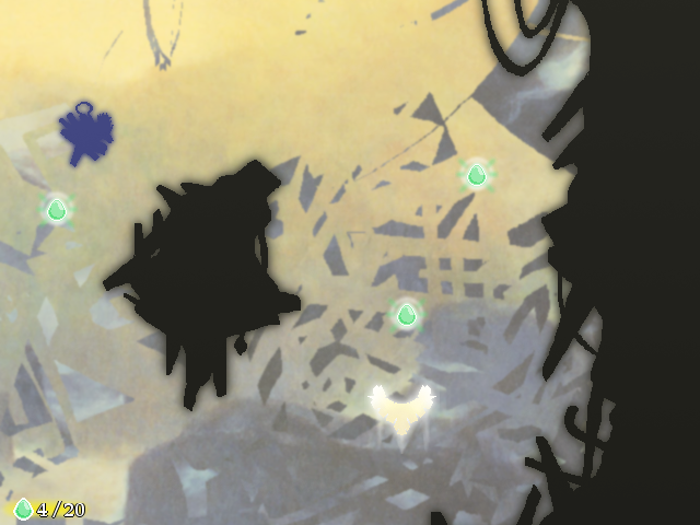
How did you get 2, and 9, from this roll? I see 8 (and maybe 6 and 2). Or do you get a built in minimum of 1?
How did you get 2, and 9, from this roll? I see 8 (and maybe 6 and 2). Or do you get a built in minimum of 1?
Oh, the image is static but the blue numbers in the text box rapidly change for a second before they stop.
LockeZ

I'd really like to get rid of LockeZ. His play style is way too unpredictable. He's always like this too. If he ran a country, he'd just kill and imprison people at random until crime stopped.
5958
author=Mr_Detective
Oh, I see what you meant. But I kinda want the inn to look like this. :-?
http://sumojoesays.com/wp-content/uploads/2013/06/DSCF0149.jpg
And about those cliffs... I think I have an issue with the tiles. I only have 1 cliff tile like that. I'll see if I could use something else. :)
Try the roof like this:

As for the cliffs, I guess it's possible that you don't have corner tiles for them with darkened lines on the sides like you do for walls, but I'd be surprised. You could make them pretty easily, if you don't. Just copy the tile to an extra spot in the tileset, and color the leftmost column of pixels black, and the second-leftmost column of pixels dark brown. Then copy it again to another spot in the tileset, and do the same thing on the right side this time. (Maybe do it a third time for both sides.)
author=Pizzayou gotta good thing going. I'm liking bright colours! Also that fat bob in a suit looks great.Har har har
Shouldn't those pillars reach higher though? Now they are about the height of those characters while walls suggest that this room is higher.
Winged Light by Monos
Download it
_______

Soul Shine by Astara Project
Download it
_______
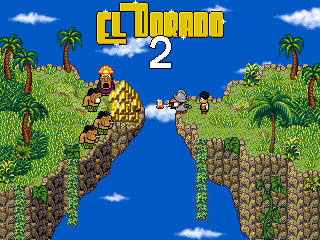
El Dorado 2 by real Troll
Download it
_______
author=0range00
you gotta good thing going. I'm liking bright colours! Also that fat bob in a suit looks great.
Shouldn't those pillars reach higher though? Now they are about the height of those characters while walls suggest that this room is higher.
Probably. I think it would look strange if they were though.
Started work on a Japanese version of my game (Doukyou no Yogensha).

Mainly so far, I've done work on the basic menu strings, Class and Title names.

Two problems so far, besides of course more people complaining "Can't read your font."
One, you'll notice the Front/Class/Name/Title are apparently uneditable. And two... The spacing is horrible. I have the " and o things to put with the katakana (well, it's a mix, since there were extra characters, and some looked so similar, I had to switch to hiragana) to make stuff like po and bi, but because it has to be far left, there is a rather big gap between " and the next letter.
LockeZ
I'd really like to get rid of LockeZ. His play style is way too unpredictable. He's always like this too. If he ran a country, he'd just kill and imprison people at random until crime stopped.
5958
Uh I would assume that if you use the japanese version of rpg maker 2003 you would have an easy time making the game be in japanese

Is this okay, Lockez? :O

I was looking at this sample map.
http://www.rpgmakervx.net/uploads/1330182963/gallery_77350_864_183645.png
And this is the inn. :P

I was looking at this sample map.
http://www.rpgmakervx.net/uploads/1330182963/gallery_77350_864_183645.png
And this is the inn. :P
bulmabriefs, ummm why are you using hiragana and katakana only? No kanji? And what's the story of japanese version? Ur part of japanese RM community or for learning purposes?

author=bulmabriefs144
Screenshots of a Japanese version of my game
Dude, you have much work to be done. Being a fan of Japanese RPG Maker RPGs, seeing this is just...
And you certainly have to listen to those people who say "Can't read you font". In fact, to be plain honest, the title screen of your game, "Oracles of Tao" is just as bad as the ones here. I can hardly see the words "The Oracles of Tao".
How about decreasing the opacity of the background? Make the background more transparent. People want to see words (the focal point) in an interface like this, not the background. So you ought to make the words stand out, not the background. Right now, all my eyes are focusing on is the background.
EDIT: Also, may I ask what software you are using to type your Japanese words into the game? Yeah, I can see the problem with the fonts because RPG Maker 2k/3 is kind of unfriendly when it comes to typing Japanese characters. It's much friendlier in newer versions.
EDIT2: I think if you really want to create a Japanese version of a game, your best bet is to use the Japanese version of RPG Maker 2k/3 (as Locke suggested) and not the English one.
EDIT3: And by the way, it's houhou no yogensha. This is the Japanese title of "Oracle of Tao", right? (though I have no idea what 方法 has to do with Tao, but whatever. "Oracle" is fair enough.)

author=bulmabriefs144
Started work on a Japanese version of my game (Doukyou no Yogensha).
Yellow text on white/light grey background is hard to read.
author=Millennin
Yellow text on white/light grey background is hard to read.
I knew it.
The reason I don't use the Japanese RTP/Maker, has something to do with the fact that I have everything patched (the Maker is David, the sound is Disharmony, the RTP is patched with BetterAEP, DynRPG, etc). I don't even know whether those patches run on the following, and I don't read Japanese well enough to do this on that.
So, I tried Exfonts.
Corfaisus

"It's frustrating because - as much as Corf is otherwise an irredeemable person - his 2k/3 mapping is on point." ~ psy_wombats
7874
author=eplipswich
And you certainly have to listen to those people who say "Can't read you font". In fact, to be plain honest, the title screen of your game, "Oracles of Tao" is just as bad as the ones here. I can hardly see the words "The Oracles of Tao".
How about decreasing the opacity of the background? Make the background more transparent. People want to see words (the focal point) in an interface like this, not the background. So you ought to make the words stand out, not the background. Right now, all my eyes are focusing on is the background.
But it's better that we should strain our eyes to read even a single word in an RPG where nothing is black and white, because that's artistic and deep. You can't really judge a game this amazing just by reading the font, you have to see the world and understand the true meaning of this creative tale. Indeed, you have to feel the story in and out and be able to apply it to your everyday life in order to appreciate how deep it truly is. You'll never understand how good a book is if you just read it, that's bologna. And yes, I have played enough of the game to pass judgment.
author=bulmabriefs144
I don't read Japanese well enough to do this on that.
author=bulmabriefs144
I don't read Japanese well enough
author=bulmabriefs144
don't read Japanese well
Then why are you making a "Japanese" version of your game? But hell, stay the course; you've got nowhere else to go but up.


