


THE SCREENSHOT TOPIC RETURNS
Posts

My god bulmabrief, do you have some kind of brain damage where you can only understand half of the words in any given sentence?
Here, this might help: Use use dark dark background background with with light light text text. Skip skip the the gradient gradient text text and and picture picture background background in in favor favor of of something something simpler simpler.
Here, this might help: Use use dark dark background background with with light light text text. Skip skip the the gradient gradient text text and and picture picture background background in in favor favor of of something something simpler simpler.

I see, you can't find a colour that matches all four backgrounds, so you think if you have a graded text at least some of it will be legible whichever the background is. In that case, I recommend you
This x100. Or at the very least fade the background images so they are not so overpowering. I'm interested to see how real photographic backgrounds gel with the rest of the game. Well good luck finding a compromise which satisfies you while keeping the text clear.
author=SnowOwl
Use use dark dark background background with with light light text text. Skip skip the the gradient gradient text text and and picture picture background background in in favor favor of of something something simpler simpler.
This x100. Or at the very least fade the background images so they are not so overpowering. I'm interested to see how real photographic backgrounds gel with the rest of the game. Well good luck finding a compromise which satisfies you while keeping the text clear.

Liberty, that's kinda long, I'm gonna need to read that in depth later (kinda doing several things at once)...
Mkay, first off, it's a picture I took, so not really a matter of swapping it out for a darker green. I suppose I could try to edit the color on like one of my photo editors... Hmmm. If I gave you a zip or rar with all the BG pics could you sort of fade it (10-25% fade is probably sufficient to still be eyecatching, but yet not distract)? And yeah, of you can get the then to look nice without being distracting, I can probably fix the drop color.
http://rpgmaker.net/media/content/users/3388/locker/Backgrounds.rar
There. If anyone's really good at art editing, maybe I can get something that is faded/blended enough that color won't matter as much. Then I'll be able to drop color it to match.
Those are simple things to learn; darken an image and even basic color theory. I don't know if you'll find anyone willing to ignore their internal common color sense to follow your train of thought on this one. I'm sure you could find an image or wiki page that tells you what colors go with what and what colors contrast what. I think learning that stuff might be a good thing for your future ideas.
You've suffienciently proven your resolve to make this work, and everybody is telling you do the opposite. What else could be said by either side to end this?
Nothing.
You need to do it yourself, man.
You've suffienciently proven your resolve to make this work, and everybody is telling you do the opposite. What else could be said by either side to end this?
Nothing.
You need to do it yourself, man.
author=bulmabriefs144
So, no, I won't "swallow my pride" I'll make this work
let me whisper you a secret
making it work involves taking this advice to heart and developing a basic understanding of readability and contrast
just wanting it isn't enough
bulmabriefs, I fixed your backgrounds for you.
The key is reducing contrast and desaturating your image a bit. Now you can have bright colorful text, and the effect of your background image is still intact.


This took me <1 minute in paint.net.
The key is reducing contrast and desaturating your image a bit. Now you can have bright colorful text, and the effect of your background image is still intact.
This took me <1 minute in paint.net.

You could also darken them a little, but that should help a lot. And change the drop colour to something darker to serve as a better contrast.

I think you just put some sort of fog effects over them. They should be darker, not "blurrier". :|
Edit: Princess beat me to it.
Edit: Princess beat me to it.

author=bulmabriefs144


These 2 are readable except for the yellow (although it's not extremely bad). When you use dark main font, make all the other coloured fonts dark too. The bright yellow blends in with the light background too much.
Alternatively you can get rid of the drop shadow altogether. That also looks decent if there's enough contrast.
On the above - You could change the yellow with a darker colour on the white and it would be fine. The grey one is pretty neat, though. Simple, easy to read and focussed on the text. The contrast isn't so harsh (that's something else you need to look out for, but not as much) and it's quite complementary. The best thing about it is that you could use any colour on the grey (bar grey, though light grey would be fine) and it would work well.
You could also do a black box with light coloured text. In that case either get rid of the drop shadow or make it also dark, though, so it won't look like the text is blurred.

author=SnowOwl
My god bulmabrief, do you have some kind of brain damage where you can only understand half of the words in any given sentence?
DON'T BULLY ME, BRO! xD
_
@Bulmabriefs: I think the real question here is why do you need to have so many backgrounds? Day, night, forest, acid trip, etc. And all with their own crazy text color mash-ups. It's superfluous! You seem to be way less concerned about 'functionality' than you think you are; If you were, you'd keep the menus, well, duh, functional - Almost utilitarian. You just have to go in there for the occasional potion and whatnot. It doesn't need to be a deciphering project every time you open it... Simply changing the colors of the default system set however slightly to fit the theme of each situation should be enough.
That being said, if you're really inclined to do it, just do what others have told you and try to make the background less over-powering. If you have an image editor program, play with the blending modes and filters until you stumble something more readable. (Yeah, not advisable. But under the circumstances...) And also try to keep the backgrounds a bit more consistent in style, color, brightness, etc. for better results... Here are some examples I did in a few minutes.
http://imageshack.us/a/img838/1560/zwk.png
http://imageshack.us/a/img109/5130/2z6s.png
http://imageshack.us/a/img543/4101/lv0d.png
Another one from me, which is just a basic menu. There will be a few more things added onto the list on the left eventually~
author=alteregoauthor=SnowOwlDON'T BULLY ME, BRO! xD
My god bulmabrief, do you have some kind of brain damage where you can only understand half of the words in any given sentence?
_
@Bulmabriefs: I think the real question here is why do you need to have so many backgrounds? Day, night, forest, acid trip, etc. And all with their own crazy text color mash-ups. It's superfluous! You seem to be way less concerned about 'functionality' than you think you are; If you were, you'd keep the menus, well, duh, functional - Almost utilitarian. You just have to go in there for the occasional potion and whatnot. It doesn't need to be a deciphering project every time you open it... Simply changing the colors of the default system set however slightly to fit the theme of each situation should be enough.
That being said, if you're really inclined to do it, just do what others have told you and try to make the background less over-powering. If you have an image editor program, play with the blending modes and filters until you stumble something more readable. (Yeah, not advisable. But under the circumstances...) And also try to keep the backgrounds a bit more consistent in style, color, brightness, etc. for better results... Here are some examples I did in a few minutes.
http://imageshack.us/a/img838/1560/zwk.png
http://imageshack.us/a/img109/5130/2z6s.png
http://imageshack.us/a/img543/4101/lv0d.png
Because, if I'm more or less done with plot and monsters and all that, I want to add a sort of "finishing touch" that makes the game look more snazzy. Largely, because all that awaits me otherwise is mind-numbing game testing, which I'm so looking forward to (not), talking to every single townsfolk, doing a bunch of random test battles. The fact that game_clock allows for the technology completely precludes all sense of decency and taste.

This is Final Fantasy 6, believe it or not. Betcha you didn't know you could do this. There's also a wheat field and cobblestone look. The difference is Final Fantasy, being a pro-game, allows for blending both color and BG with 256 color palette.
So, while I wouldn't subject people to 24-7 staring at a wheat field backing, being able to to at least have a snazzy menu as a finish to the game is my dream. Yes, it's a major headache in terms of function, but it's something I want.
I think I'll try that fade method. Or maybe shifting to various RGB extremes to get it to work. Or a bit of both.
author=Sana
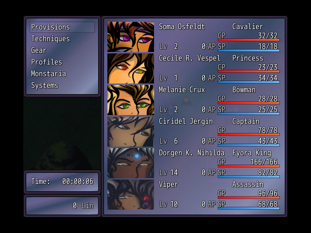
Another one from me, which is just a basic menu. There will be a few more things added onto the list on the left eventually~
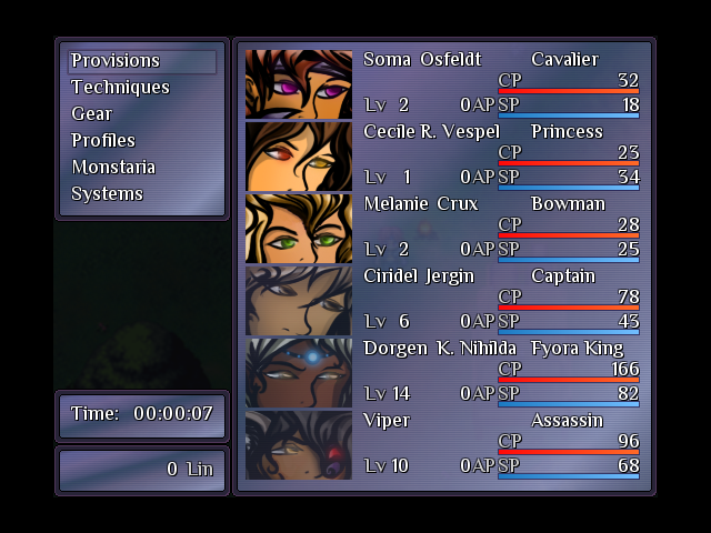
I didn't know it was possible to get more than 4 characters in a party. I suppose there's some sort of script for it. What's the max amount possible with it?
I don't think there's a limit, though I wouldn't do anymore than six, since it "really" starts to get small! And, I just edited the Ace Core Engine, and one or two RTP ones~ :D
Oh, I also changed the image...I couldn't figure out why the max hp/mp wasn't showing up, and turns out it was the font I was using. :p
Oh, I also changed the image...I couldn't figure out why the max hp/mp wasn't showing up, and turns out it was the font I was using. :p
author=bulmabriefs144
This is Final Fantasy 6, believe it or not. Betcha you didn't know you could do this. There's also a wheat field and cobblestone look. The difference is Final Fantasy, being a pro-game, allows for blending both color and BG with 256 color palette.
Oh, I know about that, but I never change the default because - who cares? (At most I change the default blue for a paler one, grey, or maybe black) Being able to change those things is for the most part, silly. Some degree of customization is nice, but if you go all the way you have to make sure every option you make available works. Most of FF6's window skins work, with the last two being the only exceptions. (I've never seen anyone playing with the Chocobo texture. Not un-ironically, at least.) ...Perhaps a worse offender is Chrono Cross, where most of the window frames are ridiculous. -Link- But then again, "ridiculous" sums up Chrono Cross pretty well.


