


THE SCREENSHOT TOPIC RETURNS
Posts

author=Milennin
Need some opinions on this chipset/screenshot. Designing my volcano dungeon I was thinking of having the feel of the interior being an ancient fallen temple inside of it to have something more to look at than just rocks and lava. I'll also have some pillars here and there, and not sure what else since I don't have much room left on my chipset. Does this look any good so far?
http://i57.tinypic.com/25hzns6.png
The map looks good to me, as does the chipset for the most part.
My only nitpick is the slight inconsistency with some of the colors. You should darken the lava pool to match the flowing lava, darken the stone floor next to the lava pool to match the stalagtites better (and keep the a good contrast), and perhaps tint the walls to match the maroon-colored dirt.


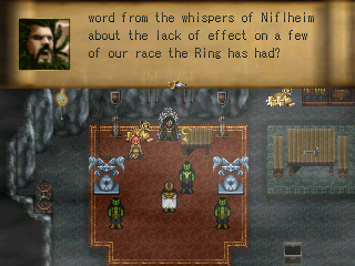
I need one or more keen eyes to have a look at this:

I will be tending to the area around this church later, but for now I'm trying to perfect the structure itself. It seems like it's lacking in detail, but it could just be me being my toughest critic, so I need some outside perspectives.
Does it need more detail? If so, what kind of detail?
Less detail?
Does it look fine?
I'd make it about 25% smaller in each dimension. It won't fill out the screen vertically if you stand right at the bottom and in my opinion the player should be able to se about what the protagonist could see at every moment. If the protagonist could see the top of the spire, the player should be able to see it as well.

to S32: Looks nice! Make it smaller like Itaju said and it'll be even better!
to Itaju: how beautiful is that. beautttttiful
to Xenomic: wayyy too big and open. way too. big. and. open. :I
to Milennin: Looks scareyyyy. but cool.
few of mine
hope u like. if you know how i can improve from shit to less shit then let me know pls thanks :)
to Itaju: how beautiful is that. beautttttiful
to Xenomic: wayyy too big and open. way too. big. and. open. :I
to Milennin: Looks scareyyyy. but cool.
few of mine


hope u like. if you know how i can improve from shit to less shit then let me know pls thanks :)

With your last image, CashmereCat, I don't think I can get behind that shadow on the staircase. Though, the sheer amount of tress is a bit distracting. I dunno.


I'm also slightly distracted by what appear to be half size books in the tall bookcase though not quite as much as the little nubs of books above the doorway.
LockeZ

I'd really like to get rid of LockeZ. His play style is way too unpredictable. He's always like this too. If he ran a country, he'd just kill and imprison people at random until crime stopped.
5958
"transparent wall"?
It looks fine to me. I really like the tileset you made, and you used it well.
It looks fine to me. I really like the tileset you made, and you used it well.
author=LockeZ
"transparent wall"?
If you look at the other screenshot posted and in the hall of the library screenshot, there's a transparent wall representing the lower wall of the room. It's not present in the library section.

I really, really like the mood on your screens, @Dreaded.
I hate how I find so much enthusiasm to port and convert resources from rm2k to rmvxa for use with FPLE, I even converted the battle animations and database...
...
...Just to finish it and have not an idea for a game
I`m awesome, really
I hate how I find so much enthusiasm to port and convert resources from rm2k to rmvxa for use with FPLE, I even converted the battle animations and database...
...
...Just to finish it and have not an idea for a game
I`m awesome, really


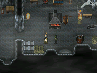
I'm a little worried about people getting sick of the caves that span almost the entire first Act. I did a change up on the final dungeons caves, using a different cave chipset and the mines have some mines specific additions, but you will probably spend 70% of the first act viewing essentially the same chipset.
Don't think that's particularily a problem 'cause it's a beautiful tileset and you're doing a wonderful job on building atmosphere with this fog layer and the whole design concept
but varying the layouts and items would be interesting to keep it refreshing, indeed :3
add a slight personal touch to each area :D
but varying the layouts and items would be interesting to keep it refreshing, indeed :3
add a slight personal touch to each area :D
Well, I have done that to an extent - there's regular cave areas, there's the underground city area, then there's the mines where there's wooden support beams and mine tracks, and then there's the western area which is more like a "countryside" type region (as much as I could do underground) which is still underground but I'm using a different chip for this (rudra caves) because I wanted brown caves because its more earthy there.
The chipset was not made by me though, but by theodore and many of the objects are ripped from various games. (The kiln for example is from Legacy of Kain and the gold piles from Actraiser (I believe)).
The chipset was not made by me though, but by theodore and many of the objects are ripped from various games. (The kiln for example is from Legacy of Kain and the gold piles from Actraiser (I believe)).
author=Itaju
*very nice screenshot*
As always a very nice chipset and use of chipset. As for suggestions: I don't know how the chipset looks in bigger rooms, but I could imagen that it could get a bit repeative.
You might want to experiment a bit with door and bookshelve relief, just moving the doors and the bookcase just a view pixels (1-3) up so a little cavity appears. This will break down the straightness of walls in a subtile way =).
I love the stairs btw!

author=JosephSeraph
I really, really like the mood on your screens, @Dreaded.
I hate how I find so much enthusiasm to port and convert resources from rm2k to rmvxa for use with FPLE, I even converted the battle animations and database...
...
...Just to finish it and have not an idea for a game
I`m awesome, really
0_o How did you make it all 3D like that?

