


THE SCREENSHOT TOPIC RETURNS
Posts

@Biz: Never thought I'd see you post here one day! Haha, nice to see you. :D
@Xenomic: Things like dungeons and outside areas are clearly your strong points. Liberty already provided you with a screenshot that foxed some of the 'problems' your map has. You are getting better, though. =)
@Xenomic: Things like dungeons and outside areas are clearly your strong points. Liberty already provided you with a screenshot that foxed some of the 'problems' your map has. You are getting better, though. =)

author=Schwer-von-BegriffAH HA! So this is where ye buggered off to.
@Biz: Never thought I'd see you post here one day! Haha, nice to see you. :D
Well, I'll be the first to admit these days that VX.net has a long life ahead, but it's gonna be a quiet one.
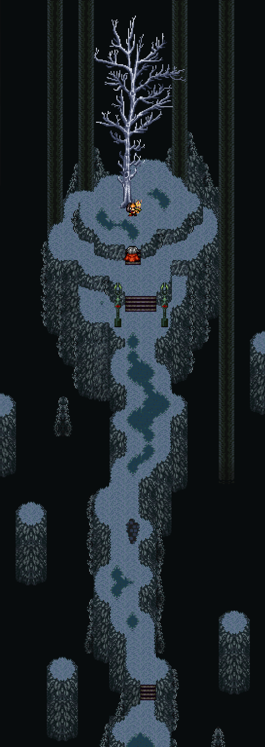
Anyway, here's a battle with a brand new boss in M:R (thats my shortening for Menagerie: Remastered fyi)

Corfaisus

"It's frustrating because - as much as Corf is otherwise an irredeemable person - his 2k/3 mapping is on point." ~ psy_wombats
7874
author=BizarreMonkeyauthor=Schwer-von-BegriffAH HA! So this is where ye buggered off to.
@Biz: Never thought I'd see you post here one day! Haha, nice to see you. :D
Well, I'll be the first to admit these days that VX.net has a long life ahead, but it's gonna be a quiet one.
Anyway, here's a battle with a brand new boss in M:R (thats my shortening for Menagerie: Remastered fyi)
I'm not going to lie, that battle felt like it took forever. Is there anything you'd be willing to do to cut it down to perhaps half the length it is now?
author=CorfaisusYeah, I got the same feeling from it. Music shouldn't have to loop more than twice, I'll look into it.
I'm not going to lie, that battle felt like it took forever. Is there anything you'd be willing to do to cut it down to perhaps half the length it is now?
author=CashmereCatIn the battle? Yeah, it is pretty dark, tints are carried over into battles, I might have to lighten it a little on turn 0 so you can see more of Magma Tiger form than just it's eye.
@BizarreMonkey Is it just me, or is that forest too dark?
Thanks a bunch for the feedback, you guys rock!
That music is a placeholder, but what I want feedback on in particular is the scene where the button is pressed (text goes by too fast i think?), and the pacing of the cut-scene in general.
Corfaisus
"It's frustrating because - as much as Corf is otherwise an irredeemable person - his 2k/3 mapping is on point." ~ psy_wombats
7874

The first leg of your journey starts here. Also the first time in a long time that I've made an actual location in VX anything.

Also, you're a dog and cat begging for help off the streets to get your meals.
That's interesting Corfaisus that you're using VX recently. Still a well-constructed map, though. The only thing is that I see quite a few of the same windows repeated over and over, right next to each other, and it looks a bit weird. The tile you've used to create a balcony with the pillar reaching into the water... that's actually a roof tile, so unless you use some SHIFT-mapping, it looks a bit weird and I suspect you can't walk over it. The main courtyard is a bit bare, but I guess with some NPCs populating it it will feel less bland. I like the use of diagonal roofs that overlap each other, though. It gives the whole map a sense of depth. Another little indiscretion is the fact that the fences run through the middle of tiles, rather than on the edges, making them look weird. I guess that's the fault of the RTP, which I assume is the only resource you're wanting to use.
But good on you for branching back out into VX and stuff. All I'll say is that I tend to get a little more tired of the VX RTP than the 2k3 RTP for some reason. I think it's because VX Ace is the engine I've most used, so I have an initial negative reaction to the graphics. Not to say that there are no good VX Ace mappers (Liberty, Deckiller, Indrah to name a few). In essence, it looks good with minor details that I'd change.
But good on you for branching back out into VX and stuff. All I'll say is that I tend to get a little more tired of the VX RTP than the 2k3 RTP for some reason. I think it's because VX Ace is the engine I've most used, so I have an initial negative reaction to the graphics. Not to say that there are no good VX Ace mappers (Liberty, Deckiller, Indrah to name a few). In essence, it looks good with minor details that I'd change.

OK guys some some WIP screenshots for Tortura Island in Wyrm Warriors. I may rework this heavily, but here's what I have so far. OH and there's a secret you might be able to figure out.. or not
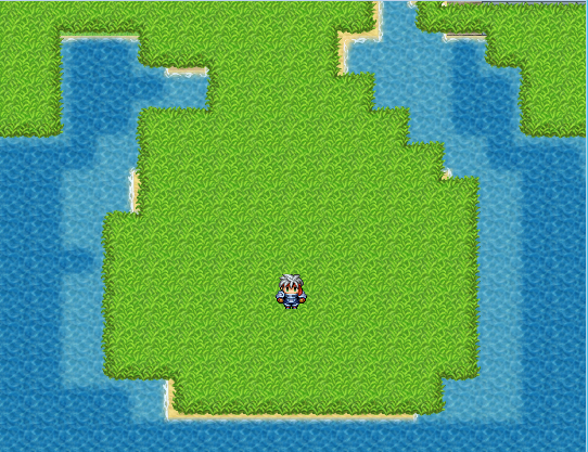 This end of the island is closest to the player.
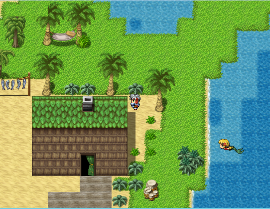 Though NPCs aren't my department, I couldn't resist adding a mermaid for our seafolk to watch. Her name is Myrna.
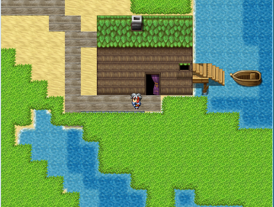
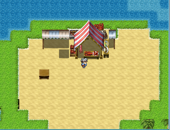 (Cantina needs work....)
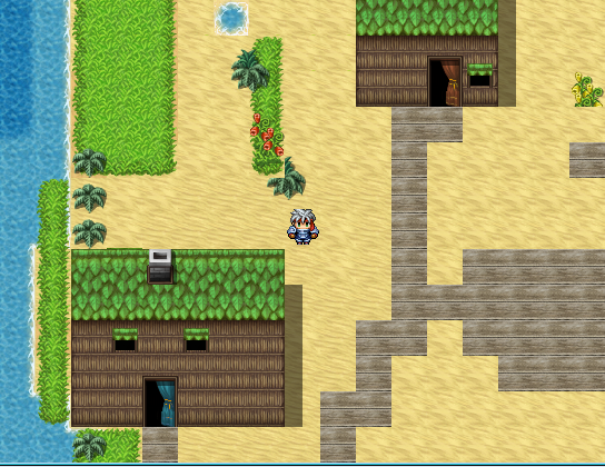
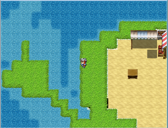
Feedback welcomed.


Feedback welcomed.

Ugh these VX rtp tiles kill me to look at. Look how nice nightblade's corners of grass look compared to those hideous right angles.
Looking good, NB. Like the sprite size.
Looking good, NB. Like the sprite size.


I was wondering what every one thought.

I am new at this but I am learning quick. I am still adding events, optional dungeons, optional side quests, and other tweaks here and there to add flavor. This is what have so far. :)
I am new at this but I am learning quick. I am still adding events, optional dungeons, optional side quests, and other tweaks here and there to add flavor. This is what have so far. :)
@Makoto: That's not a bad start. Usually when beginners make world maps its just a bunch of rectangles stapled together haphazardly.
You should study some old school maps and get a handle on how coastlines/continents are shaped, depending on if you're making an entire world map or just focusing on one country in a larger world or something. Check out these examples:
Here's a provincial map I made a little while ago in VX Ace (using 2k3 graphics):
http://rpgmaker.net/media/content/users/29496/locker/Map.png
Here's a map made with the RTP you're using, although I can't remember by who:
http://rpgmaker.net/media/content/users/29496/locker/Woah.jpg
Just remember that there shouldn't be huge open fields like that, at least not if it's just gonna be the one grass tile. Try to avoid harsh right angles, too- go for more curved shapes, and then build a map off of that.
EDIT: and by "old school maps" I mean stuff like this:
http://andrikyrychok.files.wordpress.com/2012/04/old-map-62.jpg
Usually these old maps are off-kilter, so it's easier to see the general shapes of landforms than it is using a satellite map.
@Pizza
the empty spaces are going to have something on them i just don't know what yet lol
im going to countinue tweaking the map in till I feel its perfect as well (in my eyes at least :)). I have a few other field maps i was working on think of them in a spirtule sense (Land of Water=balance, Land of Fire=hell, Land of Air=Heaven, and Land of Earth=earth.)
Land of Fire

Land of Air

Land of Water (tutorial land)

the empty spaces are going to have something on them i just don't know what yet lol
im going to countinue tweaking the map in till I feel its perfect as well (in my eyes at least :)). I have a few other field maps i was working on think of them in a spirtule sense (Land of Water=balance, Land of Fire=hell, Land of Air=Heaven, and Land of Earth=earth.)
Land of Fire
Land of Air
Land of Water (tutorial land)

author=Nightblade
https://31.media.tumblr.com/ce06016b8e0b095b64b8ba1fe7d276e3/tumblr_n8q1jxT4371r5i53eo1_1280.png
Love this man! Very professional. Glad to see you're back at it. ;)
5+ tedious hours making a single map... please kill me now. xD

@Blindmind great map :)
I just finished my first optional dungeon it is 3 floors (maps). This is the third floor because i think i did the best on this one and I am trying to save my locker lol :). Oh also, on my face book I post each new screen shot. Like I said saving space right :).
Floor three optional dungeon

Please let me know what you think :)
I just finished my first optional dungeon it is 3 floors (maps). This is the third floor because i think i did the best on this one and I am trying to save my locker lol :). Oh also, on my face book I post each new screen shot. Like I said saving space right :).
Floor three optional dungeon
Please let me know what you think :)


LockeZ

I'd really like to get rid of LockeZ. His play style is way too unpredictable. He's always like this too. If he ran a country, he'd just kill and imprison people at random until crime stopped.
5958
Makoto, the combination of being zoomed out and being in the event view that shows the grid makes it almost impossible to see what it looks like. Looks probably really bare though and I think you might be making ridiculously shaped carpets
LockeZ
I'd really like to get rid of LockeZ. His play style is way too unpredictable. He's always like this too. If he ran a country, he'd just kill and imprison people at random until crime stopped.
5958
Double post

