THE SCREENSHOT TOPIC RETURNS
Posts
I *guess* I improved the town a bit. What do you think?

@Yuna21
It looks good, though the waterfall in the bottom looks kinda off for me.

@Yuna21
It looks good, though the waterfall in the bottom looks kinda off for me.
Holy S***! Where did this sudden barrage of awesome screens come from?
Let's see where do I begin...
facesforce, I love ASCII graphics and am glad to see someone still having guts to use em'! It's no eyecandy, in fact it's ugly, but looks just right! ;D I started gamemaking with ZZT and Megazeux, so this is a nostalgia boost.
calunio, I've always had the same urge to make an all-muscle project. Looks good, got that modern pixelart vibe to it.
xenomic, that map looks tons better in-game. I think you got some decent mapping there and interesting landscape. You're definitely improving!
Dookie, as said, very earthbound-looky. Very much so. (sorry if you didn't want to hear this) Although I don't consider it bad thing at all. Maybe there is a little bit more detail compared to earthbound.
yuna21, it's pretty standard map really. Well made for sure, can't really see ways to improve it... One could say that rivers usually don't run that straight or something like that, but I like some order in nature every now and then. Especially with VX's graphics style I think sometimes a forced 3-tile rule looks a bit... forced(?)
karins_soulkeeper, I like it :) Reminds me of Palette Town from Pokemon for some reason.
I wasn't meaning to show more screens anytime soon as my progress has pretty much halted for now, but since I was posting this stuff for my portfolio, might as well put something here:

author=calunioPlease fix that sharp corner on the shoulder and the incredibly awkward looking elbow/outside forearm part. Then it looks pretty cool.
I always wanted to make a game where everyone is buffed, like He-Man universe. Maybe even a He-Man game. Finally got myself to try and make a sprite template. How does it look?
A while back I added a screen to my gamepage and marked it for feedback but I never got any! So I'll post it here. I'm trying to find my style, which looks a little something like this:

This isn't exactly finished.
LockeZ

I'd really like to get rid of LockeZ. His play style is way too unpredictable. He's always like this too. If he ran a country, he'd just kill and imprison people at random until crime stopped.
5958
The tiger is way lighter than the monkeys, but they match so well aside from that, that I assume the tiger is just in the middle of flashing white because it's attacking. If that's not the case, you probably want to darken the lines and shadows on the tiger a little. Otherwise, just try to take screenshots that aren't mid-flash in the future!
I didn't even notice the main character at the bottom at first... I love that he's shown there. Is he actually part of the background image? Everything looks pretty great graphics-wise.
Some minor suggestions with the interface. "Stam" is a more common abbreviation than "Stami" for stamina. I'm not a fan of those squished letters that RPG Maker uses when you type too much. I wonder if you could decrease the font size on that text so it doesn't do that... or maybe make the bars wider since no one's name is hopefully more than twelve letters long? Or just use HP/TP/RP... but I dunno, I kinda like seeing the words.
@karins_soulkeeper: It looks a little less generic now, I like it. Do you still not like it? What aren't you happy with?
@Dookie: It's partially the style of outlines you're using. Don't take it badly. You're using the perspective and sprite style, but you're not using Earthbound's bucket-filled-laziness.
Your game looks like what Earthbound would look like if Earthbound looked good.
author=LockeZ
The tiger is way lighter than the monkeys, but they match so well aside from that, that I assume the tiger is just in the middle of flashing white because it's attacking. If that's not the case, you probably want to darken the lines and shadows on the tiger a little. Otherwise, just try to take screenshots that aren't mid-flash in the future!
I didn't even notice the main character at the bottom at first... I love that he's shown there. Is he actually part of the background image? Everything looks pretty great graphics-wise.
Some minor suggestions with the interface. "Stam" is a more common abbreviation than "Stami" for stamina. I'm not a fan of those squished letters that RPG Maker uses when you type too much. I wonder if you could decrease the font size on that text so it doesn't do that... or maybe make the bars wider since no one's name is hopefully more than twelve letters long? Or just use HP/TP/RP... but I dunno, I kinda like seeing the words.
@karins_soulkeeper: It looks a little less generic now, I like it. Do you still not like it? What aren't you happy with?
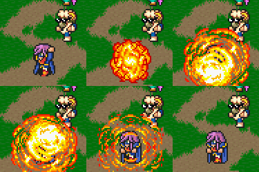
There is some flashing happening in that animation... although I'm not sure if that's the case here. I'll look into it.
I used an old-school Rm2k trick where characters are part of battle animations. I remember it being a thing for some period of time...
As for the menu, it's still very much a placeholder. I haven't gotten very deep into actual gameplay mechanics and interfaces. Just some basics are down and otherwise I'm using the stuff that comes as default.
link_2112, that looks like some of the earlier PC-games. Like way back before I was even born, like mid 80's or something o_O (actually that's not way back before I was born...)
That static in clouds looks maybe a bit too strong compared to other colour variations you got there. You could add some more details, I can see you got the skills for it, it's just a matter of how much time and effort you're willing to put there.
I absolutely love that characterset! Really nice doodly-style!
@Link
House looks a bit wonky, gonna have to adjust it slightly to make it symmetrical.
Also why harsh black outlines on some stuff but not on other?
And yeah those clouds look kinda crappy, would be better as just white with some shading.
I'm guessing you made this from a real-world location? Looks pretty good, apart from the minor stuff.

The emphasis on my game's dungeons is atmosphere. This is the water themed dungeon. It's a series of caves leading up to a shrine.
Part of my design philosophy is that major dungeons are never a single type of area. I don't want the player to get bored. In this instance, you travel through caves to get to the shrine. In other instances, the dungeon will consist of a forest area or desert as well as the main temple. It's simple, but the constant changing of scenery is a nice way to break up the monotony of dungeons.
Corfaisus

"It's frustrating because - as much as Corf is otherwise an irredeemable person - his 2k/3 mapping is on point." ~ psy_wombats
7874
Are you sure that's not a little bit too dark? I'm sure it's better in full screen and I can make out what it's meant to be even now, but that feels like it's teetering on the edge of visible.
I'll most likely end up brightening it just to be on the safe side. It looks fine on my monitor, but you're probably right. Other people might have problems seeing it.
Try removing some of that saturation. It'll keep it dark-ish but not blindingly so (it'll also make it so all the chips don't blend together into a fuselage of inky-blue-blackness).
Here's two from me. I took a bit of a breather (about an hour or three) from judging to do some gam mak. It was relaxing. I miss gam mak. ;.;

Keeping the tradition of making men into women~ (Not my fault he has a girly face!)

There's never enough catgirls in games~ (I'm half-tempted to rename her Mrrn, but I like this name too.)
Here's two from me. I took a bit of a breather (about an hour or three) from judging to do some gam mak. It was relaxing. I miss gam mak. ;.;

Keeping the tradition of making men into women~ (Not my fault he has a girly face!)

There's never enough catgirls in games~ (I'm half-tempted to rename her Mrrn, but I like this name too.)
Looks good, but speaking of screen tint... What's up with the first screen? If it's a flashback scene and it's supposed to be sepia to represent that, then it's fine, but otherwise I think it's a bit too yellow.
Maybe you're going for an apocalyptic, desolate sort of feel. Even then, I feel it should be toned down a bit.
My other suggestion is to save those images as .pngs and not .jpgs. But as I said, looks great otherwise.
Maybe you're going for an apocalyptic, desolate sort of feel. Even then, I feel it should be toned down a bit.
My other suggestion is to save those images as .pngs and not .jpgs. But as I said, looks great otherwise.
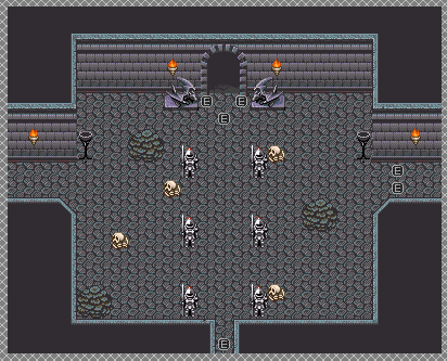
Right now top path is blocked off by spikes. Same with right path, so only left path is available (now there's stairs to a basement and 2nd floor in the main room). Goal is to get through that top route, which is where the boss room is located deeper in. Not sure how to set up the dungeon though...I need some good opinions/suggestions for this one. This would take place right after a major event (the battle at Pandaemonium), which isn't meant to be too long of a dungeon there. This one, I'd like to have a little decent length to with some puzzles. I don't think a "Go around, flip switches to lower one set of spikes and then find another switch to lower other set of spikes" is a good idea for this place. There's no special gimmicks involved here so...yeah. ^^;
Oh, and that's just the entrance to the Silent Shrine/Temple.
It's more a "great calamity just struck and there's lots of dust in the air and fires are still raging, also ash is coming down we're all gonna die" kinda thing. It fits for what that area is supposed to represent. (Also, yeah... they were png's but the site I hosted them on changed them. :/ )
@Xenomic
Here's a pretty basic, short dungeon design you can use:
Go left, travel a bit, enter a room with a puzzle. Solve puzzle. Flip a switch or gain an item that allows you to go right in the first room. Travel down some corridors. Solve a puzzle that unlocks the middle entrance. Fight boss.
I think the room is a bit too open, by the way.
@Liberty
I guess if you want to represent fire and ash, it kind of works. Personally I'd make it a tiny bit less yellow and a little more red, and maybe use a very subtle dust/fog overlay. Just a suggestion
It might be the jpg but it is a bit redder than that image shows. Let me png this. :/

As you can see, it's a tad redder. XD I don't want it too red, though. Fires would be dying down at this point. You'd actually be surprised just how orange a place looks when there's a major fire. You'd think it'd be dancing with red, but the smoke in the air clogs up, creating a dirty orange colour. It's pretty scary, really. (Oh, and ignore the cut-off of the black smudge. That's an issue caused by a script. I'm looking into it.)
Oh, and no to fog effects. I don't really like them - they take far too much work to get them perfect. Same with lighting. I'll stick to the basics - much more likely to come up with something that still looks good but doesn't take forever to do.
LockeZ

I'd really like to get rid of LockeZ. His play style is way too unpredictable. He's always like this too. If he ran a country, he'd just kill and imprison people at random until crime stopped.
5958
author=dethmetalThe emphasis on my game's dungeons is atmosphere. This is the water themed dungeon. It's a series of caves leading up to a shrine.
Part of my design philosophy is that major dungeons are never a single type of area. I don't want the player to get bored. In this instance, you travel through caves to get to the shrine. In other instances, the dungeon will consist of a forest area or desert as well as the main temple. It's simple, but the constant changing of scenery is a nice way to break up the monotony of dungeons.
Your philosophy is all well and good, but the fires in the brazers shouldn't be dark. No matter how dark everything else is, fire is always shining.
It can totally be blue fire though.
author=dethmetal
@XenomicHere's a pretty basic, short dungeon design you can use:
Go left, travel a bit, enter a room with a puzzle. Solve puzzle. Flip a switch or gain an item that allows you to go right in the first room. Travel down some corridors. Solve a puzzle that unlocks the middle entrance. Fight boss.
I think the room is a bit too open, by the way.
Hmm...yeah, it might be a bit too open, though it IS a shrine entrance so...well, shrine/temple. The problem though is figuring out what kind of puzzles to put in this dungeon, as I'm piss-poor with puzzle design (Locke knows allll about how bad I am with that lol). And again, since this screenshot there's a basement and 2F too just in case (don't know if they'll really be needed. This is near the end of beta5, so that'll be about the 62.5% point of the game. Hmm...
Sharing an update on my progress here. Alot of stuff has changed. I feel pretty good about my progression.


^ yes! Great improvement! I love those trees and that character! Those cliffs look a bit too square for my liking. If you could round them up?
Dookie, I agree on palette swap. Older snes games got really nostalgic effects with multiple palettes for gradual change. Your game doesn't look that earthboundy anymore. A lot more detailed stuff! I'm liking your style
Dookie, I agree on palette swap. Older snes games got really nostalgic effects with multiple palettes for gradual change. Your game doesn't look that earthboundy anymore. A lot more detailed stuff! I'm liking your style


