I guess in this case I'm an easy client/easy customer because I don't really care what the design is, CSS wise, as long as it looks neat. Lemme see if I can find a page or two I think is particularly neat looking as an example. The Nakaishi Wars (which, incidentally, looks hella neat, at least I really like the premise, one more for the playlist) page is nice and clean and functional and also just around the limits of what I can accomplish myself (I am sure that my CSS is uglier than yours to look at is code, being kludged together from bits and pieces of copy pasta with a total cargo cult approach, but I can make a page look more or less the same as that).
I know that my own skill/patience with CSS ends with
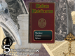
pages (I'm reminded you helped me with the CSS for this one last year!) that look
like this (essentially the same CSS input w/ different color and image choices); the background color, text color, hyperlink color, and background image for the most part I know how to alter.
Ironically, setting up an itch.io page's "theme" is essentially CSS, but easier cause it's all wysiwyg point and click.
I guess maybe one piece of information I can put out there is I'd like it to look like (or at least be evocative of) an old medieval tome, or grimoire. So it would use tones and textures that are evocative of parchment/books and also a B&W medieval illustration (I have several that would suit) for a background. Is that helpful?
Edit:
neat looking pages.


 Add Review
 Subscribe
 Nominate
 Submit Media
 RSS
RSS StormCrow