 Add Review
 Subscribe
 Nominate
 Submit Media
 RSS
RSS
- Summary
- Blog
- Images
- Reviews
- Media
- Characters
- Classes and Jobs
- Areas
- Dungeons
- Weather Effects
- Battle Magic Cards
- Downloads
- Play Lists
Posts 

Pages:
1
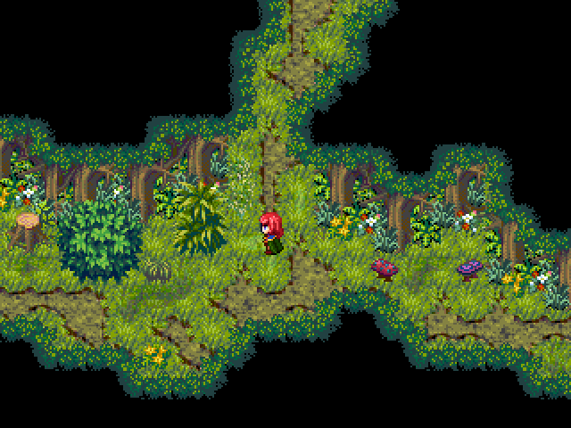
I think the black is a bit too harsh. The black itself is drawing a lot of attention to itself, causing the other tiles to meld together a bit.
Something about the colors is bugging me. It's not just the black... It looks like the colors are bleeding into each other. I'm not sure if it's just a lot of pieces of chips thrown in together on a 256 color palette and getting degraded or if it's just bad screenshot quality, but there is something about the way the colors come together here that is not working for me.
Edit: I do love how you put the pieces together though. It looks great, but I think the palette needs to be evened out, the number of shades of green needs to be reduced, and the whole thing needs to be unified a little bit (right now you can easily tell which parts are and aren't meant to go together)
Edit: I do love how you put the pieces together though. It looks great, but I think the palette needs to be evened out, the number of shades of green needs to be reduced, and the whole thing needs to be unified a little bit (right now you can easily tell which parts are and aren't meant to go together)
author=fredo
I do love how you put the pieces together though. It looks great, but I think the palette needs to be evened out, the number of shades of green needs to be reduced, and the whole thing needs to be unified a little bit (right now you can easily tell which parts are and aren't meant to go together)
...Yeah. Hashing together those plants was probably a bad idea, but it'll get thinned out as things go on. May have been a bot overzealous :D. Im just worried about making things look too cartoony if i lower the number of greens too far. Hopefully I can find a happy medium.
And as for that black, yeah. Dark green coming right up. I think they have the shade i just dumped in there Sequoia Grove or something. It's an Olympic Paint color I think.
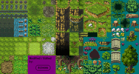
This chipset might help you. It looks like it has all the same tiles and plant life that is on your screen, but it doesn't look like the colours have suffered as much. You might even be able to shove it directly into the project, to save yourself the work, though you might have to move a things about on the map if they are not positioned the same on the chipset. Hope it helps.
I find this map really evocative''it's maybe the fourth time i stare at it, trying to define)! I didn't know it was for the summer contest, so refrained from saying this, yes, in relation to the theme : a character at the center of three directions, like 3 levels of the mind, subconscious, conscious, inconscious or w/e, i.e. a character in the center of his mind .
author=chana
I find this map really evocative''it's maybe the fourth time i stare at it, trying to define)! I didn't know it was for the summer contest, so refrained from saying this, yes, in relation to the theme : a character at the center of three directions, like 3 levels of the mind, subconscious, conscious, inconscious or w/e, i.e. a character in the center of his mind .
I don't think they do this in that way, but anyway, its a cool form to see it.
Pages:
1


