


CORFAISUS'S PROFILE
Corfaisus

"It's frustrating because - as much as Corf is otherwise an irredeemable person - his 2k/3 mapping is on point." ~ psy_wombats
7874
"Winning" internet arguments via dismissive hyperbolic falsehoods and selective ignorance.
Unallocated Skill Points
"Take this beautiful moment and make a joke out of it. If you can't, you're a slave to it."
"The imperfections show the face."
Unallocated Skill Points
"Take this beautiful moment and make a joke out of it. If you can't, you're a slave to it."
"The imperfections show the face."

Search
Filter
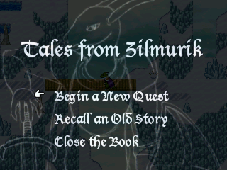
 Final Title Scren
If everything else is final, could you at least do something about the font of the Start, Load and Exit options? To be frank, they look terrible. The lettering looks sharp and misshapen instead of smooth and consistent like the font you used before.
Cave Dungeon Teaser
It looks good but you might consider adding an option to turn off the movement sound effects or have a process to detect if the player has a direction key held down as opposed to tapping it and if so have the sound effects only play every other step. As it is right now, it's distracting hearing Bom-Bom-Bom-Bom-Bom-Bom-Bomp while running across the bridge when it looks more like the character is shuffling their feet. It would sound more realistic like Bomp-ff-Bomp-ff-Bomp-ff-Bomp-ff.
The Tower of Light! Walkthrough Part... wait, what?
I was looking for a way to burn some time before I head out tonight and I hopped on here to see this. Thank you for that.
 FFD Concept Art 13 - Priscilla Alexandros
author=WCouillardauthor=CorfaisusAt no point did I suggest any of what you're assuming in this ridiculous post. In reality, I was protesting the original concept. Not to mention, I have no input whatsoever on the design of the characters in the concept stage, Paul is more than capable of handling it himself. I see these designs at the same time as the rest of you, and I give my opinion just like everyone else does, after the fact. At that point, if things need to change, they do. Priscilla is the third character whose design has changed after their initial concept was shown.author=WCouillardYou're right, needs more skin. I demand bras that are a couple of sizes too small (for that overflowing butt crack cleavage that makes all the boys go "woooooo") and thongs yanked up to the ribcage. Better yet, skip tight undergarments altogether and just go straight for historically accurate berserker women (no clothes, just a pelt over the head).
I'm going to be a little blunt here.
This is my least favorite of your normally awesome, perfectly personality fitting designs. The outfit looks like... I dunno, but not anything a Ranger or Hunter would be wearing, especially one who would be totally outdoorsy the way this character is.
Everything about it says military. I'm not a fan of this one. But whether we decide to use it or not, keep it for the art unlocks! :)
I'm not sure, by putting words in my mouth, what your point is here.
I was debating whether or not a (sarcasm) tag was necessary there, but I figured people would just get the joke because of how outrageous it is. Apparently not, and for that I'm sorry.
Unless you're faking outrage, in which case I'm not sorry.
FFD Concept Art 13 - Priscilla Alexandros
author=WCouillard
I'm going to be a little blunt here.
This is my least favorite of your normally awesome, perfectly personality fitting designs. The outfit looks like... I dunno, but not anything a Ranger or Hunter would be wearing, especially one who would be totally outdoorsy the way this character is.
Everything about it says military. I'm not a fan of this one. But whether we decide to use it or not, keep it for the art unlocks! :)
You're right, needs more skin. I demand bras that are a couple of sizes too small (for that overflowing butt crack cleavage that makes all the boys go "woooooo") and thongs yanked up to the ribcage. Better yet, skip tight undergarments altogether and just go straight for historically accurate berserker women (no clothes, just a pelt over the head).
author=janussenpre
@emmychNah, you're right in the sense that it can be construed as 'suspect'. That's simply because my artistic aesthetic does revolve around certain eastern media tropes that generally place a lot of emphasis on sexualization. There isn't any agenda behind this decision. It stems back to the origins of my artistic history: drawing anime and mimicking artwork from Japan, Korean and Taiwan. However, whether my male designs are interesting and my female designs are boring (because of the sexualization) is a matter of opinion.
I've spent a good number of years doing lineart commissions for eastern based customers and companies and not surprisingly, my style has grown to reflect the tastes of that clientele. Aesthetics that are common in games like Lineage 2, Aion, Agarest War, Langrisser or any typical eastern CCG is the kind of style that my commissioners wanted. This is simply where my style has ended up after years of working in that particular market.
As far as how people may react to it? I make it a rule to ignore that facet entirely. There is no intent to offend, nor is there any hidden meaning or message that I am trying to promote. It's all subjective (and often polarizing) so I pay very little attention to it. Yuri, yaoi, ecchi... I've drawn it all so there really isn't much I consider taboo when it comes to art. It's just a matter of ensuring you create the appropriate subject matter for the (hopefully) appropriate audience.
Why have you chosen to get yourself stuck in this design philosophy instead of embracing versatility? There's really no other explanation as it's as simple as just making like garments for the female characters as you do the male. There shouldn't be a difference. War knows no gender.
Another thing that I've found with this game over the years - and others where the designer clearly misses the point - is that there's this synonymous quality between "strong" and "exposed". "She gives everyone a show because she knows she can kick serious ass." Ability comes through discipline. Discipline comes through humility.
FFD Concept Art 08 - Ellie Baldesion
FFD Concept Art 07 - Parker Gabbiani
She's always been the male fanservice character of the game. When they first started, she had a neckline all the way to her waist with no bra apparently. I'm surprised they're still cranking out designs like these after that last debacle.
What I would recommend is running this by a few women in your personal lives or even here on RMN and get their take on it. It's not to say that you can never have sexual this or that in media, but if it's made by men, it's likely going to be made for men (it's pretty obvious with the massive (each breast is literally the size of her head) and completely exposed bust and midriff). You'd think a gambler would have clothes that contained everything, but I guess this is more a case of "distracting" in order to win? Sounds pretty racy if you ask me.
What I would recommend is running this by a few women in your personal lives or even here on RMN and get their take on it. It's not to say that you can never have sexual this or that in media, but if it's made by men, it's likely going to be made for men (it's pretty obvious with the massive (each breast is literally the size of her head) and completely exposed bust and midriff). You'd think a gambler would have clothes that contained everything, but I guess this is more a case of "distracting" in order to win? Sounds pretty racy if you ask me.
For money? Seriously?
Let's Play Rainbow Nightmare Libra Intro (Part 1)
author=LordBlueRouge
#2I wanted to quickly add this example.
On the left, we have the original:
And then, once we add these rules:
-Read your dialogue out loud.
-3 sentences/text window minimum per character
-2 sentences maximum per window.
- Each sentence is a complete sentences contained in the same window.
You can immediately see on the right,
it’s a lot easier to read and it flows much more naturally for the player.
Again, you do not have to always follow these rules.
But when it comes to revising dialogue, this definitely helps clean it up a bit
and it makes it a lot easier to follow.
I'll probably add another example later on.

Ugh, no. What needs to be done is a cutting down of the overall amount of dialogue and maximizing the usage of characters per line so that it fits better into message boxes all the while maintaining the player's interest. The way you decided to cut it up, if anything, makes it worse.
Phantom Legacy Fan Trailer
Pages:
1

