


CRAZE'S PROFILE

a wolf can eat the equivalent of 100 hamburgers in one sitting
who needs PLOT whe nyou ahve GAY PEOPLE
who needs PLOT whe nyou ahve GAY PEOPLE

Search
Filter
 [RMVX ACE] A video I made showing how complex animations can be made. Hopefully it will help some people!
I agree. The style's not for everybody but it's a neat idea and will be more easily accessed as a tut.
drew a snake
love the topic title.
it looks pretty good but i think i'd prefer if the inner borders used color. if you want outer black borders, w/e, but whereas the belly and hood are so dark already, the black is pretty distracting. if you wanted to colorize the whole border, that would help the tail -- the very end doesn't actually look much darker because of the contrast with the outline.
i have a few other nitpicks but i'll leave it at that for now ;V still, hope to see more :)
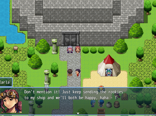
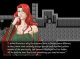
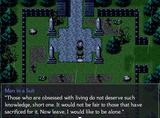
Screenshot Survival 20XX
maija. i appreciate what you are doing except that you have help menus telling you what the spells do? so that's pretty unfaithful.
What are you thinking about right now?

[RMMV] How to make slopes in caves look better
unfurl, open a new map. draw some autotiles around. play around with combining the shift key with left and right clicks. you're welcome.
edit: those slopes look pretty bad since they don't extend past the cliff face, bulma.
edit: those slopes look pretty bad since they don't extend past the cliff face, bulma.
[RMMV] How to make slopes in caves look better
you've never seen slopes , visitors???? wat

here's how i'm doing them in my own game. i'm just using the natural edge tiles but hand-made a little divot that goes out on the bottom.

it's actually not perfect atm since as you can see i have a bit of rock jutting out in a rectangle but w/e. easy fix.
here's how i'm doing them in my own game. i'm just using the natural edge tiles but hand-made a little divot that goes out on the bottom.
it's actually not perfect atm since as you can see i have a bit of rock jutting out in a rectangle but w/e. easy fix.
Screenshot Survival 20XX
SgtMettool
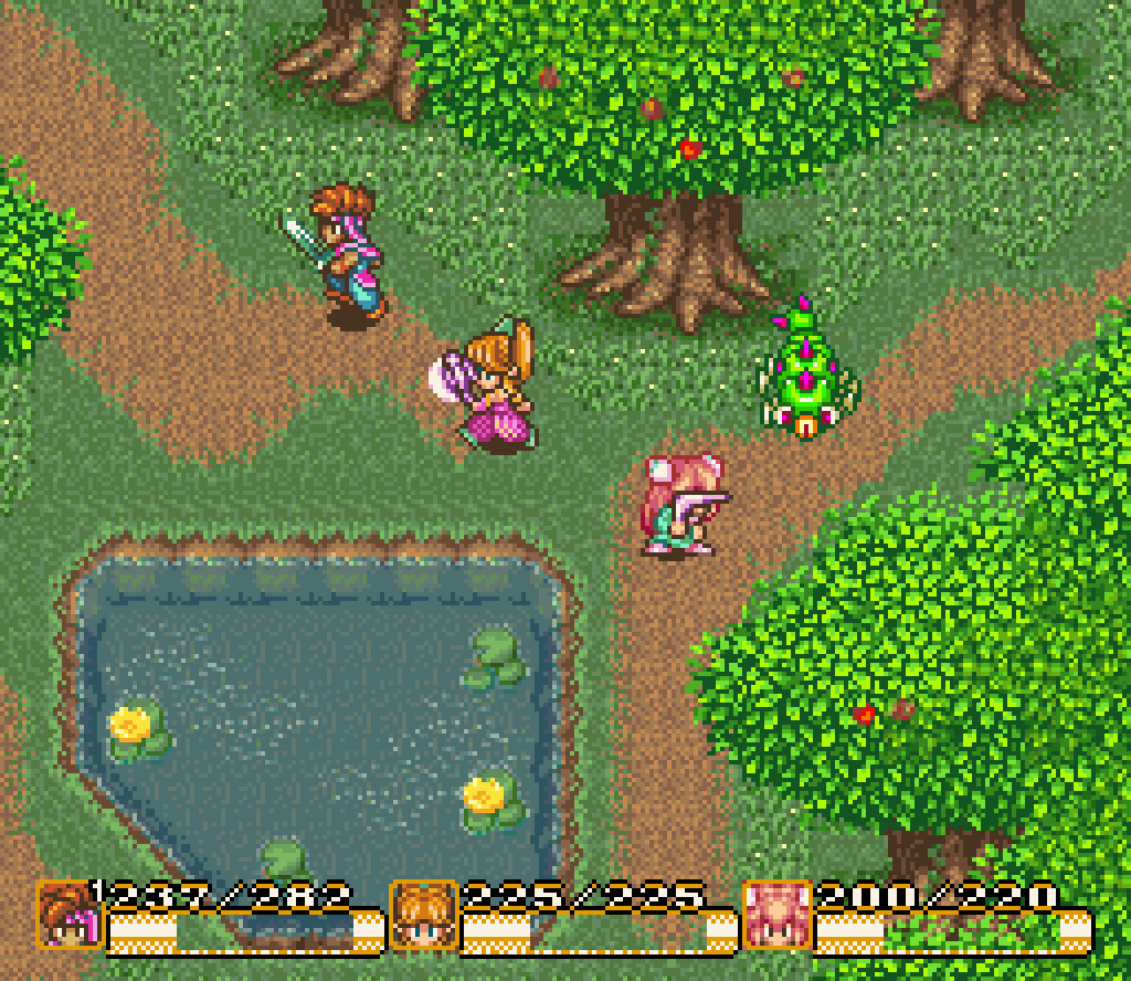
I've been making an effort to de-clutter some of my maps, because I'm finding there's a disparity between what looks good in a screenshot versus what is actually practical level design.
my rule of thumb is to pick like 2-3 major plant types for an area and then make a few positioning edits for them. i'm cheating a bit in this game with more variety because it's all set in one location, but still. if town 1 has white flowers that grow around water and coniferous trees that grow everywhere, maybe town 2 has blue and yellow flowers as well as shrubbery in neatly uniform rows and carefully-planted big oaks.
i also just use the golden ratio a lot. not literally perse, i don't actually measure, but you can look at a craze screenshot and usually tell by how everything is set up in triangles... https://rpgmaker.net/games/1212/images/6702/ even in my older games, unless it's intentionally planted there, i try not to keep the same tile on the same x or y axis within a single screen-width.
it's still talking!!!!!!
As for actual critiques of the screen; the water is transparent enough to see the cliff face and the bottom of the lake? ocean? but the pier pillars disappear as soon as they touch the surface. They should be visible too!
Are the buildings on the piers themselves or propped up next to them?
....FUCK lol. thanks for pointing that out. i'll fix it tonight.
they're on the piers partially but also propped up. i'll try to make it more obvious via adding in visible pillars. i also thought about adding some dock "trim" around them but i got tired of editing the corner dock pieces so we'll see. the player will be here a few times so probably worth it.
 I actually have no idea how to make a video game.
Screenshot Survival 20XX
a talking duck?
I'm not familiar with RM... MV's(?) in-game resolution, but it looks like there are areas where all you'd see is a big field of brown with some white and a tiny sprinkle of green at the periphery. You don't have to make it that obvious where the path is.

i don't know where it learned how to talk
As far the screenshot goes, it is nice! As far as visual detailing goes, the path has literal edges carved into the earth, you could put nine million plants in there and it would still be ridiculously obvious where the road is. I'm not saying that's a good idea, but --
-- but it would look bad and hurt the player's eyes and is a bad argument. level design is more than just throwing a bunch of clutter everywhere.
is anybody else worried??
"fewer details!" is such a canned Craze response that I wonder if you had those links pre-selected for the next time you got to whip it out.
yeah, i always use guardia forest! i'm glad that you both think i hate details while also looking at the the docks i've been working on... i'm gonna take that as a testament to how well my alterations and details blend in with celianna's base tileset ;)
then again nobody's yelled at me for how poorly that one edge of the dock tiles so *shrug*

