


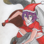
STORMCROW'S PROFILE
StormCrow
2877
>look StormCrow
You see not a bird but an American lady who likes other ladies. Oscillates between shy as a mouse and babbling violently, seemingly at random.
I like badasses. I like babes. I like badass babes the best. Okay...actually I like doggoes the very best, but I aspire to make games about badass babes is my point.
I use music from bands and artists in the free games I make: the frustrated filmmaker in me is very enamored of scoring scenes with rock'n'roll soundtracks Scorcese or Tarantino style. In addition to being a time honored tradition in cinema, this has a history in AAA videoogames as well (for a really great use of it, see Bioshock: Infinite). If I was a millionaire, I'd totally license these songs so I could actually use them legally.
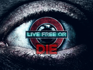
Live Free Or Die
"The Tree of Liberty must be refreshed from time to time with the blood of patriots and tyrants."
"The Tree of Liberty must be refreshed from time to time with the blood of patriots and tyrants."
Search
Filter
 17.png
Based on a recent-ish event with my D&D group where they had an encounter that was almost literally this screenshot, I strongly feel you should have a third option:
"Attack both sides like the complete idiots you are"
XD
"Attack both sides like the complete idiots you are"
XD
castlearddlech.png
holy fucking shit
that mind-bogglingly intricate complex of cliffs on the lefthand side...can the player actually navigate that area, like is there gameplay there? if not, if all those cliffs are there just to look purty, well obviously you are a mapping genius but I think you might also be an actual crazy person :P
(The overall layout vaguely reminds me of the Lost Bastille from Dark Souls 2 for some reason.)
DA_image_2.png
ALL_the_guns.png
useid_4.png
Yeah it's already been brought to my attention and changed to this...

I just have a ton of old screenshots mainly for things like demonstrating features that still have the old font. So many that I'm still finding new old screenshots to upload from time to time.
I just have a ton of old screenshots mainly for things like demonstrating features that still have the old font. So many that I'm still finding new old screenshots to upload from time to time.
Actor_FW02_03_f2.png
These wasn't meant as screenshots or anything, I just needed the image hosted somewhere so I could post them to a thread on RPGMaker Web, I hadn't really thought about the fact that they'd appear in my images feed. Probably should have used my locker. *shrug*
THAT SAID:
I think there is a pretty big difference between "redistribution" and what I'm doing which is "using the graphics I paid actual money for as they're intended such as for character portraits when marketing my game". I don't think anyone will mistake me for saying "this is Actor_FW02_03_f2.png, help yourself" I'm pretty clearly saying "this is my original character Naomi Watanabe and let me tell you all about her".
If Frontier Works or whoever has an issue, they can contact me, but I appreciate your concern.
01.png
Wow, that looks a lot like the basic engine/graphics of FF7. But better. Immensely impressive. But actually I care about story more than graphics so tell me: what's the deal with those lion men?
Who_Cares_Shoot_em_1.png
I do always play in full screen and I am pretty sure it does look better there.
Part of the weirdness of the font display probably might come from the fact that it is Bold-by-default.
(unity is one of maybe 4-6 people on this site where if she takes the time to pop into one of my games and make a suggestion I will just immediately unquestioningly follow it)
Part of the weirdness of the font display probably might come from the fact that it is Bold-by-default.
(unity is one of maybe 4-6 people on this site where if she takes the time to pop into one of my games and make a suggestion I will just immediately unquestioningly follow it)
Who_Cares_Shoot_em_1.png
I mean to be clear, I want to stress that I have absolutely no difficulty whatsoever reading the font but, by all means, all are welcome to chip in. Y'all are my audience so yeah if a lot of people are saying the font is hard to read, yeah, gotta deal with that.
I have average eyesight at best but if my eyes are somehow anomalous in being able to read Agency FB with no effort or difficulty, the font shall be changed (but even then I probably won't ever have the energy to go back and replace every one of the 25 screenshots I took today with the "bad font" in them). I guess I should probably make the decision to replace it or not by Wed, when I'm going to take the next batch of screenshots.
It just occurred to me that probably one of the very first things I should do for a game at the outset of development is a typeface test. Because apparently things that are easily legible to me are not to other people. Having to rejigger every single show text command because I switched to a less compact font would be a significant amount of anal discomfort I could have avoided by this simple practice.
Who_Cares_Shoot_em_1.png
It does not look anything like that at all? Like I don't understand how it could remind you of that because the unpatched 2k3 font that was LITERALLY ILLEGIBLE.
Anyway, I quite like the font. If enough people hate it I'll consider changing it (and be glad that I didn't fix all of the awkward spacing issues like the one seen here, because I'd have to fix them all over again with a new font, but sad that I fixed the text boxes I did fix, because then I'd have to fix them all over), I suppose, but I like it. Everyone's eyes work different, I guess.
Anyway, I quite like the font. If enough people hate it I'll consider changing it (and be glad that I didn't fix all of the awkward spacing issues like the one seen here, because I'd have to fix them all over again with a new font, but sad that I fixed the text boxes I did fix, because then I'd have to fix them all over), I suppose, but I like it. Everyone's eyes work different, I guess.

