Well, I thought I was doing something, but I guess I'm not, so here are a bunch more:
@luiishu:
As far as high concept games go, you're not going to get more universally accepted than "Kill the Clown." The title screen is looking a bit barebones, like it was made in Word, though. I don't mind the minimalist color, though, so I think it would look pretty slick with a more intriguing clown picture and a more unique font. If it's supposed to look like a high school report, though, it's doing its job.
@SgtMettool:
I've been seeing glimpses of this here and there on tumblr, and I'm liking the looks of it so far. Nice earthbound-inspired walk cycle, and the face graphics are expressive. Cool stuff!
@mjshi:
Nice use of the 2k3 tiles. The painting looks a little low to the ground, though; maybe move it up a tile or put it in the middle of a three-tile high wall? I hope that's showing the inside of an airship!
@Irog:
Are you working with a specific color palette? If not, you might want to wash out the color on those grass tiles so that your characters stand out a bit more.
@kory_toombs:
Good use of the tiles. I'm also kind of salivating over seeing a tactical rpg.
@addit:
You better release Monopolo this year, you son of a bitch. I'm afraid it's going to CONSUME you. It's looking slick, though.
@Pizza:
Oh, look, more great looking stuff from pizza. Real original. Those trees in particular are killing me. Your sketch is also a lot stronger than the similar stuff I've seen from you even a few months ago.
@KatanaHiroshi:
The first two maps are huge. Learn from my past mistake: you've got to condense those. Give the players enough to explore, but there's got to be a lot of variety in that exploration. I got dogged on that pretty hard for my first game.
@Red_Nova:
That menu looks good; not much to say there. It's very easy to read and gives lots of information.
@Lucy_Fox:
That looks gorgeous; I wish I knew German!
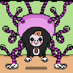
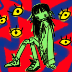
@Unity:
Those monsters are great, especially pregnant eye lady. Cool color choices there; very psychedelic. Animations are hard to judge like that, but they're looking good--ESPECIALLY that slime skill.
@Sooz:
Those look great! It's hard to offer much feedback since I'm at the point in my art where I can say, "People can tell that's a horse, so that should be good." But, your maps are detailed and look like the real deal, and the composition on the character still is clean, the shading's consistent, and the style's cool. Her left hand (her left, not mine...the hand with nothing in it) seems a little unnatural to me. Like, I'm not sure what that gesture means, like she's trying to explain the burger while setting the burger down with her other hand. Maybe I'm overthinking it because of a dearth of criticism.
@pianotm:
Thanks! That's definitely the feel I was going for--particularly pulling from the Ys games and (the admittedly terrible) Lagoon. I always loved that slap bass. Anyway, your tracks have some pretty sweet aspects. Against the Clock sounds pretty reminiscent of the Phantasy Star series early on, but it takes a turn and sounds a bit more unique after the introduction. I don't mind the ostinatos in the first three songs, but, for the sake of variety, having those three songs in the same game might sound too samey. I'm getting major FF6 vibes from Into the Expanse. I like your big overpowering chords when they come in throughout several of your songs. I would like to see some more variety in your rhythm work, though; you often rely on ostinato or, like in your last song, just a metronomic high hat. Your phrasing over that stuff is cool, but a bit more love for the rhythm could really elevate your tracks.
@dinkledaberry:
Thanks, man! That blob is supposed to be revolting, but, damn if I can't help but make him look adorable. Anyway, your new game is looking pretty slick. Did you draw those tiles/sprites or are they from a pack? The maps are super well-composed.
@Zephire98:
Was this done in the editor or did you make some changes to it? He looks like the brave hero type.
@Kylaila:
The slime is actually the main character; he's an eight year old boy with the power of empathy, so he can imagine himself as a few different monsters and turn into them. So, that's actually him squeezing out of a very tight spot. Glad you like that and the track!
Anyway, are those future monster designs? Interesting assortment, there. Things like the bear look very well-composed, and your more abstract monsters are intriguing (including dear, dear buttheart).
@zds:
I'm loving that aesthetic! In the battle picture, you do have a lot of unused space. I'm not sure if you're leaving it open in case of having lots of monsters, but if the number of battlers stays that low, you might consider having a frame around the battle like Dragon Warrior does; it will keep the space neat and further call on the NES feel that you're pulling from.
@Frogge:
Thanks! I'm sure there are lots of animators on this website that destroy me, but I'm glad they're working; I definitely like animating more than just drawing. Anyway, you've got a really interesting riff on tic-tac-toe there. It's going to be interesting to see how it plays.
@Zero3D:
I haven't played the game, so I can't comment on the mechanics (but they look really interesting!). Aesthetically, though, you could probably benefit from some mapping tutorials. You might be needing to keep everything open for the gameplay, though, so that might be intentional. Your title screen has some conflicting aspects; the sprites are blown up really big, and the spray tool makes it look too "mspainty." It's really hard to get a well-composed title screen, though, so I get why you phoned it in. It might be good practice in aesthetics to work on it a bit more, though.
@Cyberlous:
If I remember correctly, didn't you say you were 13? The variety of stuff that you're producing is very, very cool to see from someone your age. You do have a lot of room for improvement, but, I mean, shit, when I was 13, the most you got out of me was a few sketches in the margins of my notebooks. Anyway, I'll focus on your music since that's where I've had the most practice. The dynamics (the loudness and softness of a note) are kind of all over the place in A Future Feeling. The biggest thing missing from your work is polyphony: you just need to have more than drums and a single melodic line. Try to work up so that you have percussion, a bass line, a melody, and chords. Once you get familiar with that, you can branch out from there, but, in general, your music is losing a lot of potential expression by going too minimal. It does work for Infiltration 1, though; sounds very reminiscent of cyberpunk.
@AcesOfAces:
Your mapping looks too open. Even if you want to give the player a feeling of wide open spaces, keep the actual path that they can follow more concise. This is something I learned pretty hard from my first game.
@BerryRMN:
Try to match the aesthetic of your sprites to the tiles; they're clashing a bit. Too, that first room looks too open; maybe give the room a shape other than a rectangle so you're not forcing yourself to have that extra space. Also, some variance in the floor tiles (like a carpet) would really help bring some color to the rooms.
@Pooperflooper:
Woah! This game looks pretty cool! Hopefully it lives up the aesthetic, but, visually at least, it's really appealing.
@punkitt:
Neat aesthetic! I'm a little worried that the maps are too empty, but if you're doing an exploration game rather than a traditional jrpg, that's probably going to be fine. I especially like that last gif.
@Thunder176:
That's a weird carpet in your second screenshot. Remember, carpets are generally just rectangles, so break up the carpet instead of leaving it as a continuous piece like that. Your last three screenshots are pretty well-composed.
@krox:
I'm liking all of that stuff--super creepy sprites, the title screen, and that tile set: all great!
@Liberty: Good luck! I just had bad luck with my own stuff, so you might be able to get it to work fine.


 AraFellGreenlight_0000_TitleAraFellcopy2.png
 AraFellGreenlight_0001_TitleAraFellcopy.png
 AraFellGreenlight_0002_TitleAraFellcopy5.png
 AraFellGreenlight_0003_TitleAraFellcopy4.png
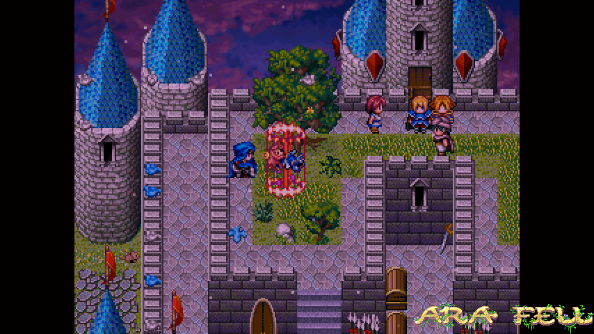 AraFellGreenlight_0004_TitleAraFell.png
 AraFellGreenlight_0006_TitleAraFellcopy6.png
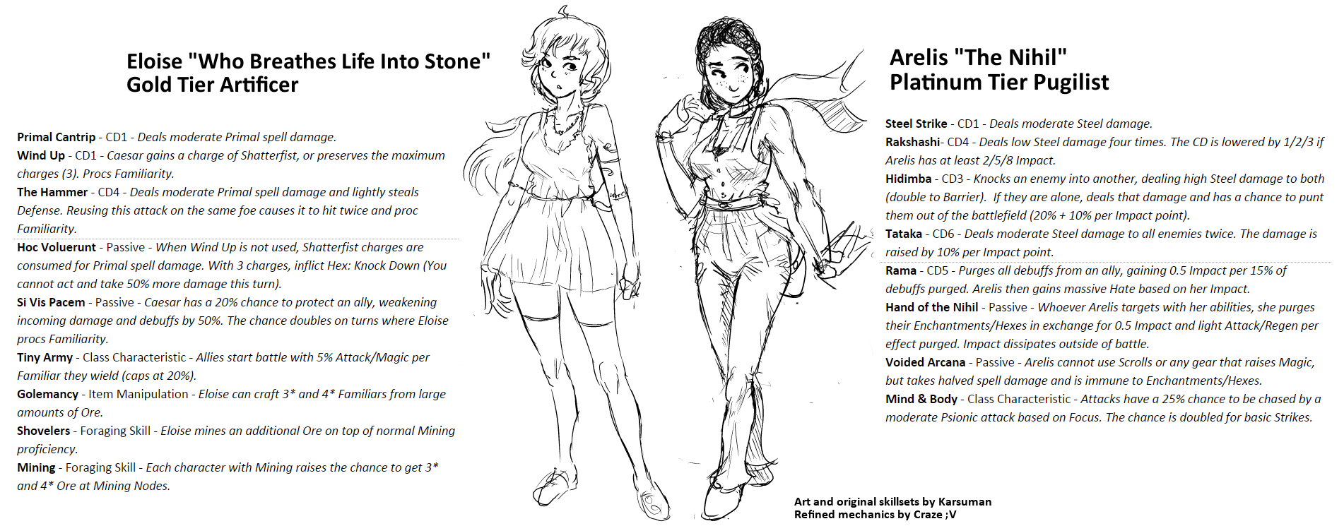 utVZj4G.png
 OverworldIconsRawr.png
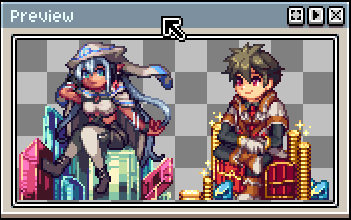 20160118_05050.png
 Eliciaattack3.gif
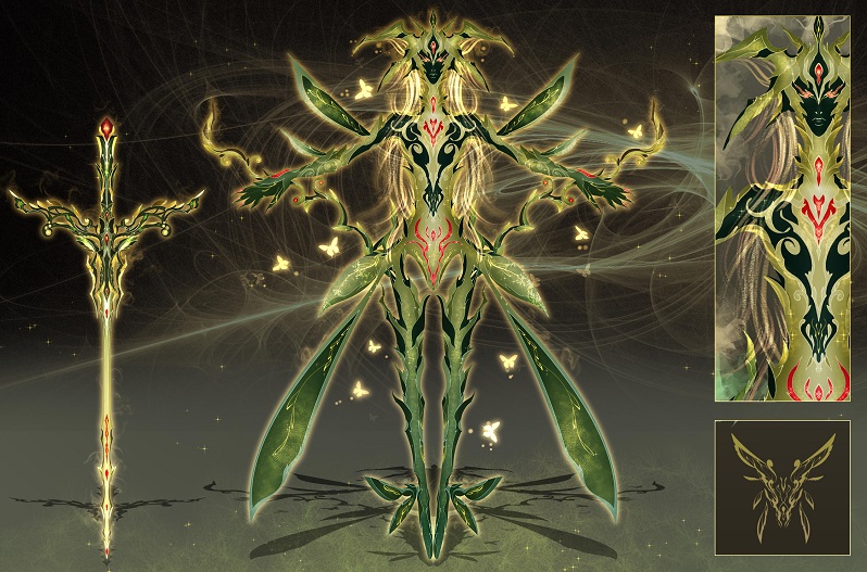 01_Fairy_Spirit.jpg
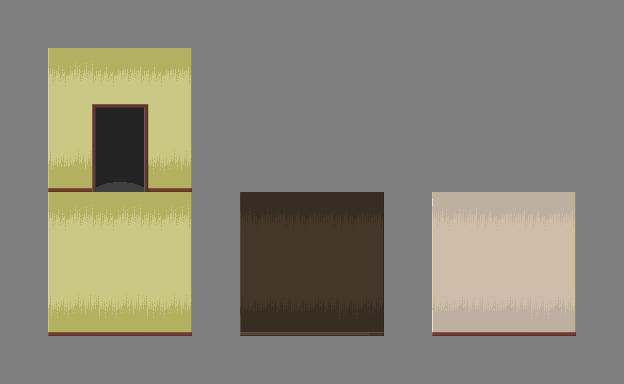 walls_and_door.png
 milla3.png
 milla_test.png
 milla_test_2.png
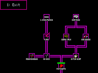 Skill_System.PNG
 High_Kick_Skill_Card.PNG
 One_Inch_Punch_Skill_Card.PNG
 minty.gif
 Battlers_1.png
 Ship_Bridge_WIP.png
 Ship_1.png
 Port_Town.png
 INTRO_03.PNG
 INTRO_04.PNG
 INTRO_05.PNG
 Screenshot_20160113_130013.png
 Screenshot_20160113_125854.png
 releasesomething1.png
 WeDroveThemOverTheCliffs.png
 FirstScene.png
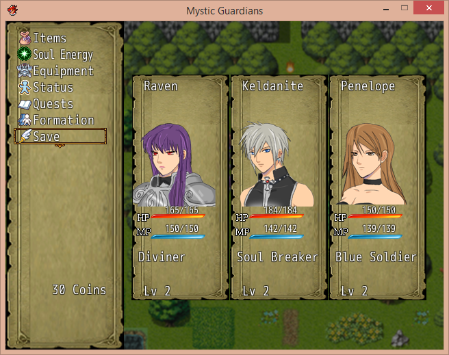 Menu.png
 Untitled.png
 KILL_THE_CLOWN_Title_Screen_Concept_Art.png
 FaceSets.png
 Screenshot_1.png
 Screenshot_2.png
 map01a.png
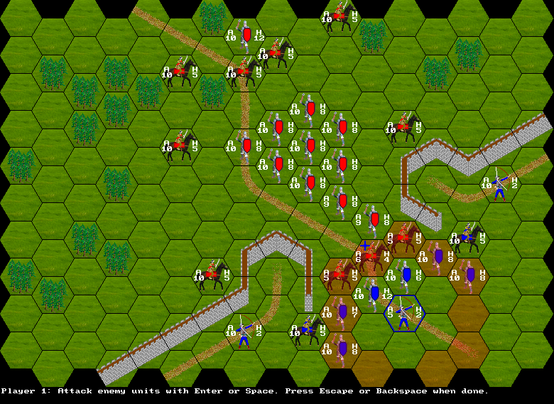 map06e.png
 map08a.png
 t2.png
 t4.png
 t5.png
 tactics1.png
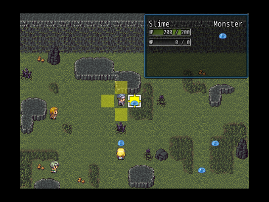 tactics2.png
 tactics3.png
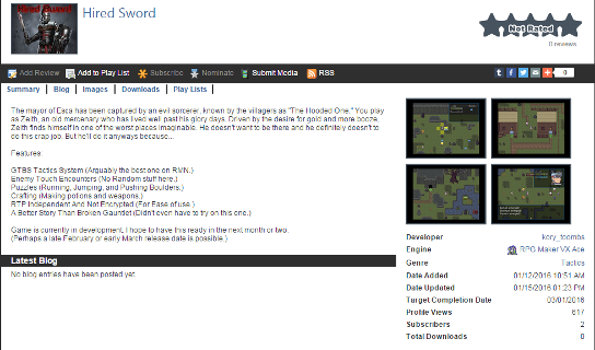 GamePage.png
 Rule_Variations.png
 Rule_Adjustments.png
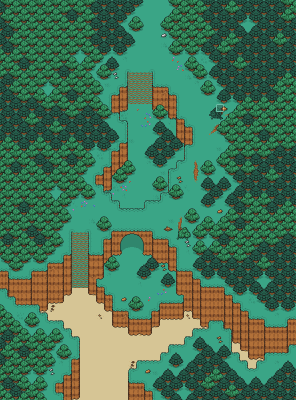 BeachWoods_2_Map.png
 CW_DevShot_8.png
 OWF_Sketch.png
 HolographicStnad.png
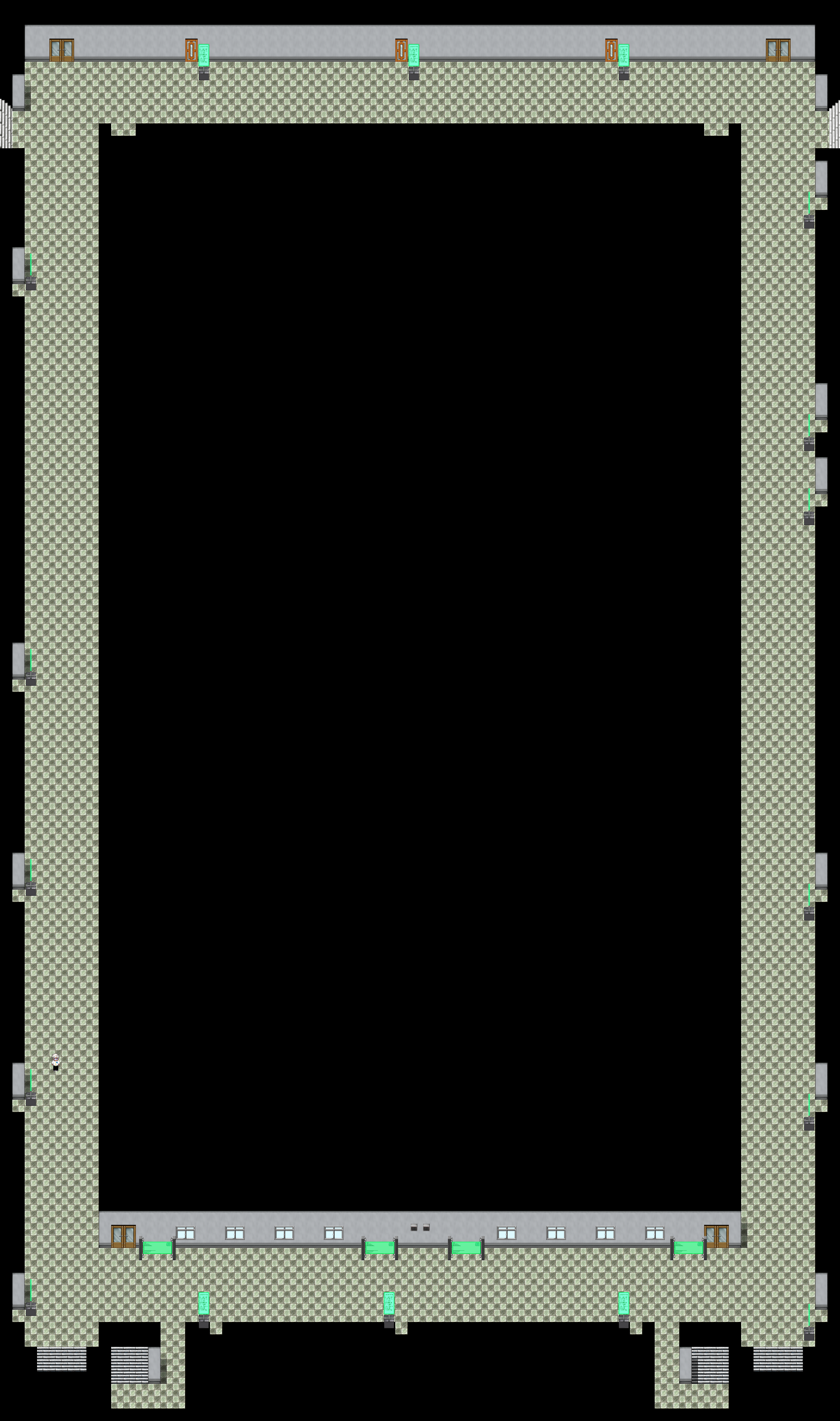 Map010.png
 Chaos.png
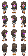 Kezia.png
 TheSerpent.png
 TheWeepingAngelEffectIsReal.png
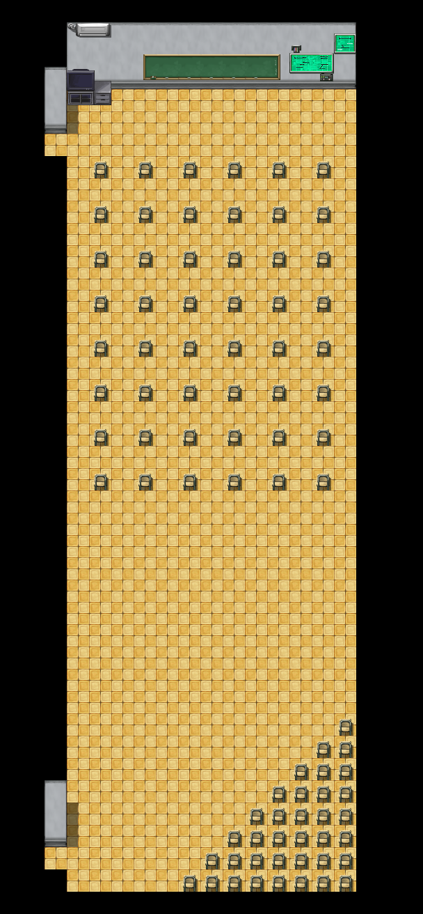 MMC_MultiMedia_Center.png
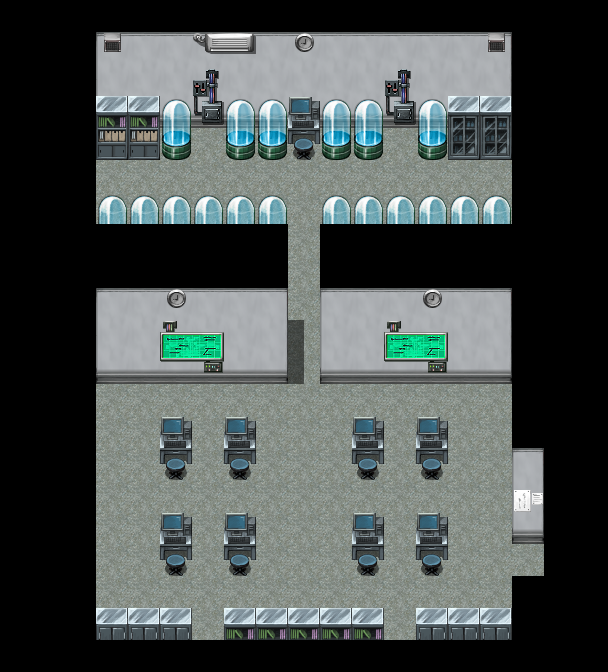 Tech_Room.png
 TRACE_System_1.png
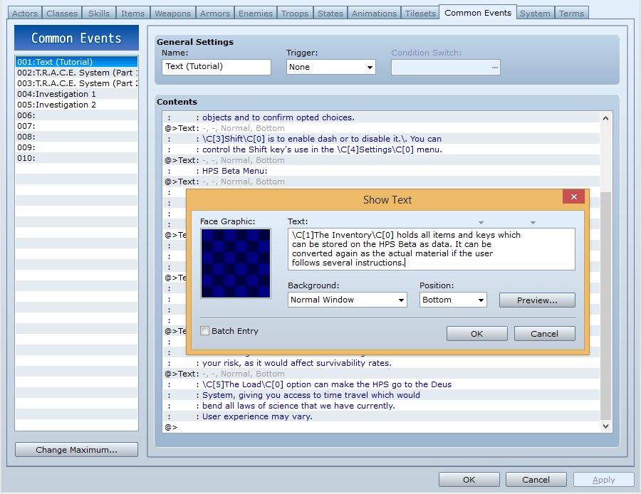 WhenTutorialsGoCanon.png
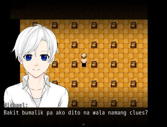 WhyDidIComeBackHereAgain.png
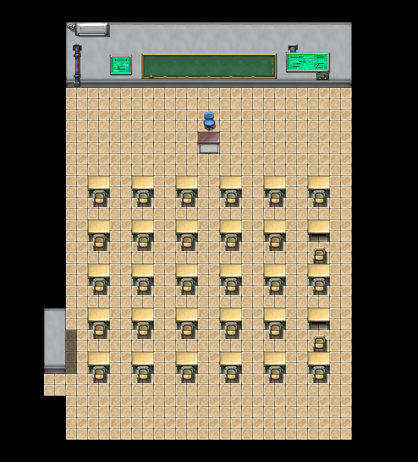 X__Xenarthra.png
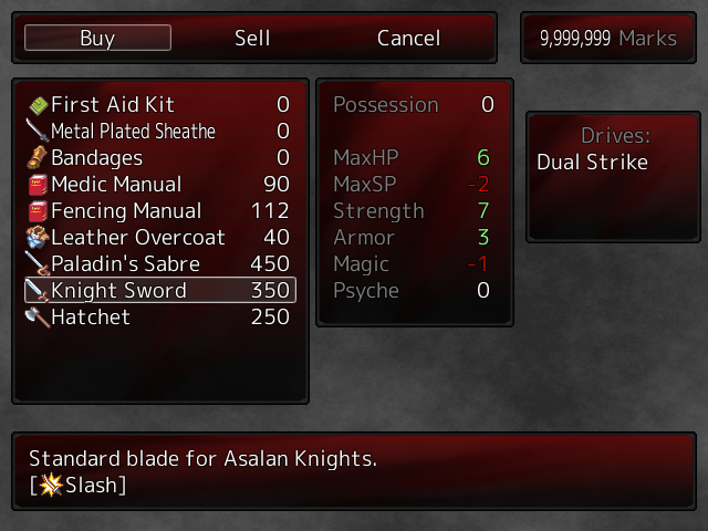 New_Shop_Menu_1.png
 Shop_Menu_tweaked.png
 endhouse.PNG
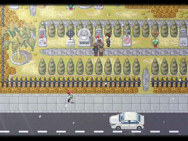 grave.PNG
 Blob2.gif
 Weird_And_Unfortunate_Battle_Animation1.png
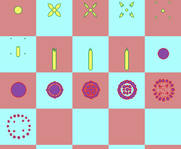 Weird_And_Unfortunate_Battle_Animation2.png
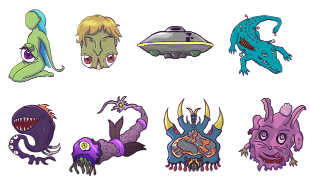 Weird_And_Unfortunate_Monsters.png
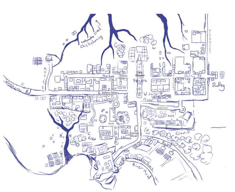 1760.jpg
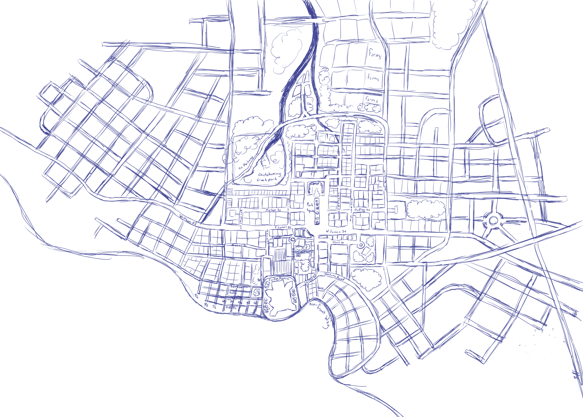 1947.jpg
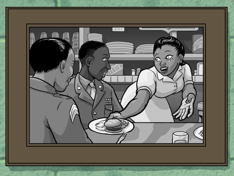 backgrounds.jpg
 SuperHomicideDetectiveTitle.png
 SHDApartment.png
 SHDBattleTest.png
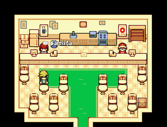 SHDCafery.png
 SHDCrimeScene.png
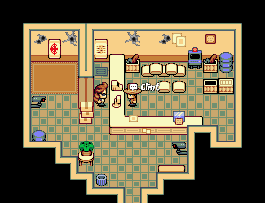 SHDGunnery.png
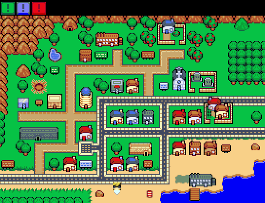 SHDMap.png
 SHDMorgue.png
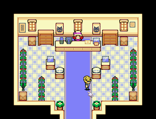 SHDOutfittery.png
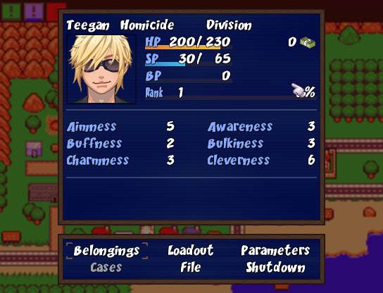 SHDStatusScreen.png
 Issac_Swordsman.png
 SKETCHES_DREAMSCAPE_PHANTASM_COLLECTION.png
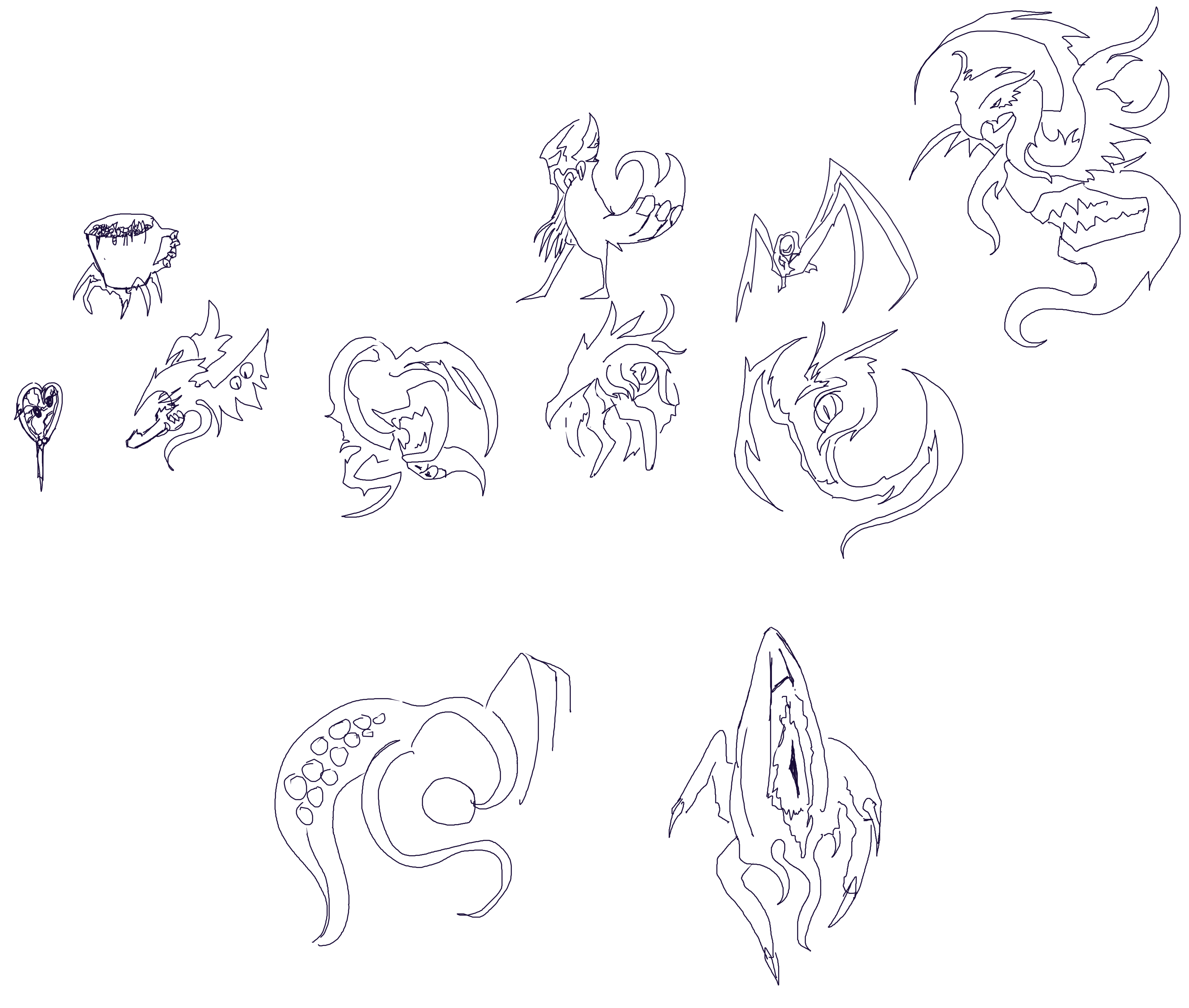 Sketch_Collection_2.png
 Sketch_Collection_4b.png
 Buttheart2.png
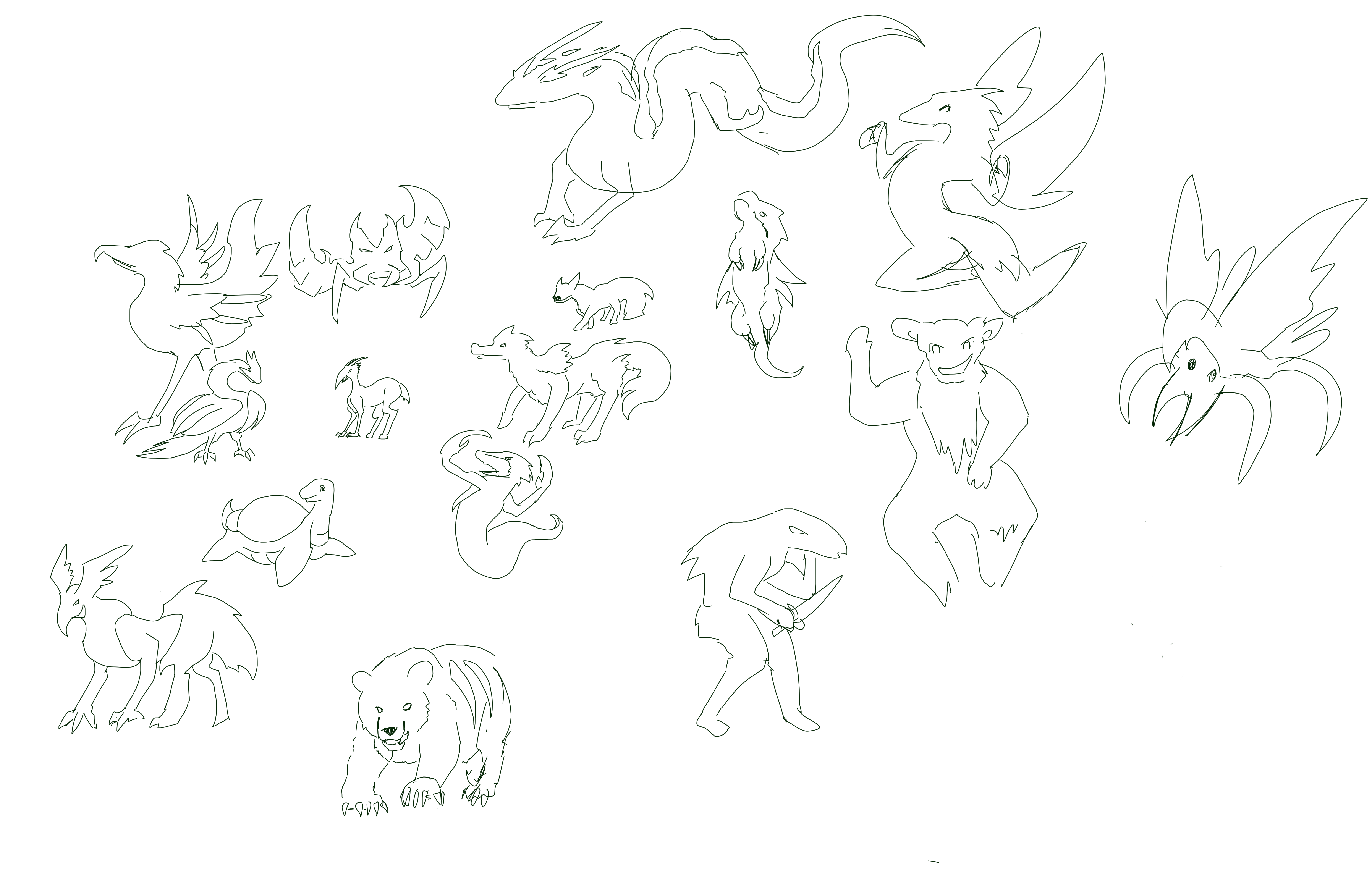 Critter_Sketch_Collection.png
 sketch_collection_3b_1.png
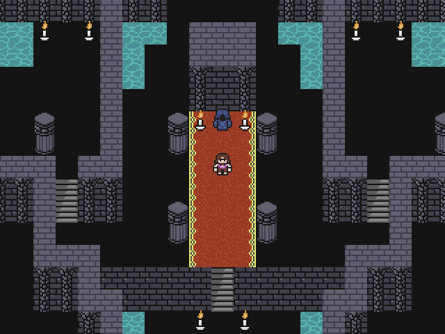 The_Keep.png
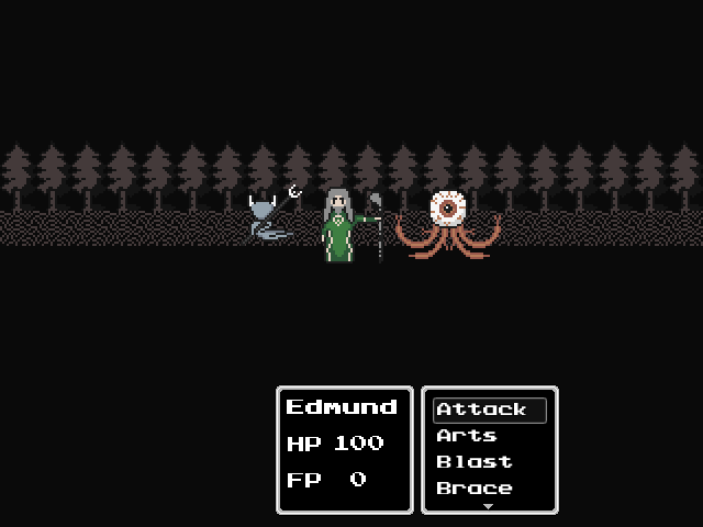 Battle_Layout_WIP.png
 IMG_48771.JPG
 PowerUps.gif
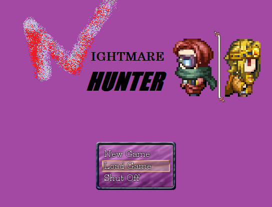 NightmareHunter_3.png
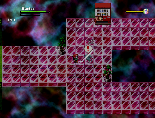 NightmareHunter_4.png
 NightmareHunter_1.png
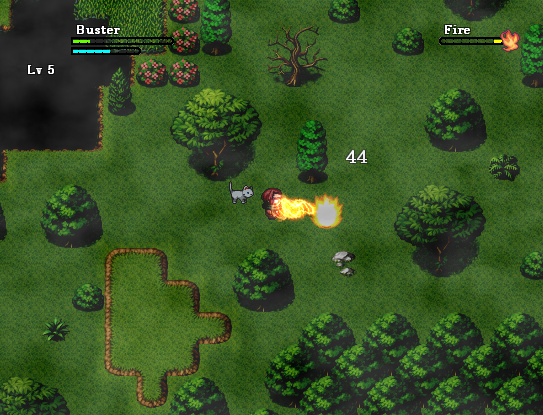 NightmareHunter_2.png
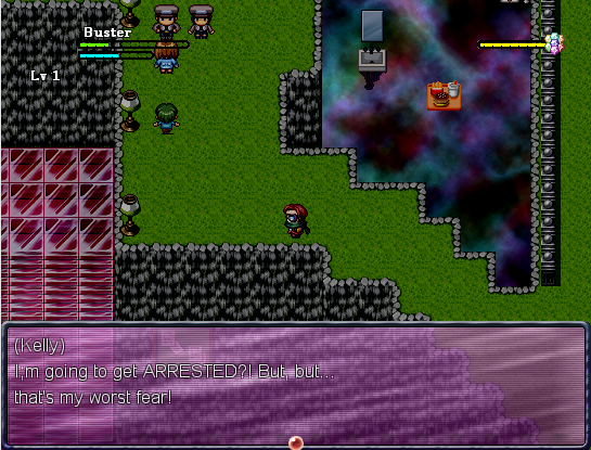 NightmareHunter_5.png
 Test2.gif
 DrAxton_Normal.png
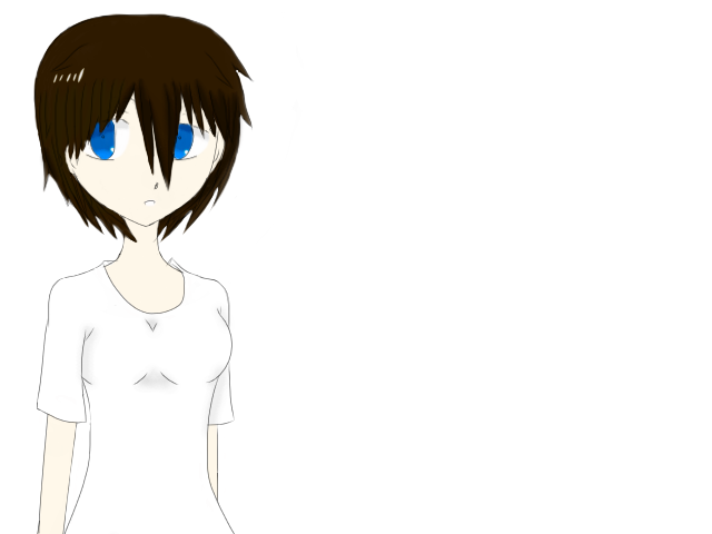 Sona_Normal.png
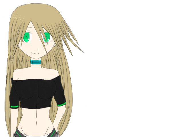 Echo_Normal.png
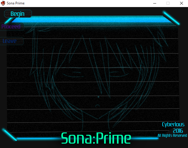 Title_Art.png
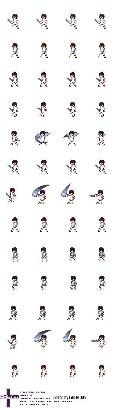 Sona_Battler_1.png
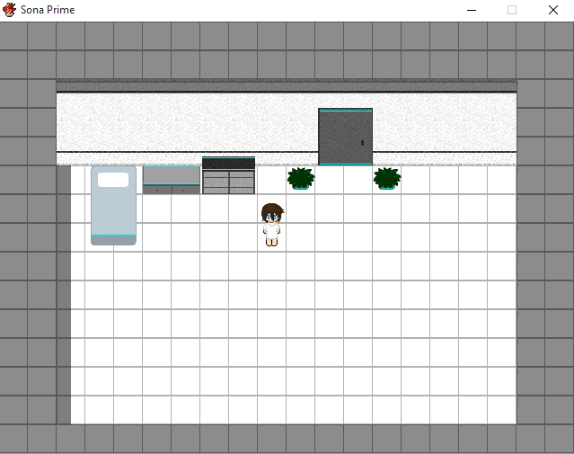 Screenshot01.png
 __38.png
 __39.png
 __40.png
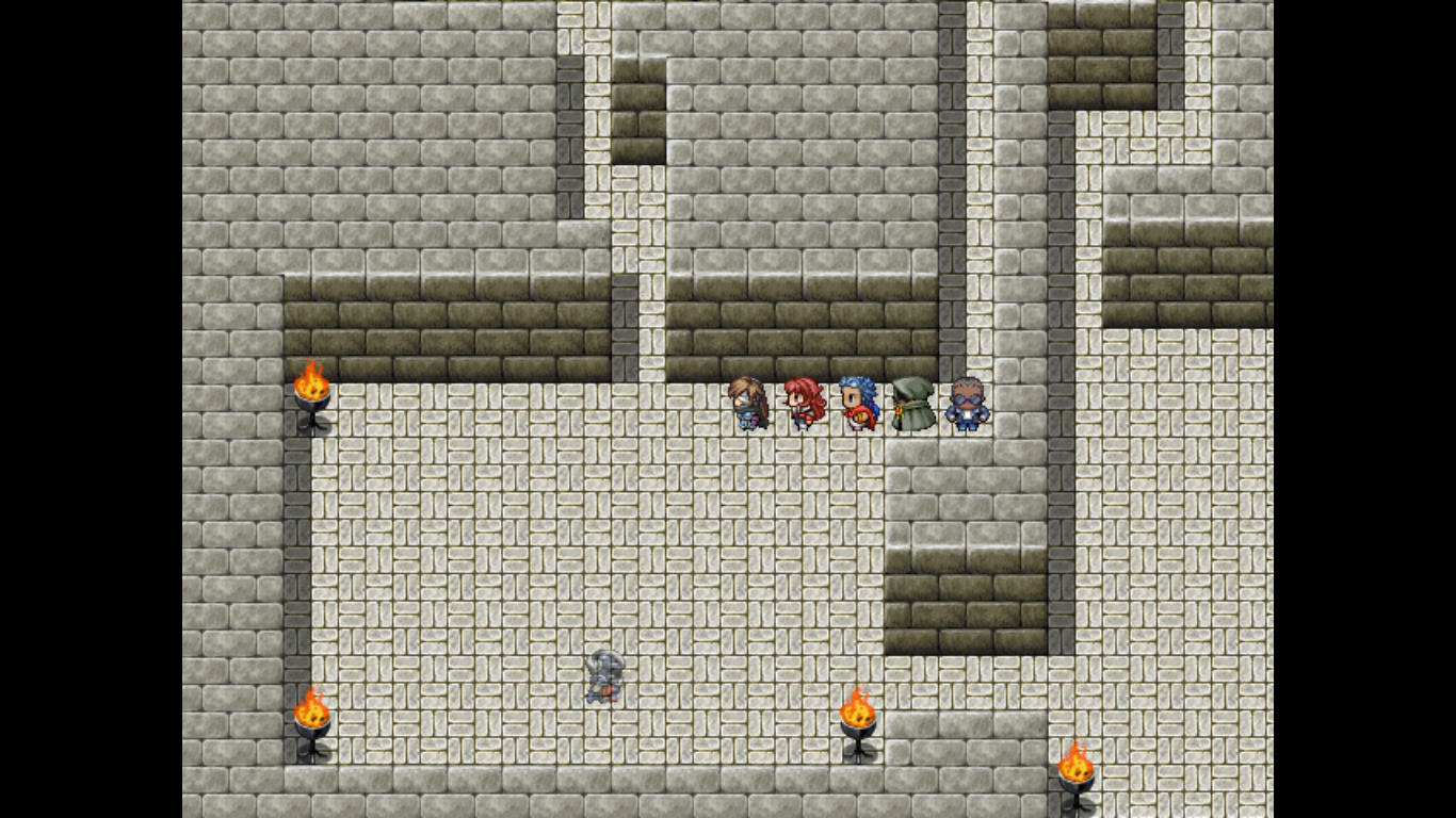 StealthSystem.png
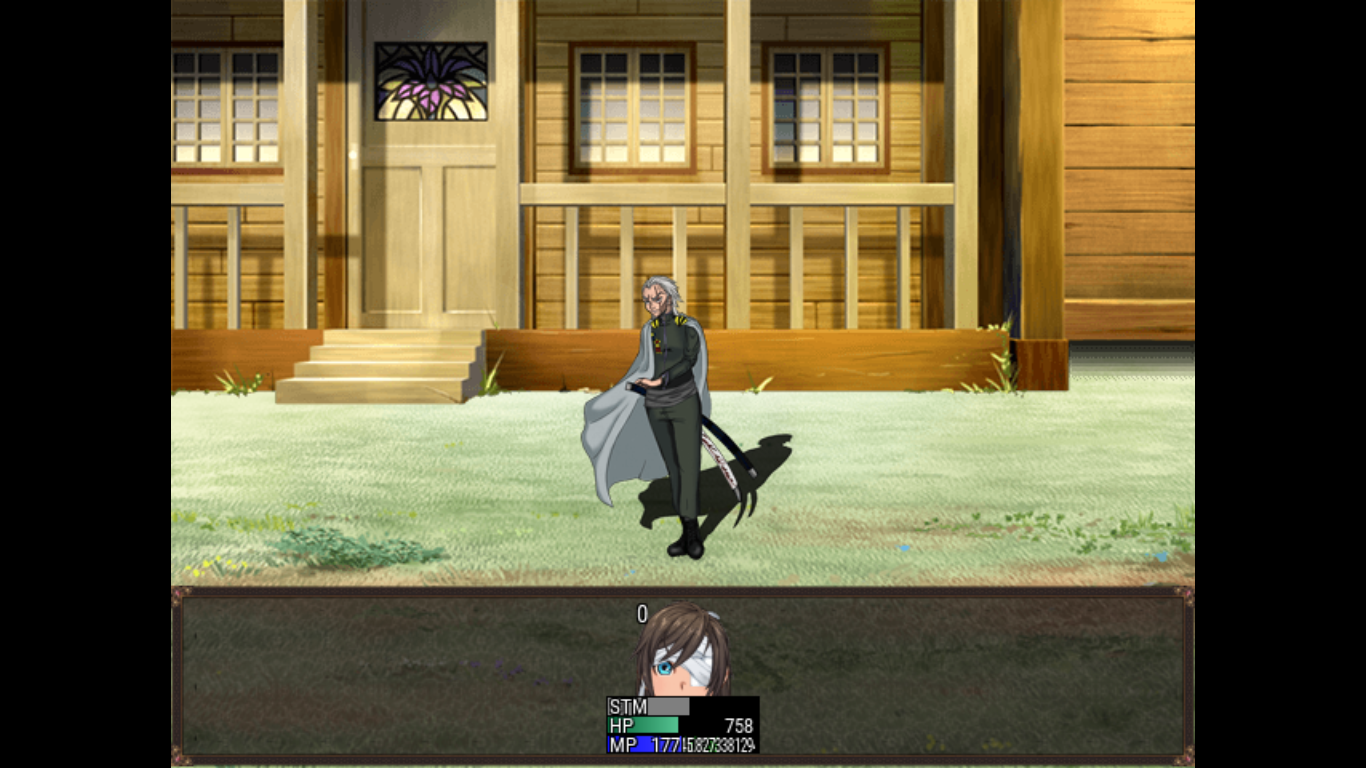 Rival.png
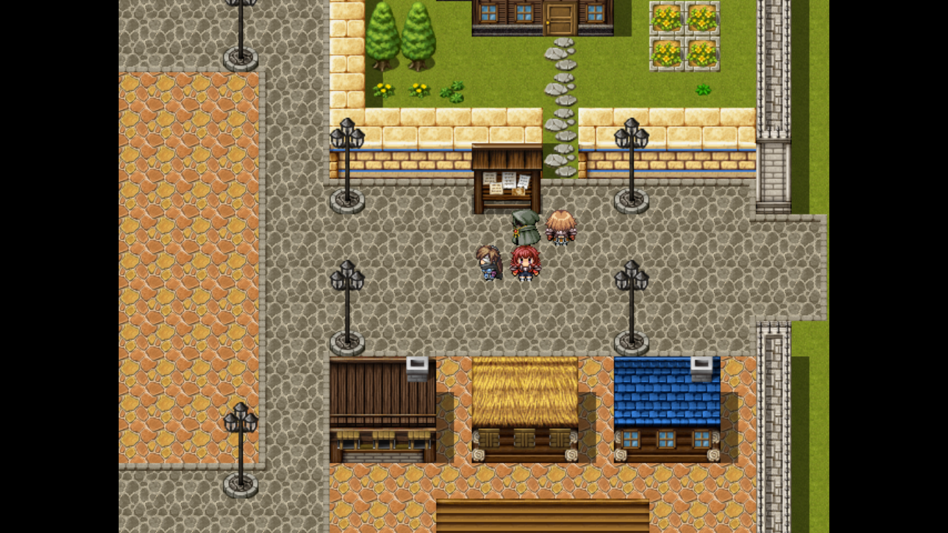 CeltiaInGame.png
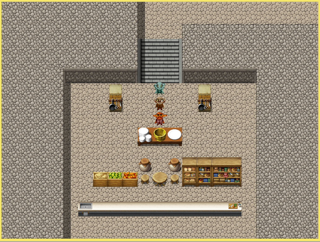 Cooking.PNG
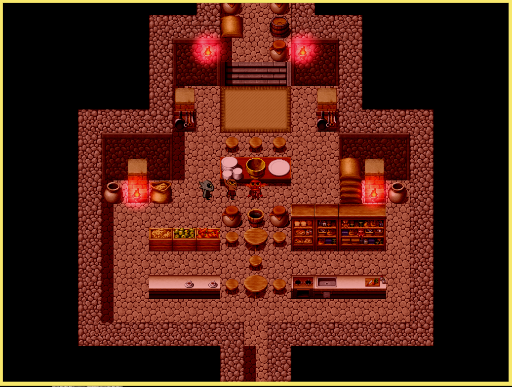 Cookingv14.PNG
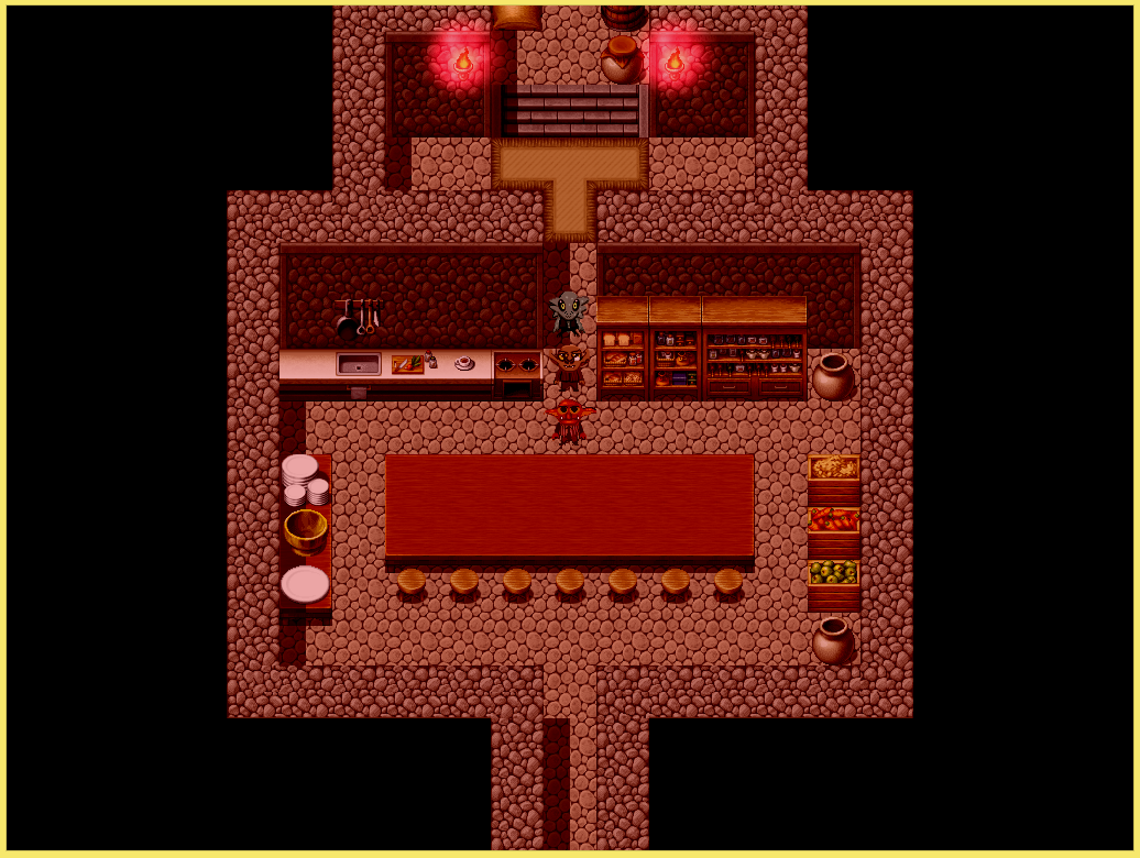 Cooking_v20.PNG
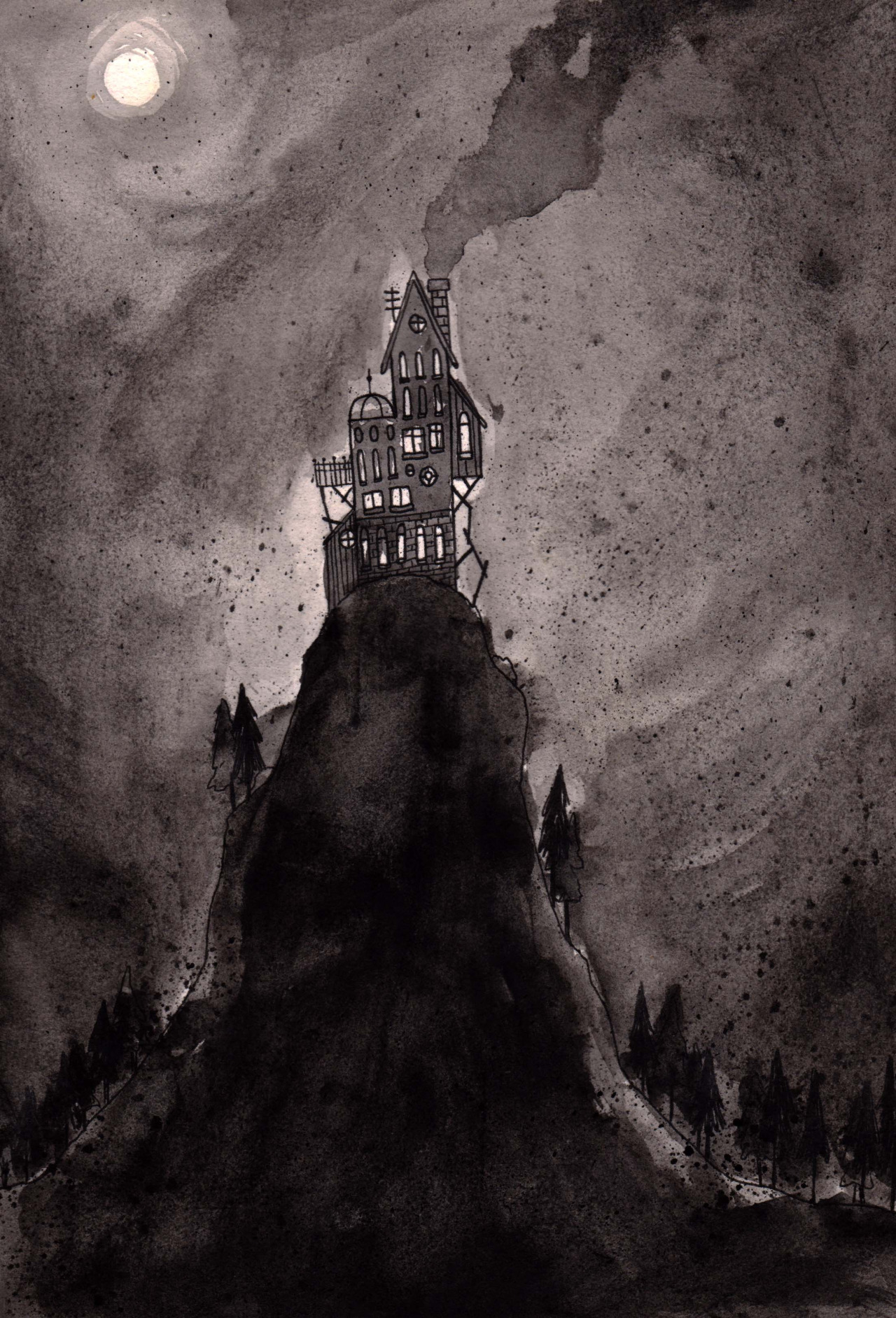 maison_dvasion.jpg
 attic.png
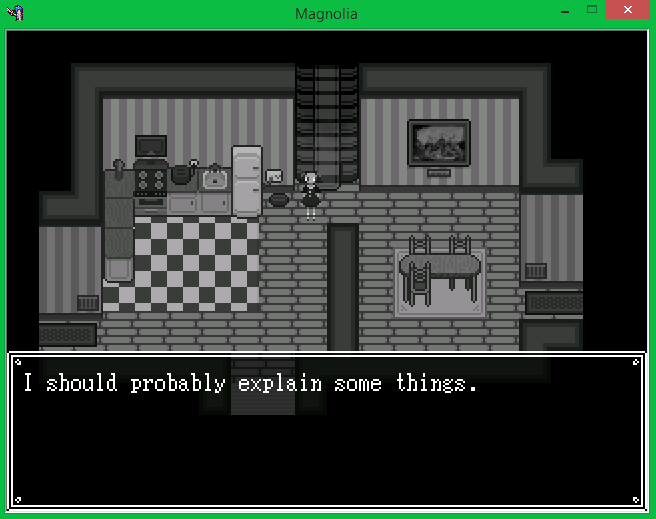 la_cuisine.png
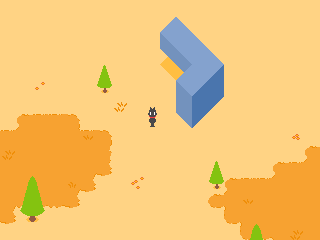 weird_geometry.png
 better_gemetry.png
 waterfields.png
 better_weird_geometry.png
 monument.png
 unfinished_map_layout.png
 title.png
 wordbubbl.gif
 starworld.gif
 1.png
1.png 2.png
2.png 3.png
3.png 4.png
4.png 5.png
5.png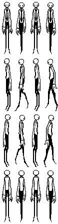 J0e.png
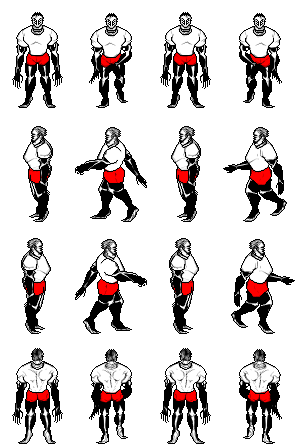 Coach_Imani.png
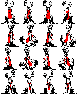 Art_Teachers_Kama_Ananta.png
 Music_Teacher_Amna.png
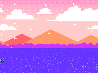 clip0010.gif
 clip0003.gif