


WIP THREAD (NON-GAME ONLY)
Posts
Hahahaa thank you XD
QUESTION.
I'd have some obvious touch ups to do, but which palette does y'all think is more visually appealing.


Edit: Okay, after looking I think I like the last one the most lol. Which means i wasted all that time looking for good blues DX
QUESTION.
I'd have some obvious touch ups to do, but which palette does y'all think is more visually appealing.
Edit: Okay, after looking I think I like the last one the most lol. Which means i wasted all that time looking for good blues DX


LOL Homunculus xD
I really love the middle one, but the last one is a good choice also.
Either way, good work~
I really love the middle one, but the last one is a good choice also.
Either way, good work~

Your works are weally nice, Homu ;w;~
I think that the only problem with the first one is the lack of an intensely light color like in the second and third ones!
(not exactly lack, you basically swapped the light blue shade with the lightest of the bluish gray ones!)
I think that the only problem with the first one is the lack of an intensely light color like in the second and third ones!
(not exactly lack, you basically swapped the light blue shade with the lightest of the bluish gray ones!)
author=JosephSeraph
I think that the only problem with the first one is the lack of an intensely light color like in the second and third ones!
(not exactly lack, you basically swapped the light blue shade with the lightest of the bluish gray ones!)
GENIUS. You're right. I liked the blue but there was something that wasn't quite cutting it for me.
That's a lot of votes for the middleman lol even everyone I asked here at home was like "Middle one plz" Sssssoooooo I guess I'll continue working on the middle one today XD I got so many AA touch ups and fixings to do now DX
Thank you so very very much all :D <3!
he is done lol I can't look at him any longer

Barret ish done

So today I was left wondering what to draw next and a friend recommended my favorite FFT class. I always like monks lol but I don't like the female monks hair and the male looks plane jane so I changed the hairstyle. I GOT SO MUCH DONE LOLOLOL. I still gotta add gloves, boots, and color before I can start doing the actual fun stuff DX


So today I was left wondering what to draw next and a friend recommended my favorite FFT class. I always like monks lol but I don't like the female monks hair and the male looks plane jane so I changed the hairstyle. I GOT SO MUCH DONE LOLOLOL. I still gotta add gloves, boots, and color before I can start doing the actual fun stuff DX
Image of main character + wife


edit: I seemed to have sped full force into uncanny valley! I took a break from this image for a few hours. When I opened it back up it gave me the creeps, haha. I guess I kind of want to evoke this feeling, but when the picture is still unpolished it's kind of shabby and creepy... eurgh
another edit:

had to change the corpse colours of the dude, looked really awful against the girl's pink skin. Anyway, now I can go to bed because this picture is done.
edit: I seemed to have sped full force into uncanny valley! I took a break from this image for a few hours. When I opened it back up it gave me the creeps, haha. I guess I kind of want to evoke this feeling, but when the picture is still unpolished it's kind of shabby and creepy... eurgh
another edit:
had to change the corpse colours of the dude, looked really awful against the girl's pink skin. Anyway, now I can go to bed because this picture is done.
Oh wow, what a difference that skin tone change makes! The pic looks all harmonized now :D
And I think i figured out the mystery of the cloud girl tendrils. Someone had commented on facebook that the picture didn't look very balanced, like the clouds and the girl were fighting for the eye's attention, so maybe the tendrils served as a bit of a break between the two to allow the eye to transition from one subject to the other???? MYSTERY. I did start something new though.
I wanted to take an old piece I did a few years back and translate it into pixels. I may be in over my head once again but will finish this damnit lol.
I KNOW, SEGMENTS OF PALETTES EVERYWHERE, MY WORK SPACE IS A SLOPPY MESS I KNOW I KNOW I KNOW

Okay, cleaned up the area a little

(Original old pic)
And I think i figured out the mystery of the cloud girl tendrils. Someone had commented on facebook that the picture didn't look very balanced, like the clouds and the girl were fighting for the eye's attention, so maybe the tendrils served as a bit of a break between the two to allow the eye to transition from one subject to the other???? MYSTERY. I did start something new though.
I wanted to take an old piece I did a few years back and translate it into pixels. I may be in over my head once again but will finish this damnit lol.
I KNOW, SEGMENTS OF PALETTES EVERYWHERE, MY WORK SPACE IS A SLOPPY MESS I KNOW I KNOW I KNOW
Okay, cleaned up the area a little
(Original old pic)
Your stuff is more organised than mine!
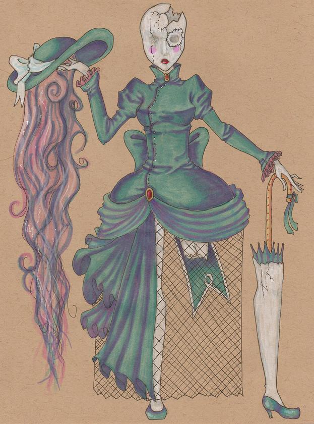
And call me crazy, but I'm assuming you're a Tim Burton fan.
Working on actual stuff for my game, now that I have a substantial amount of character concept art. Faceset in the works for main character:


And call me crazy, but I'm assuming you're a Tim Burton fan.
Working on actual stuff for my game, now that I have a substantial amount of character concept art. Faceset in the works for main character:


Sketched out some taller sprite template stuff this morning. Problem is that I don't really know what version looks better. I'm leaning towards 1 or 2, and strongly towards 1 as it looks more dynamic, but I'm not certain- it might make the characters look like they're standing in an odd manner.
I be working on a gift for a friend. He's finally got the funding he needed for a comic series he's been dreaming about for ages and it's so amazing to see his dream finally come to fruition. He has and continues to pour his heart and soul into Nyobi Lee, which can be checked out on her webpage here so I'm so happy for and proud of that mofo.


Sooz

They told me I was mad when I said I was going to create a spidertable. Who’s laughing now!!!
5354
Your facial anatomy's off. The main issue is that the features aren't conforming to the center line:

This makes your mouths too far to the right side of the image, which causes them to look kinda off.
In addition, the eye on the viewer's right is smaller vertically than the one on the left, and the ear is placed oddly. (Ears are further back and generally align with the top of the eyes and the bottom of the nose.)
Here's a quick adjustment I did (I only fixed the ear in the first face; I adjusted the eye and mouth in all):

ETA: Looking again, there's kind of an issue with the hairline placement in general; it should probably be moved back. Right now, the face is a lot larger than it proportionally should be for the head size.
This makes your mouths too far to the right side of the image, which causes them to look kinda off.
In addition, the eye on the viewer's right is smaller vertically than the one on the left, and the ear is placed oddly. (Ears are further back and generally align with the top of the eyes and the bottom of the nose.)
Here's a quick adjustment I did (I only fixed the ear in the first face; I adjusted the eye and mouth in all):
ETA: Looking again, there's kind of an issue with the hairline placement in general; it should probably be moved back. Right now, the face is a lot larger than it proportionally should be for the head size.

Homunculus, your palettes are really nice and they play out so pretty... Your details are great, too. I love all the winding curves on that true.
I did some lineart for a character, but now I have no idea which way to take the colors...

Messing with colors:
I should try coming up with a palette beforehand, sometime - I usually just start throwing colors down at random until I find something I like. With this one, I don't really mind the palette I ended up with, but I don't know where to go with the color/texture of it, like how to give the hair / clothes a little more detail.
I did some lineart for a character, but now I have no idea which way to take the colors...
Messing with colors:

I should try coming up with a palette beforehand, sometime - I usually just start throwing colors down at random until I find something I like. With this one, I don't really mind the palette I ended up with, but I don't know where to go with the color/texture of it, like how to give the hair / clothes a little more detail.
Ahh, thank you so very much, I freakin love colors XD
I love that character, is it an OC of yours? I'd love to know more about her, I'm in love with her design.
SLOPPY WIP (The text is just a placeholder till I figure out how to pixel the text myself)
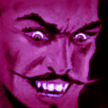
Yes. His facial expression and pose is highly inspired by Nathan Explosion.


I love that character, is it an OC of yours? I'd love to know more about her, I'm in love with her design.
SLOPPY WIP (The text is just a placeholder till I figure out how to pixel the text myself)
Yes. His facial expression and pose is highly inspired by Nathan Explosion.


