SCREENSHOT SURVIVAL 20XX
Posts

Working on (admittedly shitty) graphics for a DQ/FF-like game. I know there's something janky about the triangle tree shading. I didn't want to get too detailed style-wise, but I also don't want just flat colours (I'm aiming for one highlight, one shadow with a base colour, palette-wise.) Is it... okay?
I would split the highlight on the top of the brick wall at the cracks that separate each brick, as that bright line looks kind of strange as is.
The dark outlines are kind of inconsistent (presumably because the graphics aren't finished); I'd add outlines to the flowers & cliff edges, and some basic texture to the grass, road, and cliffs.
The way that the two different tree trunks are drawn makes them look as though they're sitting at different perspectives to each other (the triangle tree trunk looks more consistent with the other tiles). The "fluffy" looking tree looks like it's flat against the background. The trunk could be a little shorter so that it looked like it was somewhat behind as well as under the tree leaves, & I'd make the bottom of the trunk look more rounded rather than a straight line.
The trees especially look like tiny shrubs in relation to the enormous bed & table. Unless this was deliberate, I'd consider doubling the height of the trees/reducing the size of the interior objects.
author=ReMiXI agree with PineBox! That is very crisp!
@pinebox: a larger version of the map i uploaded just above and here's a look at the character
author=ReMiX
@pinebox: a larger version of the map i uploaded just above and here's a look at the character
Amazing work, looks great.
Thanks guys still finalising his design but getting there!
sorry i must have missed this comment before, your absolutely right, now that the tile set is heading in the right direction and isn't far off from being able to implement it into the beginnings of a game i can now look at designing the actual space ship or the game map in it's entirety, and with that in place ill have something to reference the actual room maps too so the mapping will be a lot more logical :)
author=Ramshackin
You've got a nice tileset going, ReMiX!
What about spending more time on how the maps are composed? For example, that top right map doesn't really have anything to see, and as far as I can tell, nothing to do game play wise.
sorry i must have missed this comment before, your absolutely right, now that the tile set is heading in the right direction and isn't far off from being able to implement it into the beginnings of a game i can now look at designing the actual space ship or the game map in it's entirety, and with that in place ill have something to reference the actual room maps too so the mapping will be a lot more logical :)
I just realized I have 11 days to finish my New Year's resolution of creating a proof-of-concept prototype for a game.

One sentence elevator pitch: Persona's school life with Sweet Home's RPG survival horror.

One sentence elevator pitch: Persona's school life with Sweet Home's RPG survival horror.
author=Ramshackin
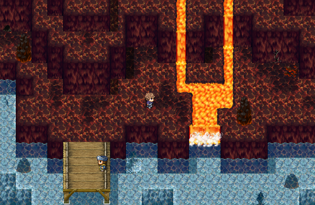
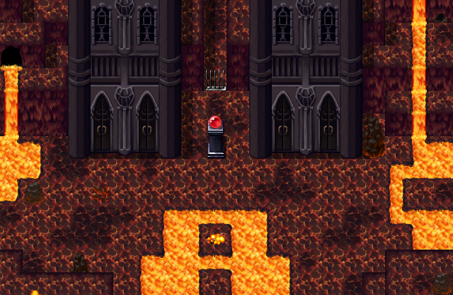
Volcano time!
Volcano time!
I like how there's steam curling off the water as the magma hits it, but you'd also get at least a bit of a growth of black, hardening lava at a spot like that.
@jaybee: Nice room concept art!
Working on the menu system.

I haven't touched RPG Maker in 10 years but seeing how annoying image manipulation still is it's like coming home.

I haven't touched RPG Maker in 10 years but seeing how annoying image manipulation still is it's like coming home.
author=PineBox
I like how there's steam curling off the water as the magma hits it, but you'd also get at least a bit of a growth of black, hardening lava at a spot like that.
You know, I was thinking the same thing. Though I was totally trying to get away without doing the art asset for it ;p
But if people are taking notice, I'll have to get around to it.
Oh man, this game i'm working on doesn't have a page on here yet, I want to get a little more content working in the game first BUT id like to share some early screenshots for thoughts!

The title screen is still a WIP. Id like to have some animation in it, like something in the background running on a Parallax but I don't want it to interfered with readability.
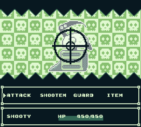
This is your standard combat screen, I need to change "Shootem" to "Fire" so its reads better.
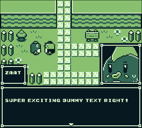
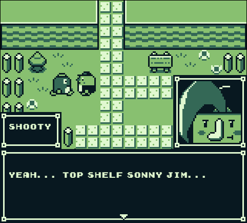
And this is some over-world with the look of the message system.
Obviously I am sticking ridiculously close to the original Gameboys limitations, its been a fun challenge getting RPGMaker MV top run properly in such a low resolution.

The title screen is still a WIP. Id like to have some animation in it, like something in the background running on a Parallax but I don't want it to interfered with readability.

This is your standard combat screen, I need to change "Shootem" to "Fire" so its reads better.


And this is some over-world with the look of the message system.
Obviously I am sticking ridiculously close to the original Gameboys limitations, its been a fun challenge getting RPGMaker MV top run properly in such a low resolution.
author=visitorsfromdreams
Oh man, this game i'm working on doesn't have a page on here yet, I want to get a little more content working in the game first BUT id like to share some early screenshots for thoughts!
The title screen is still a WIP. Id like to have some animation in it, like something in the background running on a Parallax but I don't want it to interfered with readability.
This is your standard combat screen, I need to change "Shootem" to "Fire" so its reads better.
And this is some over-world with the look of the message system.
Obviously I am sticking ridiculously close to the original Gameboys limitations, its been a fun challenge getting RPGMaker MV top run properly in such a low resolution.
Whoa, this looks pretty great. Looking forward to the game page.
@Liberty: Looks all right to me. The thing that stands out the most is the character that doesn't fit the style at all. Other than that compared to the trees the walls are quite big and thick.
@Remix: Those characters looks gold. I look forward to seeing more from the game.
@visitor: I really like just about everything with those screenshots.I'm not sure how strict you want to follow the gameboy limitation. But technically the sprites wouldn't work on a gameboy. They use four colors but on a gameboy one of those colors would have to be the transparency.
I made blood.

I also failed at making blood
@Remix: Those characters looks gold. I look forward to seeing more from the game.
@visitor: I really like just about everything with those screenshots.I'm not sure how strict you want to follow the gameboy limitation. But technically the sprites wouldn't work on a gameboy. They use four colors but on a gameboy one of those colors would have to be the transparency.
I made blood.

I also failed at making blood
@ Momeka - Pretty good. I feel like the blood that starts to get away should continue pulling further away. Also, maybe have a couple spots where it's starting to glob up a bit. Did you make this in RPG Maker 2003 like most of your creations? If so, I would have no idea how to fix it or how you did so well in the first place.
Some shots of newest WIP on RTP. I'm still pretty bad, but improving. Happy Holidays!
Edit: Thanks deth :)
Some shots of newest WIP on RTP. I'm still pretty bad, but improving. Happy Holidays!
Edit: Thanks deth :)
@visitorsfromdreams - Quite splendid! It's amazing what you can do with just four colors. It looks like there's a tiny bit of anti-aliasing on the text - maybe get rid of that to retain the authentic gameboy feel.
@Momeka - I'm not sure how you accomplished that effect, but it looks really cool! It would look awesome on a title screen.
@theloathableone - Hopefully it's just me - I can't seem to get your images to load!
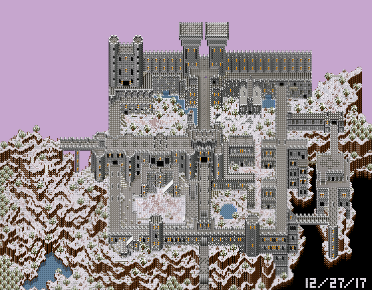
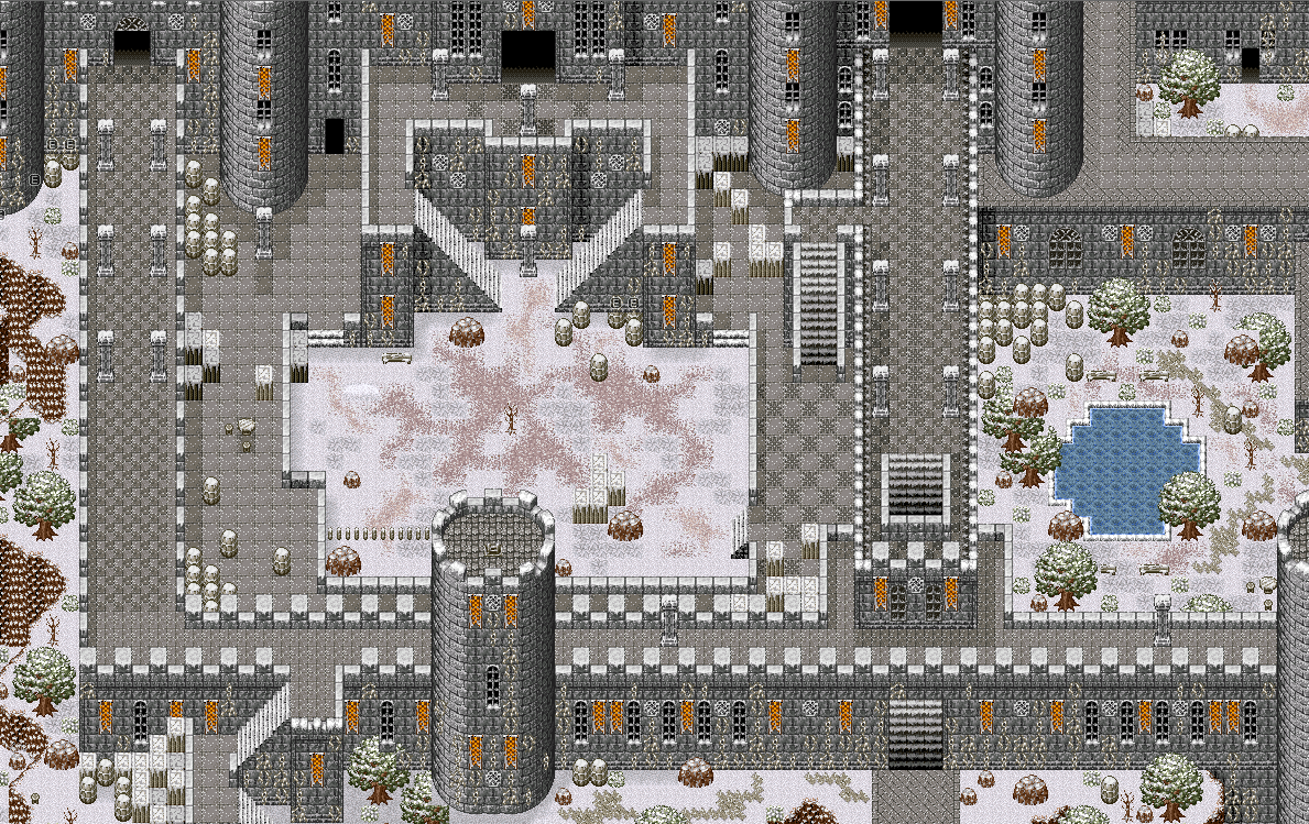
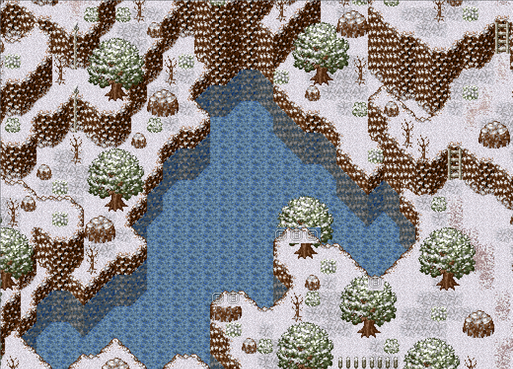
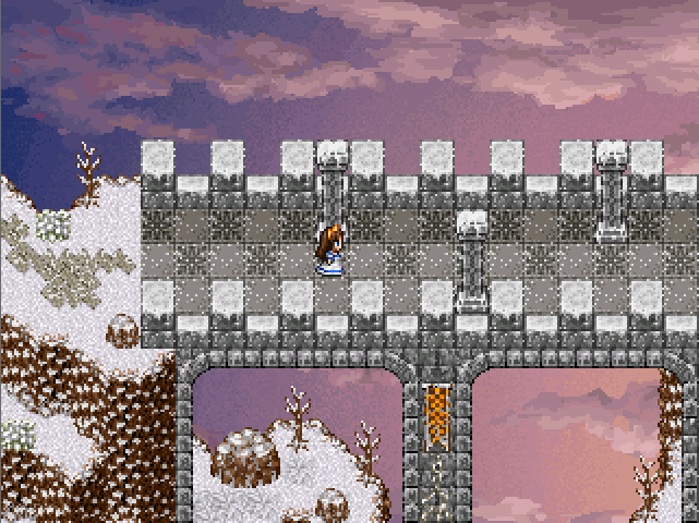
I'm about 98% finished with the exterior map of my game's penultimate dungeon. A major event of the game takes place here. I wanted to make this one ridiculously epic, and whats more epic than a large castle atop a snow-covered mountain? The design of this location is inspired by real-life locations, as well as maps in Demons Souls and Dark Souls. This dungeon is quite lengthy, probably the longest in the game. Hope you brought plenty of healing items!
I still need to add some finishing touches like more vines and such.
I was planning on using that style of tilesets for a small project I was working on, though your maps are infinitely better. I look forward to seeing the finished game.
author=ReMiX
looks nice i get an undertale vibe from it
I still haven't played Undertale but a comparison was inevitable at some point I suppose ha ha. Theirs certainly worse games to be compared too.
author=Pancaek
Whoa, this looks pretty great. Looking forward to the game page.
I'm hoping to get one up in January, I wanted to make sure I had enough content to actually show off and i'm getting close now.
author=Momeka
I really like just about everything with those screenshots.I'm not sure how strict you want to follow the gameboy limitation. But technically the sprites wouldn't work on a gameboy. They use four colors but on a gameboy one of those colors would have to be the transparency.
I made blood.
Yeah, originally I wanted to adhere completely to the gameboys limitations but over time I sort of eased up on that a bit. I like to think of it now as the gameboy as seen through rose tinted glasses now, especially when it comes to the music the composer has been doing for me.
Also, nice blood!
author=dethmetal
Quite splendid! It's amazing what you can do with just four colors. It looks like there's a tiny bit of anti-aliasing on the text - maybe get rid of that to retain the authentic gameboy feel.
I liked that font at first but I definitely think I want to find something that feels more authentic and thinner. UI isn't done yet so that side of things is subject to change.
That first map of yours is crazy!


