SCREENSHOT SURVIVAL 20XX
Posts
top of page edit because I don't have anything I want to show off:
@visitors:
very nice i like
@dethmetal:
So obviously that area is bloody amazing, but this is a feedback topic SO:
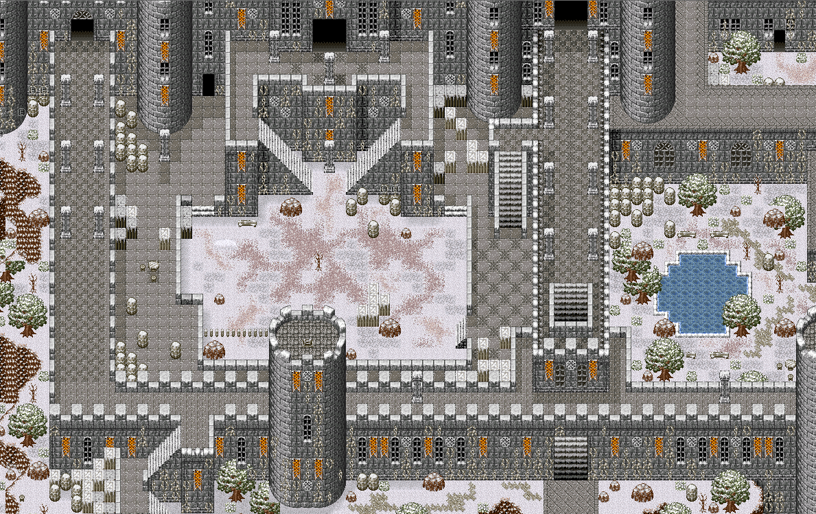
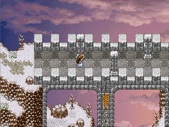
Maybe a drawbridge would make more sense than a stone one? Might be a nice detail with the chains and stuff, and it'd make more sense for an impenetrable fort.
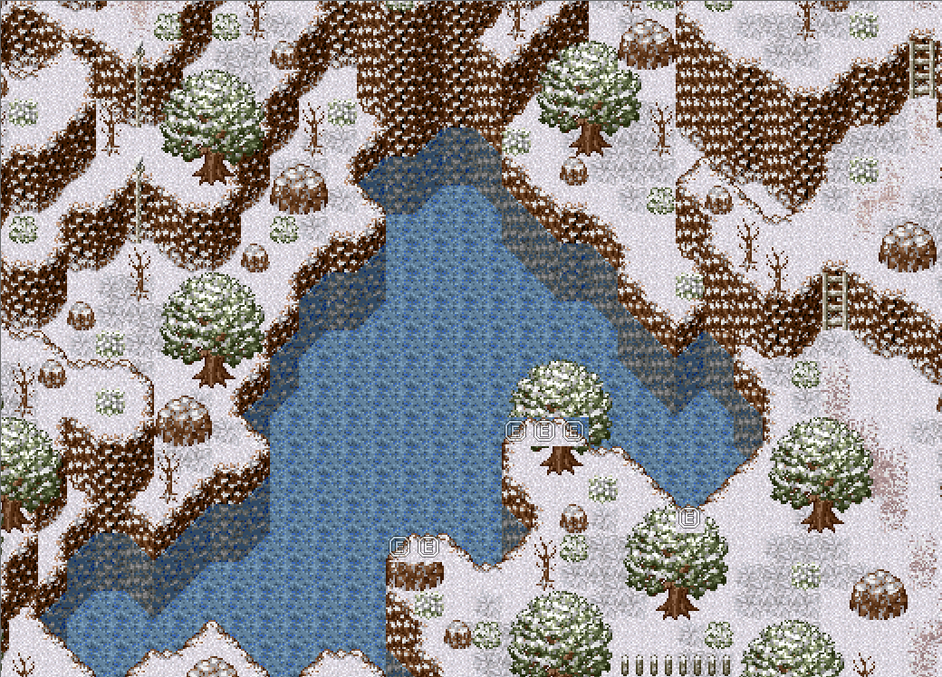
The lakeside is really nice overall (I love the feel of it), but that (presumably secret) rope on the left could be spread out a bit instead of two on top of each other. Given how much the main path winds (a good thing) and how much variation there is in the cliffs, it just seems like there's more opportunity to navigate down to the secret shore than 'hold the down arrow'.
Hopefully the encounter rate here isn't too high so we can enjoy wandering around. :D
dethmetal
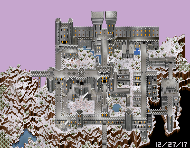
I'm about 98% finished with the exterior map of my game's penultimate dungeon. A major event of the game takes place here. I wanted to make this one ridiculously epic, and whats more epic than a large castle atop a snow-covered mountain? The design of this location is inspired by real-life locations, as well as maps in Demons Souls and Dark Souls. This dungeon is quite lengthy, probably the longest in the game. Hope you brought plenty of healing items!
@visitors:
very nice i like
@dethmetal:
So obviously that area is bloody amazing, but this is a feedback topic SO:
Maybe a drawbridge would make more sense than a stone one? Might be a nice detail with the chains and stuff, and it'd make more sense for an impenetrable fort.
The lakeside is really nice overall (I love the feel of it), but that (presumably secret) rope on the left could be spread out a bit instead of two on top of each other. Given how much the main path winds (a good thing) and how much variation there is in the cliffs, it just seems like there's more opportunity to navigate down to the secret shore than 'hold the down arrow'.
Hopefully the encounter rate here isn't too high so we can enjoy wandering around. :D
Thanks for the advice, Kaempfer! I'll see what I can do. As for encounter rate - my game doesn't have random encounters. You can see the enemies on the map!
The advice you gave me for the draw bridge is a great representation of a dilemma I often face when mapping. A drawbridge would certainly make much more sense, especially in real life. It wouldn't be a problem at all to change, either. But at the same time, I like the look of the large stone bridge. Finding a balance between realism and aesthetics is often tricky.
That's a great point about the rope, too. I'll move the bottom one a little bit.
@dethmetal:
Make a stone drawbridge, then. It's an impenetrable fortress in a world with magic... dolly it up with some chains and cogs for a beautiful set piece.
edit: or don't it's your game and it already looks great
Make a stone drawbridge, then. It's an impenetrable fortress in a world with magic... dolly it up with some chains and cogs for a beautiful set piece.
edit: or don't it's your game and it already looks great
esby you can use the rmweb tilesets well and drop them down without comment all you like but i'm not gonna give them the time of day until you release something >:{
@ESBY I get a really warm and fuzzy feeling from the colors + old school RPG feel from the overall style. I wanna play it.
author=Craze
esby you can use the rmweb tilesets well and drop them down without comment all you like but i'm not gonna give them the time of day until you release something >:{
To be fair, it's someone else's project. He's just doing some of the mappage for it.
Playing around with new tools: (gif quality is low sadly)
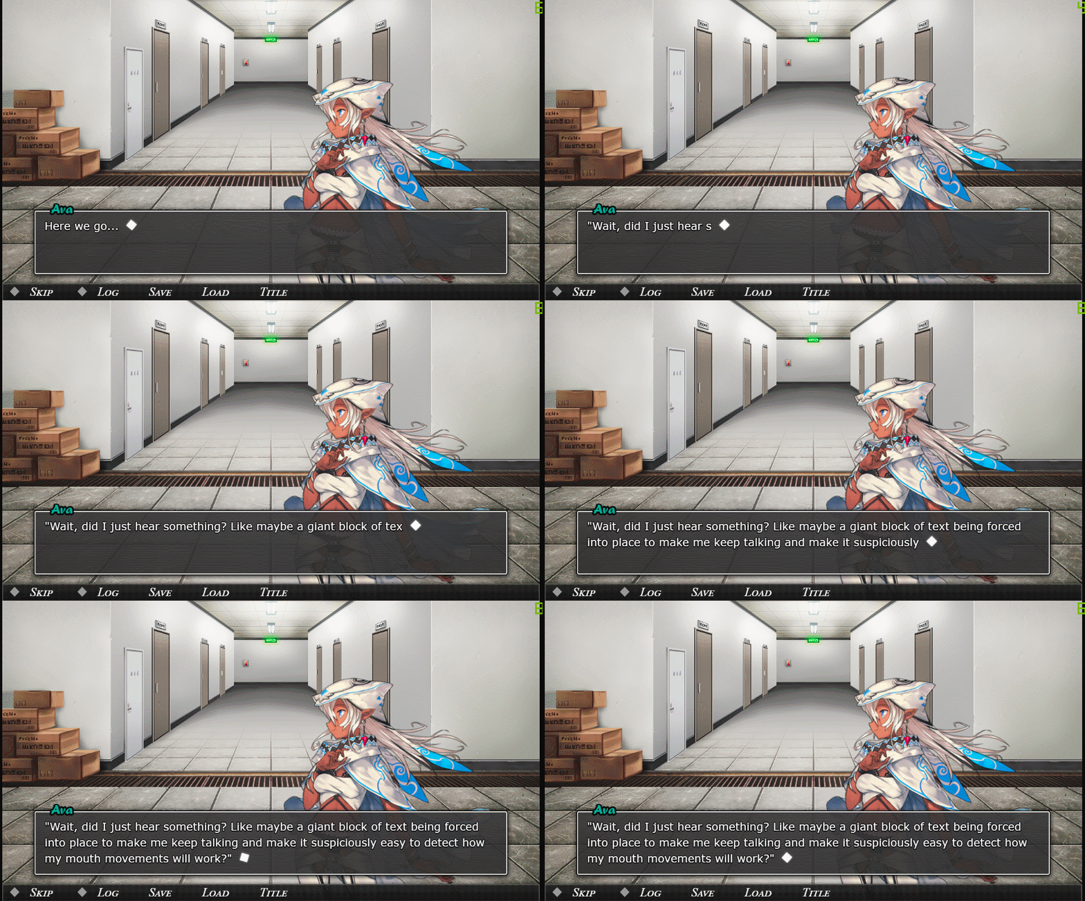
The character is default art from Visual Novel Maker, but it's not animated by default, artist is figuring out Live2D (although it doesn't support the latest version, so she learned a bunch that went to waste.)
Gotta do something simple to get the hang of it before we do something deeper.

The character is default art from Visual Novel Maker, but it's not animated by default, artist is figuring out Live2D (although it doesn't support the latest version, so she learned a bunch that went to waste.)
Gotta do something simple to get the hang of it before we do something deeper.
Hello, Screenshot Thread, old friend.
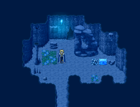


Screens from probably the last game I made in VX, before moving onto MV. It was a good run (late 2010-November 2017).


Screens from probably the last game I made in VX, before moving onto MV. It was a good run (late 2010-November 2017).
W-wow.. XD
Did you draw any of those tiles, Luchino? If so, that's pretty astonishing.
Besides the tiles, those maps have a great tone and sense of "temperature." The interior radiates warmth - the room looks cozy and regal. The blue tint on the other two shots emits a bitter cold.
The only potential flaw (might be kinda nitpicking) is the strong black outline on the character. The sprite itself looks good, but it sorta contrasts with the objects on the map, which don't have very pronounced outlining.
--
Been working with the (very talented) Caladium to further enhance the shading on BR's title screen. The foreground isn't finished yet, but it's getting there. Animated version will be unveiled very soon. ^-^

I may be wrong, but I believe that those tiles are digital art and not pixel art. The sprite is definitely pixel art, though, kind of like the VX/MV RTP; digital art tiles and pixel art sprites. I personally prefer sticking to one style for a game.
That's still a pretty rad title screen. I like the trees.
That's still a pretty rad title screen. I like the trees.
That ice game looks hot.
@Blind - That's some very nice work. Feel welcome to make me title screens too :)
Inconsistent light source. Typically it comes from one side or another just so it's consistent.
Holy shit, Blindmind. That is some sick pixel art!
Holy shit, Blindmind. That is some sick pixel art!
@dorien1010
The hard-edged square shadows clutter the screen, and generally don't make sense. Better to make proper shadow tiles (that are cast from the correct angles of cliffs and other objects, for example), or else just ditch the shadows altogether.
Clearly they're WIP, but the cliffs need to be tidied up - you have grass edges on dirt tiles, irregular corners that don't match the shape of the top of the cliff - and graphics aside, the cliffs themselves are improperly structure. Specifically with the middle tier, it looks like you've merged two different levels of cliffs together.
Outlines are inconsistent in terms of thickness of lines, colour, sharpness, etc. It's not necessarily a bad thing, but perhaps it's better to unify the graphics through a particular style - soft outlines such as the narrow trees, flowers, grass & cliff patterns and the sign, or harder/darker outline like the wooden tiles, cliff edges, stairs, etc. - than use both.
There's a sharply cornered highlight on the narrow tree that doesn't make sense because the rest of the tree looks like it has a puffy, rounded shape.
The shadow underneath the large round tree is too small considering the shadow underneath the triangular tree, which is only slightly larger, is bigger & proportionate to the size of the tree. And the narrow tree doesn't cast a shadow at all (presumably because it hasn't been drawn yet).
The ends of the wooden posts are inconsistent. The top has a diamond shape, and the bottom is a round curve.
The green shape under the large flowers look a bit strange. It's hard to tell if it's the leaves of the plants, or grass that they're growing amongst.
The bush, player sprite, grass & cliff textures, and small flowers look pretty good though. The trees look decent too, but as I said the shadows are inconsistent.
Hope that helps!
The hard black lines that divide the different tile types.
Looking just below the first staircase the division between the dirt and grass is too obvious.
The bottom of the cliff corners don't blend with whats underneath. Also there's no shadows in that area either.


