


SCREENSHOT SURVIVAL 20XX
Posts

well its been an exciting year.
finally moved from rpg maker and now have my project started in a new engine.
now that ive got someone doing the coding ive been able to focus entirely on the design and artwork.
its come a long way in the past year, I think:
(old on left, new on right)
finally moved from rpg maker and now have my project started in a new engine.
now that ive got someone doing the coding ive been able to focus entirely on the design and artwork.
its come a long way in the past year, I think:
(old on left, new on right)


Looking great dookie as always but the new one looks even better!
I'm on a new project that's a point and click and rpg game and so far it's been pretty fun to be on! We plan to have a pretty ambitious demo up this year!

Edit: Hey I don't do double resolution sprites anymore let's give it up for that!
I'm on a new project that's a point and click and rpg game and so far it's been pretty fun to be on! We plan to have a pretty ambitious demo up this year!
Edit: Hey I don't do double resolution sprites anymore let's give it up for that!
Holy shi-
I-I mean! Wow, Dookie, that's some improvement! Nice work!
@charblar
Ooooh, that looks lovely. The hand-drawn aspect to it is great.
I-I mean! Wow, Dookie, that's some improvement! Nice work!
@charblar
Ooooh, that looks lovely. The hand-drawn aspect to it is great.

Beautiful work, Dookie and charblar!

Those maps don't actually look too bad, Saffie. For the second and third though, I'll let you know before liberty does. Carpets don't bend like that. They are mostly rectangles or squares, and they don't bend from the walls. You could do some shift mapping(if you don't know what it is, google it because I'm on my phone and typing takes hella long so I'm too lazy to explain)and have a carpet in each seperate hallway touching each other.


Quick! Have a ghostie!
There's no programming for them yet, but I just wanted to get their battle graphics up and going. Plus, they float!
I had a character like that in a game once(he was supposed to be really wise :p). That's really adorable.

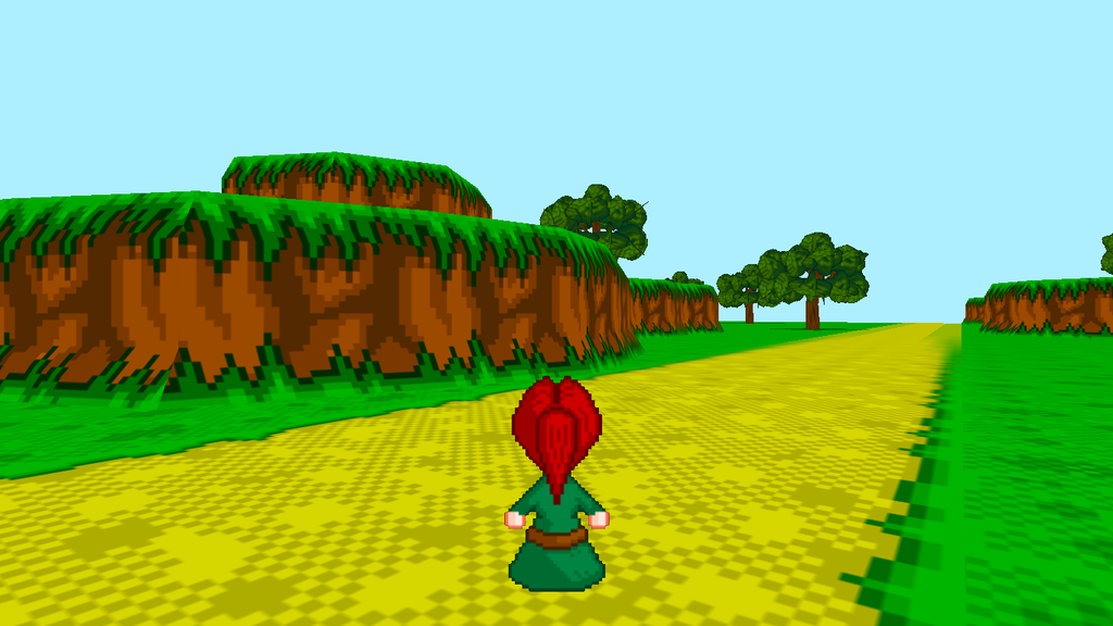
Going for a snes but in 3D feel. Procedurally generated landscape. 15bit color palette(like the snes)
author=Dookie
well its been an exciting year.
finally moved from rpg maker and now have my project started in a new engine.
now that ive got someone doing the coding ive been able to focus entirely on the design and artwork.
its come a long way in the past year, I think:
(old on left, new on right)
Looking good! While the second, more detailed one does look better, there's something special about the super simplistic style of the earlier version.
Constructive Feedback: The roof tiles looks weird since they aren't warped to the cone shape. The staircase/doorway seems to really POP from the castle because of the dark outline... maybe play with the contrast there. Maybe the doorway could have a softer outline, while the stairs keep the darker black.
@Punkitt = I'm admiring the nice menu system more. Nice floating ghosts though.
@grindalf = The right edge at the top of the road is too blurry, even if it is an image in the distance.

@grindalf- Love it man! Reminds me of playstation more than anything
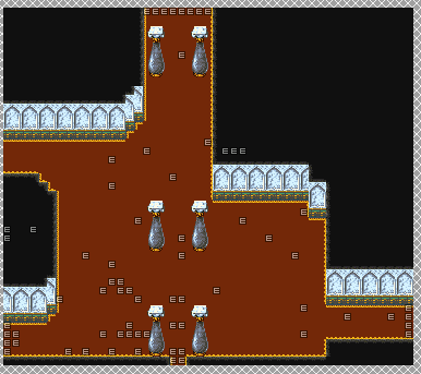
@kory_toombs- I think that screenshot would look a lot better without so many statues, or at least of the same statue.
@kory_toombs- I think that screenshot would look a lot better without so many statues, or at least of the same statue.

@Dookie: I just love how clean your pixel art is. <3
First screens for the new year.


I'm aware of the tiling issue above the cave and the lighter cliffs. Going to fix that today.
A mining town I'm working on. Still need to sprite more mining equipment though.
First screens for the new year.
I'm aware of the tiling issue above the cave and the lighter cliffs. Going to fix that today.
A mining town I'm working on. Still need to sprite more mining equipment though.
@kory_toombs: Same, the statues feel a bit repetitive.
Otherwise, I'd also say it feels a little too squarish but I guess that's more of a downside with the newer RPG Makers and the graphic style they're trying to push.
+++
When I'm trying a new chipset, it always takes me a while to get used to it.
I think I'm getting the hang of it, but this still feels wrong, I'd like to get feedback on this before I start mapping too much of the rest of the town.

This is the chipset I'm using:
I've only found Phantom Legacy using the chipset so I tried inspiring myself from the use there, but feel free to show me other maps using the graphics if you know of any ^^
Otherwise, I'd also say it feels a little too squarish but I guess that's more of a downside with the newer RPG Makers and the graphic style they're trying to push.
+++
When I'm trying a new chipset, it always takes me a while to get used to it.
I think I'm getting the hang of it, but this still feels wrong, I'd like to get feedback on this before I start mapping too much of the rest of the town.
This is the chipset I'm using:

I've only found Phantom Legacy using the chipset so I tried inspiring myself from the use there, but feel free to show me other maps using the graphics if you know of any ^^

@superstroke I like the house, and the stuff on the green. The stairs and stuff below seem weird, out of place, and bland. I think the tower base should move up above the fence tile, so you can see the base.
___
I've been working on furnishing my interiors areas.
___
I've been working on furnishing my interiors areas.

is tracing the rtp the new refmap? luchino has a gritty dos/windows 3.1 feel, at least. infinite's look like a simultaneously flat and beveled (idk how) zelda with extra saturation.
i like the god stained glass though.
i like the god stained glass though.
author=Craze
is tracing the rtp the new refmap?
Why not? Both look awesome to me.

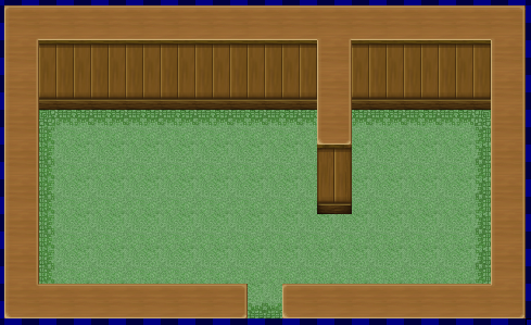
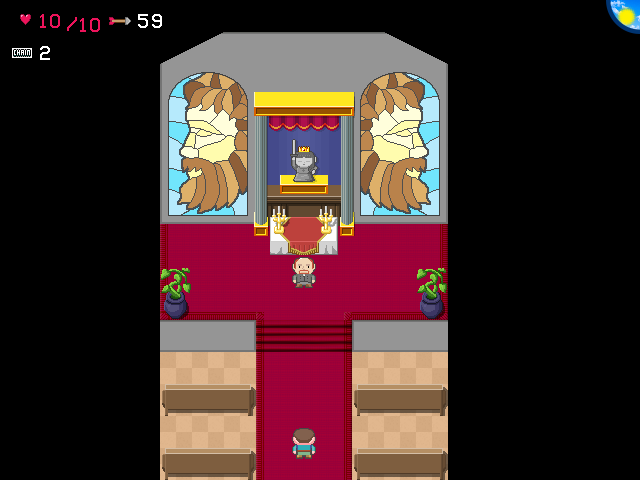
So I'm remapping Pandemonium now after finally getting tired of it (and updating the tileset a bit more):
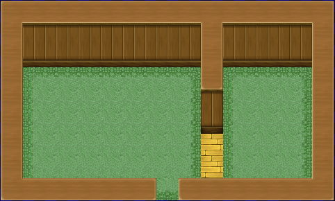
Old map (main entrance. 47x41):
New map (main entrance. 30x30. No events because will have to redo the timing on them and whatnot. Oh boy...):
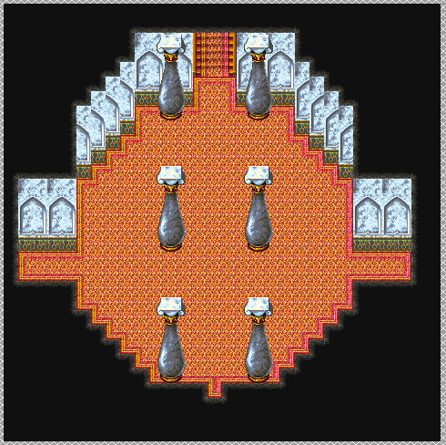
It's kinda bland right now and I don't really have much else to add to the main entrance. But at least it's...circular and more fitting of a palace lobby?? Not much of a palace lobby for the palace of Hell itself but eh...what can ya do, right?? ^^;
Old map (main entrance. 47x41):
New map (main entrance. 30x30. No events because will have to redo the timing on them and whatnot. Oh boy...):
It's kinda bland right now and I don't really have much else to add to the main entrance. But at least it's...circular and more fitting of a palace lobby?? Not much of a palace lobby for the palace of Hell itself but eh...what can ya do, right?? ^^;

