


SCREENSHOT SURVIVAL 20XX
Posts
author=InfectionFiles...doing okay there, Infection?
The tree canopy tiles have always looked off to me anyways, but without trees undetlr them it looks plain dumb lol
...Oh shoot! New page! I better quote my last thing so people can see it.
author=PunkittWorking on creating a desert tileset. I still need to add tons of detail, GUH
A sneak peak at the building's inside, too.
I need to add some more tile variation to everything here. Anyone got any suggestions?
OHANDALSOHEY
I got a gamepage set up for Happup! That other game people seemed to like here!


See, I'm thinking palm trees and more vases...

@Punkitt(spelled it right this time) your maps look very nice but one thing that's been bugging me it that your paths tiles look very square which kinda stands out with angle of the roads and houses. I have some path tiles that you can use to follow the Earthbound isometric-ish angle.

And here's what they look like in action.
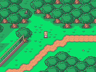
Just a suggestion. Your game is looking very nice either way.
And here's what they look like in action.
Just a suggestion. Your game is looking very nice either way.
Oh goodness, that's been playing me forever. Thank you so much! You don't mind if I recolor these for this, do yo?
author=Punkitt
Oh goodness, that's been playing me forever. Thank you so much! You don't mind if I recolor these for this, do yo?
Of course recolor them as you see fit.

@Liberty, not sure if it's a WIP still, but your water tiles have a slight disconnect between the left/right edges. There's also some stray pixels hanging out on the corner tiles.
@Punkitt, the rest of your screens so far have a "//" perspective, but your interior shot has a "\\" perspective, if that makes sense. Did you mean for that?
@Punkitt, the rest of your screens so far have a "//" perspective, but your interior shot has a "\\" perspective, if that makes sense. Did you mean for that?
Sorta, actually! The interior isn't for the building shown in the other screenshots, sorry. I didn't word that like I wanted to! I forgot nobody has actually seen some of the stuff I've been referring too. :B The interior is for a village area that has a \\ perspective, which is why the house is like that.


Chilly Phease Steak, thank you!! It looks way better now. c:
Chilly Phease Steak, thank you!! It looks way better now. c:

author=Ramshackin
@Liberty, not sure if it's a WIP still, but your water tiles have a slight disconnect between the left/right edges. There's also some stray pixels hanging out on the corner tiles.
@Punkitt, the rest of your screens so far have a "//" perspective, but your interior shot has a "\\" perspective, if that makes sense. Did you mean for that?
Odd, I do see what you mean about the corner tiles of the water. Not sure what caused that! You sure have sharp eyes~ Thanks!
Infinite, I actually like the no-ceiling effect. Also what kind of game is this? Bullethell in RPG Maker? :D
Libery, That's a really moody screenshot! If you don't mind me asking, what kind of pictures did you use for the lighting? Looks like something I'd like to aim for too.
Punkitt, the tileset is coming together nicely. Needs detail for sure, but those cactus are especially nice! Try adding more diagonal stuff to get the isometric perspective stronger. Maybe you could add even bigger sand dunes there?
Oh, I make my own lighting. Basically just make a new layer over an image of the map, then using a very low opacity, soft erasure I remove parts that I want to be shown. Then I add a guassian blur and average blur filter over the top so it's not just circles. With that map I added faint hints of colour over the top (very low opacity) and added another blur treatment.
This is the one I used for that room:

It's set at 200 opacity in the engine and there's a tint applied to the map. It takes quite a bit of tinkering to get it looking good. A lot of back-and-forth editing in the PSP.
This is the one I used for that room:
It's set at 200 opacity in the engine and there's a tint applied to the map. It takes quite a bit of tinkering to get it looking good. A lot of back-and-forth editing in the PSP.
Infinite, I actually like the no-ceiling effect. Also what kind of game is this? Bullethell in RPG Maker? :D
Yeah, it's turning into a type of bullet-hell-zelda-metroidvania-rpg


Hello! I was revising some of the earlier maps for my game and I couldn't help noticing that they felt a little... empty. I mean, when I'm making the nightmare version of school it's a horror game I can take a lot of creative liberties to fill the place up, but when it comes to the actual normal school, it just feels a little bland.
I tried searching around for some actual Japanese school images to model my map after, but they're pretty empty themselves so I'm at a loss :c I tried adding a couple of details here and there but I can't figure out what else to do or if I'm overthinking it, and after spending a little too much time on these maps that the player barely spends any time on, I figured I'd ask for others' opinions c:


(ps I'll probably also add some npcs walking around, but I need to get around to making those sprites)
The first two images have a slightly different tint from the last three because I'm experimenting with the colors to see what fits best. I think I might go with the second tint, because the first one looks like it's near sundown and that wasn't my intention, haha
also I've been lurking around here for quite a while but I've been too socially awkward to say anything oops
I tried searching around for some actual Japanese school images to model my map after, but they're pretty empty themselves so I'm at a loss :c I tried adding a couple of details here and there but I can't figure out what else to do or if I'm overthinking it, and after spending a little too much time on these maps that the player barely spends any time on, I figured I'd ask for others' opinions c:
(ps I'll probably also add some npcs walking around, but I need to get around to making those sprites)
The first two images have a slightly different tint from the last three because I'm experimenting with the colors to see what fits best. I think I might go with the second tint, because the first one looks like it's near sundown and that wasn't my intention, haha
author=SpaceZetaalso I've been lurking around here for quite a while but I've been too socially awkward to say anything oops
say more things come on do ittttt
Personally, I love it! I get exactly what you're trying to convey. The little details like the sink and the mops are really great and add to the environment. I love little touches like that. c:
Other than the sort-of wonky perspective, it looks awesome! Keep it up!
Been working on Happup some more, now that I got that gamepage up.
http://rpgmaker.net/games/8637/

Some shots of a new moon area that I'm working on! I'm adding the NPCs in a bit. I'll update with them once I get them done.
author=Punkitt
say more things come on do ittttt
alrighty then!
tbh, I've been having a hard time dealing with this top down perspective that most rpgs use, so I started experimenting with the isometric perspective on some unrelated maps and I think I like doing that one better c: But, well, considering this game is over halfway done I decided to stick to this to save myself from the headache, otherwise it'd never get finished.
But in any case, I'm curious as to which parts you thought were wonky perspective-wise, so I can see if I can fix them somehow :p
Also can I just say that I really love your style :o I wish I could make minimalist maps look half as good
what to do what to do
Spacezeta, i think those diagonal stairs are a little wonky, but that's the only thing imo. I really like your screens btw! You've pretty much nailed the japanese school feel. Check some Persona games if you want some tips on fow to fill hallways, although I don't see a problem in them as they are now.
Punkitt, i really love that artstyle! I don't understand your map, like how the moon is over there and such, but that makes it even more perfect ^^
Punkitt, i really love that artstyle! I don't understand your map, like how the moon is over there and such, but that makes it even more perfect ^^
Thank you guys so much! Glad it's going over well.
@SpaceZeta
Sorry I took so long! Here, the top door has a front-view perspective, but the bottom door has a top-down perspective. It's nothing major, so you should just roll with it.
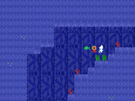
Working on character sprites for a real quick game I'm trying to make in a week. A fish, a squid, an octopus and one more that I haven't decided yet. Octopus needs some work!
@SpaceZeta
Sorry I took so long! Here, the top door has a front-view perspective, but the bottom door has a top-down perspective. It's nothing major, so you should just roll with it.
Working on character sprites for a real quick game I'm trying to make in a week. A fish, a squid, an octopus and one more that I haven't decided yet. Octopus needs some work!

What about something like a manta ray, Punkitt? Super cute, all custom I assume?


My programmer just got the character switching working. Now you can toggle between the party. Each character will have a max of three on field actions they can do.
Dustin the trash can JUMP, RUST(certain shiny objects) and STEELCAST enemies into metal statues you can jump on.
Ratavian can CLIMB ropes and chains etc, GRAPPLE with his little theif rope hook up certain spots, and use GOGGLES to sppt secrets on the map.
You get the picture.
Oh that's supposed to be confetti raining on them when you change characters, I might change or fix that up. I think it would look better with an accompanying sound effect though.
Looks good as always Dookie. Would be cooler with some type of explosion, or poof, when they transform, maybe even a little dance or pose after!


