


SCREENSHOT SURVIVAL 20XX
Posts

So I imagine there is much more I can learn with my mapping... however I do feel like I've come some way too.
This was my first attempt at Bargon Castle when I was working with MV about six months ago.
Edit: Gawd... looking at the original one I made is cringeworthy for me... what the hell is up with those flowers... and the tree rows.
This is my remake when I decided to go back to VX Ace.

This was my first attempt at Bargon Castle when I was working with MV about six months ago.

Edit: Gawd... looking at the original one I made is cringeworthy for me... what the hell is up with those flowers... and the tree rows.
This is my remake when I decided to go back to VX Ace.


author=CashmereCatYeah... gotta agree with this actually. Minus the grass clumps, what you did to the poor floor tiles and the trees, I much prefer the layout and design of the first. (Well, there is the issue with the water walls throwing off the height mapping, too.)
I actually like the original but to each their own.
However, knowing that you're remaking Legion Saga, the second is more akin to the original map.

Nice map, BL. Like a lower res Chrono Trigger feel.
Liberty: That's my fave thing about BoF2 is morphed Katt.
Liberty: That's my fave thing about BoF2 is morphed Katt.

author=Libertyauthor=CashmereCatYeah... gotta agree with this actually. Minus the grass clumps, what you did to the poor floor tiles and the trees, I much prefer the layout and design of the first. (Well, there is the issue with the water walls throwing off the height mapping, too.)
I actually like the original but to each their own.
However, knowing that you're remaking Legion Saga, the second is more akin to the original map.
So... like you mean everything about the map except the Castle design itself, lol. Which I can't even take full credit for the Castle design because I just ripped apart the "Sample Castle" originally and used it as the base... so yeah... *hangs head in shame*
@dethmetal & @zDS: Thank you for the comments!

@Arcmagik - I prefer the first one, too.
I'm finishing up some edits on the RM2k3 chipsets. I can't quite get the trees to group in a way that is satisfying... oh well. Here's a screenie from a mountain pass.

I'm finishing up some edits on the RM2k3 chipsets. I can't quite get the trees to group in a way that is satisfying... oh well. Here's a screenie from a mountain pass.
@Arcmagic:
XD
You'll get there. Give it time~
I think the main issue I have are the tiles used for the walls and roof. It doesn't look like a castle, but instead, a manor house or something. Also, towers are never a bad thing. The design of the first has some issues, but it's not just square stacked on square like the second.
Try experimenting a bit with shape and towers and see how they work. I mean, I'm pretty bad at making castle exteriors too, don't worry. I can envision how they're supposed to be but have trouble putting them onto the map (hence why most of my games with castles usually have a big old wall and a teleport straight inside. XD )
Keep at it! >.<)b
@theloathableone:
I like it. The river edges that are next to the cliffs should probably not be quite so close since they'd otherwise turn into waterfalls, but it's interesting. The far right edge probably could use something there, though. It's looking a bit bare. Also, never underestimate how a flower or two can make a map pop a little, or the importance of LONG GRASS! (Though, granted, the RTP doesn't come with any. Lemme help you fix that:

XD
You'll get there. Give it time~
I think the main issue I have are the tiles used for the walls and roof. It doesn't look like a castle, but instead, a manor house or something. Also, towers are never a bad thing. The design of the first has some issues, but it's not just square stacked on square like the second.
Try experimenting a bit with shape and towers and see how they work. I mean, I'm pretty bad at making castle exteriors too, don't worry. I can envision how they're supposed to be but have trouble putting them onto the map (hence why most of my games with castles usually have a big old wall and a teleport straight inside. XD )
Keep at it! >.<)b
author=harmonicMorphed Katt is a goddamn Goddess. >.<)b
Liberty: That's my fave thing about BoF2 is morphed Katt.
@theloathableone:
I like it. The river edges that are next to the cliffs should probably not be quite so close since they'd otherwise turn into waterfalls, but it's interesting. The far right edge probably could use something there, though. It's looking a bit bare. Also, never underestimate how a flower or two can make a map pop a little, or the importance of LONG GRASS! (Though, granted, the RTP doesn't come with any. Lemme help you fix that:
@liberty - I see what you mean about the waterfall. I actually changed the map a bit to fix the bareness of that right side as soon as I saw it in the upload. Also, thanks for the grass, that's going to help a billion. ^_^
Edit:
I edited the shot in my previous post.
How's that?
Edit:
I edited the shot in my previous post.
How's that?

@Liberty - the second, more gray floor tile looks great. It makes the map feel more colorful and alive, which is totally bizarre to say given the tiles are gray.
edit:
oh wow didn't realize I was a page behind and now no one knows what screenshot I was talking about :(
edit:
oh wow didn't realize I was a page behind and now no one knows what screenshot I was talking about :(
author=theloathableone
@liberty - I see what you mean about the waterfall. I actually changed the map a bit to fix the bareness of that right side as soon as I saw it in the upload. Also, thanks for the grass, that's going to help a billion. ^_^
Edit:
How's that?
Left side of the screen is another place where the water is to close to the cliff right under the far left waterfall.
author=Liberty
However, knowing that you're remaking Legion Saga, the second is more akin to the original map.
That's funny. I noticed that the castle's name was the same as in Legion Saga but I figured it was just a coincidence. I'm excited to see you make more progress! Have you tried contacting Kamau?
author=dethmetalauthor=LibertyThat's funny. I noticed that the castle's name was the same as in Legion Saga but I figured it was just a coincidence. I'm excited to see you make more progress! Have you tried contacting Kamau?
However, knowing that you're remaking Legion Saga, the second is more akin to the original map.
Yeah. I've talked to him about it. I have his permission.

Arcmagic, i like the new one better. It's cleaner and i don't mind that it has some super long rows of tiles. But it's little boring and it may look ugly in-game. One significant mistake i spotted are windows in the ground floor. I would either put ones in wings a tile higher and added smaller cellar windows beneath them or remove windows over the main gate.
I would probably make the courtyard bigger and more structured. I like placing of trees, but long grass seems too random and it doesn't use shifting. Green paths look more like green mess in this case than being subtle. Just turn it in a small french garden with flowers and benches. If you aim for more realistic gritty look, coloring flowers to blend in a little more isn't that difficult.
Roof, if ever visible, needs more details too.
author=Ramshackin
@Liberty - the second, more gray floor tile looks great. It makes the map feel more colorful and alive, which is totally bizarre to say given the tiles are gray.
edit:
oh wow didn't realize I was a page behind and now no one knows what screenshot I was talking about :(
Thanks! I kinda saved over the grey one but it's easy enough to whip up again. ^.^)b

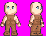
Been working on the Fighter Class character. I'm just not sure what to do with his head/hair
Not sure if I should put a leather cap on or just a spiky hairstyle

author=Arcmagikauthor=dethmetalYeah. I've talked to him about it. I have his permission.author=LibertyThat's funny. I noticed that the castle's name was the same as in Legion Saga but I figured it was just a coincidence. I'm excited to see you make more progress! Have you tried contacting Kamau?
However, knowing that you're remaking Legion Saga, the second is more akin to the original map.


