


MY SCREENSHOT IS BIGGER THAN YOURS!
Posts


I agree Harmonic. As long as the thing works and does it's job, then I don't care about the other details. It's people who want things perfectly done to the tee that pisses me off a bit. We are one person and can only do so much. If I was making Monopolo with that idea, then we would only be 20% done. Better to be 65% then that huh?
Once again, awesome work harmonic! ^^
Once again, awesome work harmonic! ^^

author=harmonic link=topic=1971.msg32894#msg32894 date=1221951184Which brings validity to that it isn't a problem. Designer statements, especially for interfaces, are worth spit without any audience testing which you never stated was done. Its not like designers intentionally make bad interfaces so why would they say anything is wrong with it? Since Karusman (who I assume didn't design the interface) said it worked fine, I'm more to believe that my limited experience (being just the video) is the problem.
Like Karsuman said, it works just fine. He's actually played it.
author=harmonic link=topic=1971.msg32894#msg32894 date=1221951184I did ask if this was intetional for a reason. I don't know your game's mechanics so when damage reported and HP differences don't match its something to bring up and ask about. Somebody who has played the game thought there was an error and all I've seen is that video. I don't know how you expected people to magically know that tidbit of info that explains what is going on without asking questions.
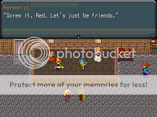
And you're dead wrong about the damage display. When you take 199, you lose 199, and it displays 199. She lost an extra 8 because she had the bloodlust buff/debuff, which ticks away 3 per turn, and an item that ticks away 5 per turn.
author=harmonic link=topic=1971.msg32894#msg32894 date=1221951184Because holy shit how dare someone offer suggestions (of questionable worth) and ask questions about a gameplay video.
I guess everything on the internet has to have an angry nerd with nothing better to do bash it.
You asked me if a mistake in my CBS was intentional. A mistake that exists only in your imagination.
Nevermind all this. I'm not going to change anything and nothing is broken. Moving on!
Nevermind all this. I'm not going to change anything and nothing is broken. Moving on!
I wasn't the only one who thought it might've been a mistake. Anyways this isn't going anywhere (like every other Internet argument) so lets drop it and get back to screenshots before it ends up being another page of the same stuff.


author=Euphorian link=topic=1971.msg32891#msg32891 date=1221941028
Ness- The menu itself is alright, but jesus, that background is amazing. Does it change depending on where you are in the game, or is that what it always is?
Yes it changes :)

And you're dead wrong about the damage display. When you take 199, you lose 199, and it displays 199. She lost an extra 8 because she had the bloodlust buff/debuff, which ticks away 3 per turn, and an item that ticks away 5 per turn. And no, i'm not going to have the damage display indicate little per turn ticks like that. Nor am I going to do anything about your silly argument that my formation is broken.
I guess everything on the internet has to have an angry nerd with nothing better to do go into an over-the-top rant about it.
Harmonic, you continue to be about THE WORST AT TAKING CRITICISM out of everyone who has ever actually released a complete RPG Maker game. Your ability to produce complete games combined with your total inability to take any advice is astonishing to me.
Well actually, I think maybe indy, the creator of Laxius Power, has a slight edge on you in being a game machine who doesn't care what people think and dismissively ignores it with (passive) aggressive comments, but then again, he has a language barrier going for him. Being French, he can't actually UNDERSTAND most of the complaints about his games. Your ability to speak English and completely ignore all criticism is...astonishing, to say the least.
My comment is made, by the way, so if you feel you need to respond, no doubt dismissing my allegation that you always dismiss criticism without listening to it, take it to PM. My intention wasn't to create "drama" in a thread that should be full of screenshots.
author=Demicrusaius link=topic=1971.msg32912#msg32912 date=1221962106
Here's my totally unrelated screenshot.
This is hardcore winnebagopunk.

Max: The forest was already burnt and you set it on fire again. :<
Okay, I am not going to take anyone's side, but due to what is going to overflow into an excessive amount of drama, anyone that mentions this whole battle system thing again will get their post deleted and receive a verbal warning from me. Just take the shit to PM if you want.
So let it die plz.
Edit: Harmonic's post is the last I will have on this subject.
Max, you can't throw down the gauntlet like that and expect no response. THAT post should have been in PM's, because it was over and done with, and you decided to continue the drama and make it much, much worse. So no, my response is going to be public despite your request.
Also, don't speak so confidently about things you know nothing about. How do you think I completed this CBS? How do you think I have made anything refined and complete? Constructive Criticism. You just don't see it happen, because it's not done on forums. People beta tested the hell out of LoD1, and I changed a lot of it accordingly. The thing is, they gave actual criticism about actual problems. GRS (sorry Red, I'm only using this as an example.) Criticized something that doesn't exist, and continued to press on and on about it.
I respond to constructive criticism constantly. I talk to a few RMN members on instant messangers regularly, showing them screenshots, bouncing ideas, changing things accordingly. I don't post screenshots and videos hoping someone will imagine up a problem that doesn't exist, and harass me about it. I refuse to indulge ignorant and bad criticism, which you are confusing with ALL criticism.
So no, your statement is not only completely false, but blatantly ignorant, extremely flame-like, and unnecessary. That subject was over with. Now it can go to PM's if you feel you must continue this nonsense.
EDIT: This was posted 1 second after Karsuman's. I think I deserved to defend myself publicly anyway.


@Karsuman: Atmosphere is perfect! And I love minimaps. Idk about the fences, does it go around the whole village? Might feel a bit restricting.
It's actually a large city(just an alley area), and yeah, the fences are everywhere. I might get rid of them, but to be honest the result would be insignificant. Very few NPCs are outside besides guards.

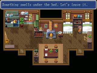
@Little Wing Guy: It looks very nice, however the cabinet covering the window bothers me. The left side is fine as is, no need to clutter it.
author=Little Wing Guy link=topic=1971.msg32988#msg32988 date=1222033246
It's a house! The left side looks a lil bare, what should I do with it?
Dude, I love your style. I can't wait to play one of your games.
author=Demicrusaius link=topic=1971.msg33020#msg33020 date=1222045747
Dude, I love your style. I can't wait to play one of your games.
Really? Thanks, but it's just refmap, most people are sick to death of it.
Ashramaru, I didn't even notice the window was cut in half! Good eye, i'll change it. I'll leave the left side alone, although... cluttering is my speciality.

author=Archeia_Nessiah link=topic=1971.msg32865#msg32865 date=1221900907
While I like the colors and border designs, the spacing and negative spaces are just really awkward, I think you can organize this a whole lot better.
Think more "Compact" ...just a bit.

