


SCREENSHOT SCHMEENSHOT
Posts


author=Blindmind link=topic=2555.msg54000#msg54000 date=1231130952
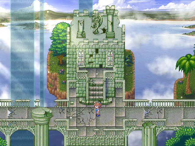
Haha lighting effects. View the entire map below:

That's very nice. You have really improved in terms of making a clear structure and path in your maps as well as lightened up on the clutter + 100 types of trees/bushes.

@Blindmind: One uniform tileset style, all the tiles fit together, no cluttering effects? Wow has little Blindmind grown up in Map Development. Looks very nice and easy on the eyes, good work.


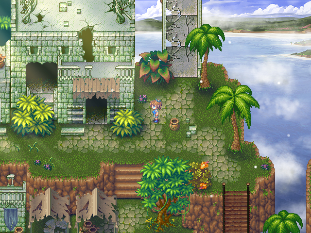
Selva - the first city in RealmS.
I had to redo the damn thing from scratch because of an unfixable map tree break (yeah I tried the fix but I must have done something to stuff it up even more.) But that's okay because I had a backup missing only Selva and a cave. Everything else was a-okay!
It needs more NPCs but thought I'd check for any suggestions.


@Lib - My God it's so cute.. Who knew after all these years RTP would still appeal to me. Good job seriously, I eagerly await your release! Also those little doors are adorable haha.
@DD - Hey you improved your mapping.. Though only slightly. Only problems I see are the shape of the map and the size of that sword, I mean it's almost twice the size of your characters.
I'd say try looking at someone elses game that used that same tile and compare it with how you've done yours. Only game from the top of my head I can think of that used that tile is Legion Saga III. Download and open up the game in the editor to see the difference.

Liberty: I love it. I want to play that game. I never even considered using FF4 style sprites and 1-square-tall buildings.

author=Tau link=topic=2555.msg54680#msg54680 date=1231475220
@DD - Hey you improved your mapping.. Though only slightly. Only problems I see are the shape of the map and the size of that sword, I mean it's almost twice the size of your characters.
I'd say try looking at someone elses game that used that same tile and compare it with how you've done yours. Only game from the top of my head I can think of that used that tile is Legion Saga III. Download and open up the game in the editor to see the difference.
Thanks and yeah the sword is currently a replacement till i find a better one.
@Tau: Thanks! I try to make the RTP look as good as I can ^.^ I'll make sure to let you know when I do release it. <I'm glad you like the little doors. ^.^>
@harmonic: Thank you. I actually got inspired by Kentona's Hero's Realm graphic wise which led me to create RealmS in the first place. And technically most of the sprites are DQ/W edits and recolours. ^.^
Kudos Kentona!
@AZN: ^.^ Thank you. A little effort really does go a long way, neh?
@harmonic: Thank you. I actually got inspired by Kentona's Hero's Realm graphic wise which led me to create RealmS in the first place. And technically most of the sprites are DQ/W edits and recolours. ^.^
Kudos Kentona!
@AZN: ^.^ Thank you. A little effort really does go a long way, neh?

Liberty, quit making my game look like crap. Also, I have made 1x1 tile doors I made for Hero's Realm you can snag (if you haven't already).

Posted on GW, might as well do it here. Game's coming along nice (projected game time 30min - 1h, so don't expect an epic).


Wow, damn. That looks really, really impressive, DE! I've always loved your art style.
A new title screen to reflect the new game of my game. It's not done, but I'm not sure what else I should do. Suggestions, please?
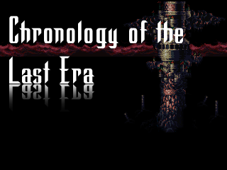
A new title screen to reflect the new game of my game. It's not done, but I'm not sure what else I should do. Suggestions, please?


author=DE link=topic=2555.msg54765#msg54765 date=1231536028
Posted on GW, might as well do it here. Game's coming along nice (projected game time 30min - 1h, so don't expect an epic).
This, FTMFW.
BadLuck: Looks really good, except that bridge going north really conflicts with the orientation of the panorama.
DE: That looks sweet. What game is it, and what is it made in?
Mog: I can't see anything because I'm at work, so its blocked. I'll comment at home.
DE: That looks sweet. What game is it, and what is it made in?
Mog: I can't see anything because I'm at work, so its blocked. I'll comment at home.

