


SCREENSHOT SUPERBOWL SUNDAY
Posts

Since it was about that time (and the old topic digressed into a discussion on language) here is the new SCREENSHOT TOPIC! (huzzah!)
To start, here is the character selection process in Hero's Realm in screen-captured action!

I think that brandonabley missed these screens when I released them over a year ago...
Anywho, I'm proud of them nonetheless!
To start, here is the character selection process in Hero's Realm in screen-captured action!
I think that brandonabley missed these screens when I released them over a year ago...
Anywho, I'm proud of them nonetheless!


Wow, i don't think i've ever posted screenshot in any of the threads.
But hey, first time for everything.
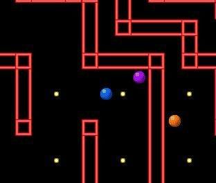
Two screens for PBS2. I like them
But hey, first time for everything.
Two screens for PBS2. I like them
You should change the background of the score/lives box to match each level's color.
Other than that, looks passable for an arcade game.
Other than that, looks passable for an arcade game.

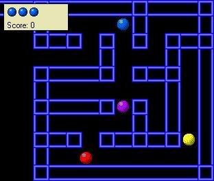
kentona: Your menus make character selection fun :) And they make it hard to choose between characters since they all seem fun to play. :P
That's pretty badass, Orig. 8) The only thing that really bothered me were the chairs in front of the bar (2 facing out, then 3 in). It seemed too even and unnatural (maybe it's just me, though). But, nice work!
author=Orig link=topic=3024.msg58941#msg58941 date=1233182459
"Dammit, they're out of Pinot!"
That's pretty badass, Orig. 8) The only thing that really bothered me were the chairs in front of the bar (2 facing out, then 3 in). It seemed too even and unnatural (maybe it's just me, though). But, nice work!

author=kentona link=topic=3024.msg58896#msg58896 date=1233172452
Since it was about that time (and the old topic digressed into a discussion on language) here is the new SCREENSHOT TOPIC! (huzzah!)
To start, here is the character selection process in Hero's Realm in screen-captured action!
I think that brandonabley missed these screens when I released them over a year ago...
Anywho, I'm proud of them nonetheless!
I would like to play this game.
May I have it now?
@Orig: Metal.

These are just the final in-modeler things, but for the fan-game contest I'm working on I'm doing a 2.5D platformer, and thinking about having a space-ship part of the game too (since the fan-game is based on a space series and the ship is pretty central).


Testing Leventhan (of rmrk.net)'s "Leviathan" windowskin. A bit gaudy IMHO, but better than the RTP.

author=Anaryu link=topic=3024.msg59872#msg59872 date=1233464161
http://www.youtube.com/watch?v=1VVE6b8SMp8
Now on to actually designing the levels at last!
I was going to say that is not a screenshot, but then I realized it is far more awesome than a screenshot could ever hope to be.
Lmao, I like when the clones come out to play! That was the best part of that movie.
Looking sweet Anaryu! ^^
Looking sweet Anaryu! ^^

Been working on my ABS
You now cannot attack the enemy unless he is attacking you.
The enemy hp bars are bug free now.
I fixed all the lag associated with the system.
Status Effects are now displayed above your health. (you can see it in the video when Tristam is fighting the blue slime, and then I heal him w\ the antidote, VOILA status icon gone
http://www.youtube.com/watch?v=JSkp47A1mN0
Any comments (about the ABS, not the tileset please, I know the grass clashes)
*GASP! No youtube bb code?! What rubbish! :D
This is actually miles ahead of what you showed us back on GW awhile back. :)
1.) I love the energy bars underneath the enemy, I found it to be quite a useful feature when your character was walking by trees, it's nice to know where the monsters are so they don't ambush you! Nice!
2.) The tileset to me is actually fine, I'm not so much a mapping whore as most people, so I think it's cool! ^^
3.) Lol = people working without noticing you fighting the slime.
4.) Also Lol = At the blue slime with no life bar.
5.) I kind of have mixed feelings about using items, on the bad side, it might take some challenge away just to use unlimited items...where as it would be cool to have a ring or something, use a item...wait 10 seconds, and use it again. But on the good side! I like it actually and you should stick with it, reminds me or Rogue Galaxy quite a bit. Using unlimited items before rushing in.
6.) The character needs a bit more animation or feeling when attacking. The HUB could be a bit better thought.
Otherwise looks cool Nack! Better then the previous movie! Bravo! :)
Edit: Remove the character after the menu disappears. Don't wanna pull a Skie! ^^

First of all, the combat looks boring. There's nothing appealing about it, there's no strategy at work here. You're just facing the monster and hitting the attack button while it aimlessly wanders around. I'll admit you have the basics of an ABS down in an RPG maker typical format, but that's not saying much. A lot of RM ABSes seem to miss actual mechanics that make the game fun.
Please change the opening of the menu, it takes too long to access. No player wants to see the menu slowly zoom in, there is no point to it. Make it instantly pop up.
Please change the opening of the menu, it takes too long to access. No player wants to see the menu slowly zoom in, there is no point to it. Make it instantly pop up.
@S4D: Yes I havent been able to stop tinkering with it and slowly adding more shit. The video is already old, the blue slime bug was fixed ^^. And if I can ever find a graphic artist ill replace the sprite animations too.
@Darken: Yes this is in fact the general consensus I have been getting. But the question then is, what would make it fun? What exactly would it take to make it more fun for you? There is only so much I can do in the way of AI...
@Darken: Yes this is in fact the general consensus I have been getting. But the question then is, what would make it fun? What exactly would it take to make it more fun for you? There is only so much I can do in the way of AI...

