


WE DID IT FIRST SCREENSHOT THREAD
Posts
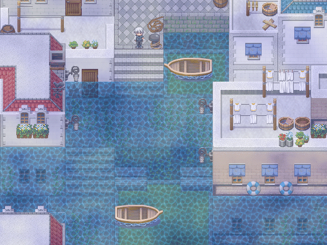
Looks pretty good to me. The long hall on the left looks a bit too straight to be a cave, but it's not a big issue.
If I ever get my own cave prison, I'm totally going to deck it out with blue carpet too.
I'd have to agree with WIP. Looks great otherwise.
I'd have to agree with WIP. Looks great otherwise.
The idea was that this was a man-made thing, but I do agree that it is a bit straight. I'll play with it a bit.


How did you do that, BTW? Just a picture? I always liked the guard throwing darts.
Er, I mean, THREE-TILE RULE BITCH
Er, I mean, THREE-TILE RULE BITCH
author=WIP link=topic=5.msg171#msg171 date=1181242329
How did you do that, BTW? Just a picture? I always liked the guard throwing darts.
Er, I mean, THREE-TILE RULE BITCH
Chipset.

Samples of the Legacies of Dondoran 2 CBS:

Status screen showing family lineage

Choose main class, then choose sub class
Status screen showing family lineage
Choose main class, then choose sub class
Looks pretty solid. I've never been a big fan of integrating the default choice menu into menus. But it's not something terribly glaring.

I love Breath of Fire games. What is yours going to have in it?
I think the cool style of the menu outlines in the upper right hand corner and the lower right hand is ruined by the gradient bars and menu on the left. You could have a really sweet looking GUI if you made the rest of it look like the outline you have.
Are the sprites all your work? (They look great!) The landscape looks ripped.
Are the sprites all your work? (They look great!) The landscape looks ripped.
That way i say it still need eye candy, lay out is one of them :D, sprite is edit from Disgaea, i make the faceset.
Yes the background ripped from BOF 4
Yes the background ripped from BOF 4
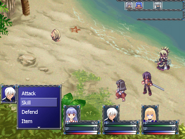
Today I've been messing around with the DBS, trying to make it better. Here's what I've got:
Suggestions are greatly encouraged. I want this to be as good as I can get it.
Suggestions are greatly encouraged. I want this to be as good as I can get it.

harmonic: very solid. Though the text in that menu is all over the place. It looks like the QUIT text is right up at the top of the buttons while with other text it's center better. Also, the TUTORIAL text seems a size or two smaller than the rest. I think it just needs to be tidied up a bit.
Lusty: I don't know if I like all the styles you have there. The monster style is different from the battle sprites is different from the facepics is different from the little faces on the top. I'd suggest using NipponIchi monsters and keeping the facepics to use at the top corner.
Raen: Seriously, that looks extremely well-kept. I like it a lot. I feel like you can add a lot more to the facepics for some neat system in battle, but that's all up to you. Where's the monster graphic from?
Thanks, glad you like it. And here is where I got the monster:
http://www.phylomortis.com/html/monster.html
http://www.phylomortis.com/html/monster.html
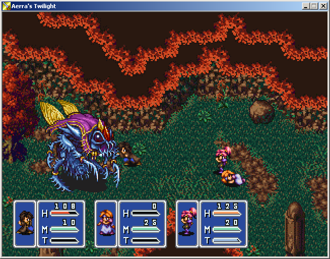
I've always liked battles with map-like backgrounds.
author=WIP link=topic=5.msg247#msg247 date=1181341841They look a lot better than panorama battle background when using character sets--when using big pictures like Wilfred's Hero or Mystic Lands--a panorama is the way to go.
I've always liked battles with map-like backgrounds.
http://www.youtube.com/watch?v=1Urr4BC76tA
This is a video of the intro I just finished for my game, Aerra's Twilight. I plan on putting some soldiers into the scene, and actually show some villagers running away and getting killed, which should make it a little more interesting, but what I'm also very happy with what I have now.
And yeah, it's not a screenshot, but it's better.
Lusty: I don't know if I like all the styles you have there. The monster style is different from the battle sprites is different from the facepics is different from the little faces on the top. I'd suggest using NipponIchi monsters and keeping the facepics to use at the top corner.Monster is came from RO and some of them from NIS, I dont have many monster from NIS that match the story or BOF world. Battle sprites will be edited to match the faceset and the charaset. I will renewed the top corner pic.
Your screen and video is very nice Raen, btw how do you make the video?

