


PIXELS
Posts

That's probably because that's exactly what it is.
E: oh thunderfuck whorebitch, a new page
author=UPRC
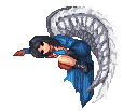
I'm sure that at least a few people should know where this ship is from.
E: oh thunderfuck whorebitch, a new page

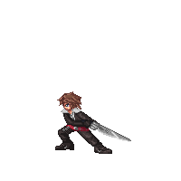
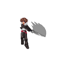
author=undefinedit is a mysterywho he ??
(this is only a prototype that has kind of amalgated both designs. cool sunglasses if you can tell me who he's nabbed his bodywork from)


Yet another monster, this time for a Christmas themed contest...
If you don't know what it is, maybe you're better of not asking.

author=alteregoYet another monster, this time for a Christmas themed contest...
If you don't know what it is, maybe you're better of not asking.
is it a wooden baby jesus, and when he lies his nose grows?

I made this ages ago during the whole "Rudra" craze, sadly its one of the only things I found as most of my other earlier sprite work died with my old hardrive :(

author=alteregoYet another monster, this time for a Christmas themed contest...
If you don't know what it is, maybe you're better of not asking.
It's one of those strange ass log things that... I think they put it in a fire and beat it or something? I read about it on Cracked a while back.
Great spritework, btw.

Wow, I haven't been in a pixel thread in ages. >>; I guess I'll show off somethin'. I need to fix a couple things on some of em'. I feel they just don't look right yet...


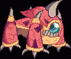

It's one of those strange ass log things that... I think they put it in a fire and beat it or something?
Yeah, that's the one, pretty weird stuff, eh? ...oh, and thanks. =)
@J-Man: Those seem to be some cool looking sprites, the bad thing is that they are full of jpg artifacts, still, for what I can appreciate my favorite one is the golem, for the very natural form you gave to the rocks, the nice shading and color choice... the knight's shoulder pads also look good, but the same kind of shading needs to be applied to the rest of the armor.
that some awesome work right there ^

author=SayaALL PIXELS. Not by me, unfortunately. I <3 the pixels forum~
Why hello there Frankie's pixel <3
http://frankiesmileshow.deviantart.com for the curious


Snake? Snake! SNAAAA-
Anyways, this one is by me. Critiques please~
Oh, and its a ball python, taking on the pose of a rattlesnake. To... you know... look threatening?
13 colors.

When drawing line art, keep it all to one px. Otherwise it looks jagged and isn't appealing.
Also, I recommend dithering to create a scale like pattern rather than just using the normal type. It doesn't really look appropriate and is slightly overdone.
Oh, and add a little bit of blue to the shadow of the white, it makes it look cleaner. Or if you're not going to a clean look, a yellow tone wouldn't do it harm either.
I hope that helped. The form's quite good, I especially like the lower half of the body.
author=SorceressKyrsty
When drawing line art, keep it all to one px. Otherwise it looks jagged and isn't appealing.
Also, I recommend dithering to create a scale like pattern rather than just using the normal type. It doesn't really look appropriate and is slightly overdone.
Oh, and add a little bit of blue to the shadow of the white, it makes it look cleaner. Or if you're not going to a clean look, a yellow tone wouldn't do it harm either.
I hope that helped. The form's quite good, I especially like the lower half of the body.
Ah, I think I've heard that somewhere before.
Is there any type of dithering you recommend for scales in particular? Saya doesn't do pixel are frequently enough.
Ah, but that's because I pixel traced! Mwuhahaha!
Ah, pixel tracing, it sure is a time saver!
I'm thinking more of a diamond shape, but don't define all of them explicitly. Just in the areas where you think dithering is necessary. Imply texture through dithering, so you're doing both shading and definition at the same time =w=)b
I'm thinking more of a diamond shape, but don't define all of them explicitly. Just in the areas where you think dithering is necessary. Imply texture through dithering, so you're doing both shading and definition at the same time =w=)b

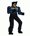
Just something I've been working on, it'd suit a thug in a Streets of Rage style game, set in that late 80s/ early 90s Judge Dredd, Terminator, etc future.
Here it is animated
Here's the sheet
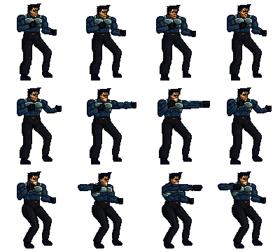
Any feedback you have would be greatly appreciated
Here it is animated
Here's the sheet
Any feedback you have would be greatly appreciated

H... His... His backpack.
Anyways, should be quicker, and you should work more on the legs (butt leave it still the same anathomy), but besides that, it's nice. :] (Except for the last punching frame. The hand could be more detailed.)
Anyways, should be quicker, and you should work more on the legs (butt leave it still the same anathomy), but besides that, it's nice. :] (Except for the last punching frame. The hand could be more detailed.)

Just some simple walking sprites for the game I am making...


edit: They weren't showing up.. ^^;;
edit:...they still weren't showing up... ;A; maybe if I remove the hide button?
edit: They weren't showing up.. ^^;;
edit:...they still weren't showing up... ;A; maybe if I remove the hide button?
@ Ketsumio: I can see em. Hm...don't use black outlines is the first thing I'll say. Black detracts from your colours and makes the piece look unprofessional. Shade with an outline darker than your darkest shade of the object.
The walking frames look a little bit stiff/jerky but I'm not the best person to comment on those ha. What I will say is that the bear's legs look very straight and stiff- trying using bigger frames or some such. Personally I think he'd look better shorter.
The balls on the ghost are really deformed. Have you heard of pixel curve theory and some such? I don't have a link right now but I recommend looking it up. It's really helpful since you're working with a medium constrained to tiny squares.
Ok, time for some of my stuff =^='' Been working on Cosplay Crisis pixels for ages now.

