


PIXELS
Posts

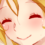
Yes, very very nice Rowan, not plain at all anymore.
beastly even!
beastly even!


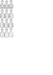
It's a mockup of an inventory. The idea is that you would see a character's equipped items and general inventory simultaneously in one menu, as opposed to having two separate commands to check them.
author=DBAce9Aura
It's a mockup of an inventory. The idea is that you would see a character's equipped items and general inventory simultaneously in one menu, as opposed to having two separate commands to check them.
an excellent idea
visually i would have inventory items pop out instead of going into slots but that is just me

Not very good, but it's my first spriting attempt. Decided to go simple with High Five Ghost from Regular Show.
Dodge Ram Sprite - One of my main characters vehicles in my game.
111 Colors
err scratch that, it took about 12 hours to complete. (Unlike the truck sprite, I didn't spend a ridiculous amount of time figuring out the shading)

The pillar between the rear door and the cab should be thinner. Otherwise, BADASS. (Oh and the diamond plate toolbox should be over the lip of the bed, I think. It looks that way on the far side)
Thanks Prexus! :D. I don't know if I'll mess with the pillar again, but the toolbox does indeed need fixing. I'll get right on that.
EDIT:

Alright. I spruced up the toolbox a bit and shortened the pillar by about 5-6 pixels. It's probably still too big, but I don't want to hamper with that little silver line any more then I have to.
EDIT:
Alright. I spruced up the toolbox a bit and shortened the pillar by about 5-6 pixels. It's probably still too big, but I don't want to hamper with that little silver line any more then I have to.
Yeah it looks a lot better now. The only other thing that might stick out to me (as a truck enthusiast, not an artist) is the rear window is a bit too rounded. I'm not sure what year Dodge Ram you are modelling this after, but that looks more akin to a Toyota Tundra than a Ram. But it still looks badass.

Made some changes from what I posted on my thread. I redid the Shinra troop's helmet, changed Zack's and Cloud's hair, and recolored and cut a bit here and there.

Still considering a few things until I consider it complete though, like adding Tifa in, changing the colors on Cloud's and Zack's uniforms to darken them a bit, and messing with Sephiroth's hair.
Still considering a few things until I consider it complete though, like adding Tifa in, changing the colors on Cloud's and Zack's uniforms to darken them a bit, and messing with Sephiroth's hair.
Sephiroth's left/right walking motion looks weird compared to his up/down sprites. Also, his and the soldiers height isn't consistent between directions. Otherwise, not bad.
author=Rowan
Sephiroth's left/right walking motion looks weird compared to his up/down sprites. Also, his and the soldiers height isn't consistent between directions. Otherwise, not bad.
If you mean how they're unevenly placed, I did that so it looks like they're stepping more. The entire body moving down like that makes it look like he's really putting weight onto one foot at a time while he walks.
I did try evening them out a little, and it looks more like they're hovering above the ground. :/
I think the sprites that come with 2k3 have the same thing done to them.
What? RM2k3 sprites don't do that. Notice how your left/right facing Cloud sprites bops his head down, up, down. Your Sephiroth sprite is bopping his head up, down, up. All you need to is lengthen Sephiroth's neutral standing left/right facing sprite by 1 pixel from beneath the waist (his pixels under his belt to be more precise); and shorten the other 2 animations beside it by 1 pixel from beneath the waist.
Also, after looking at it in more detail, I've noticed Sephiroth does not move his arms in his animations. This makes him look really stiff and isn't natural. It's also stemming from the fact that you are using 0,0,0 RGB pure black for his outfit. Doing this greatly hampers any room for details (besides highlights) that you can use to make his arm animate fluently.
Also, after looking at it in more detail, I've noticed Sephiroth does not move his arms in his animations. This makes him look really stiff and isn't natural. It's also stemming from the fact that you are using 0,0,0 RGB pure black for his outfit. Doing this greatly hampers any room for details (besides highlights) that you can use to make his arm animate fluently.
author=Rowan
What? RM2k3 sprites don't do that. Notice how your left/right facing Cloud sprites bops his head down, up, down. Your Sephiroth sprite is bopping his head up, down, up. All you need to is lengthen Sephiroth's neutral standing left/right facing sprite by 1 pixel from beneath the waist (his pixels under his belt to be more precise); and shorten the other 2 animations beside it by 1 pixel from beneath the waist.
Also, after looking at it in more detail, I've noticed Sephiroth does not move his arms in his animations. This makes him look really stiff and isn't natural. It's also stemming from the fact that you are using 0,0,0 RGB pure black for his outfit. Doing this greatly hampers any room for details (besides highlights) that you can use to make his arm animate fluently.
Alright, I think I fixed it up well enough so far.

I don't know if I can add another color to Sephiroth's clothes though, with the little 256 color limit thing, they'd change tone a bit, and may look strange after I save 'em. Also, since he's wearing shiny leather, there really are only 2 colors to it, black and white, and white wouldn't really fit. So what I did for when he was walking, was move the metal cuff on his wrists back and forth, along with the navy blue colors along his sleeves.
So, ehhhh, anything else that needs work with 'em?
Edit:
Tried the shading out actually, and it turned out pretty well dood. I also added Tifa finally.

Now, I think the correct way to upload these into you game is:
Export any character page that comes with the game.
Paste this Final Fantasy 7 page, over that character page in paint.
Then save.
Import, and that should do it.
I was having trouble saving this as a different color, but I tried that pasting method, and that worked for me.
So, yep.
Now I don't know what to do with those 2 other slots. I'm thinkin' maybe Young/Kid Cloud and Young/Kid Tifa, but that would be a little repetitive.

Finally! Took about 2 days to complete. 64 colors and will be animated soon. Any critique (on any of my 3 latest pixel work) is helpful.

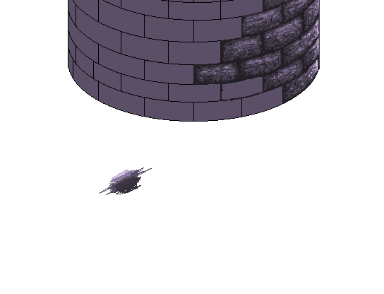
WIP for Blood Rose. Yey for enormous bricks.
Oh, not counting black (because it will be removed completely once I'm done) this is 6 colours (including transparency)


