THE SCREENSHOT TOPIC RETURNS
Posts
author=chanaauthor=TDSNo, the way they move towards and away from each other, it could maybe be a little faster, with a "second"'s halt between the hits and a little more irregular (easy to say!).
Do you mean the skills stopping the battle?
Do you mean the pushing and knock back when they clash with each other? Adding a pause there might not be possible without re balancing the battle system, but variance could be added to the push power to simulate random pushing distances which would be different with each hit.
author=Large
That's interesting from a programming point of view, I guess, but personally, I like to control the actions of my player.
The rules of the contest were that simulated battles were ok, but battles with input were not, so I decided to create a battle system with the rules of the contest in mind.
(TDS) :" but variance could be added to the push power to simulate random pushing distances which would be different with each hit."
Yes, that could be interesting, anything that will make the battle more irregular.But, I find it interesting as it is, very innovative!
Yes, that could be interesting, anything that will make the battle more irregular.But, I find it interesting as it is, very innovative!
Flickers a lot, sorry. I'll record a better version once I have more Tools made. Shown in the terrible demo:
-Sleep Powder/Angel Bell (trap monsters/shadows in place)
-Freezing Draught (turn to ice, shattering oncoming traps and becoming temporarily immune to monsters)
-Ghost Feather (phase through enemies, traps and obstacles)
-Torch (make the lit area around your character brighter)
Planned:
-Something for sprinting
-Something for crushing boulders
-Something for revealing hidden doors/treasures
-Something for obliterating all encounters on the map
-Something for obliterating all traps on the map
Yeah, there's some overlap - both Ghost Feather and the "something for crushing boulders" could get you past, well, a boulder - but some will be much rarer than others. Hypothetically. This is a test project, not an actual game.
Avee
Lol at the name Farthis.
I actually used a pretentious name generator for most of them to test the party select script. XD
Hey, your tiles, wall and grass remind me of LucidStillness's! interesting map, the roof doesn't really work with the walls though.
@Nightowl: I agree with Chana, looks great but the roof doesnt look nice. Try something more solid, maybe a repeated brick pattern.
Anyways been working on my game a bit. Spriting to fit the RTP style sucks and takes forever. Heres the final result.
Before:
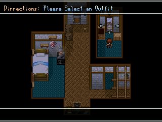
After: Alot of items to interact with, the alarm clock allows you to set and alarm to wake up earlier, the chest has a mini game to dig for treasure, and the dresser still allows you to change your clothes.

All thats missing are the lighting effects and shadows I need some help with em.
Anyways been working on my game a bit. Spriting to fit the RTP style sucks and takes forever. Heres the final result.
Before:

After: Alot of items to interact with, the alarm clock allows you to set and alarm to wake up earlier, the chest has a mini game to dig for treasure, and the dresser still allows you to change your clothes.

All thats missing are the lighting effects and shadows I need some help with em.
LockeZ

I'd really like to get rid of LockeZ. His play style is way too unpredictable. He's always like this too. If he ran a country, he'd just kill and imprison people at random until crime stopped.
5958
Nightowl, I've seen those graphics before... in RMXP. But it doesn't look like you blew them up to double size to work in RM2K3, so I guess you actually went through and lowered the quality and resolution of them? Or am I totally off base here?
Anyway, it looks nice, except RM2K3 doesn't support partial transparencies, so the gray shadows are just solid and cover up what's behind them. You should edit the tileset and remove all the shadows. Aside from that you did quite well with it. Better than the area I made with that tileset, for sure.
Anyway, it looks nice, except RM2K3 doesn't support partial transparencies, so the gray shadows are just solid and cover up what's behind them. You should edit the tileset and remove all the shadows. Aside from that you did quite well with it. Better than the area I made with that tileset, for sure.
author=LockeZ
You should edit the tileset andremove all the shadowsput the shadows on the upper layer, then use semitransparent events
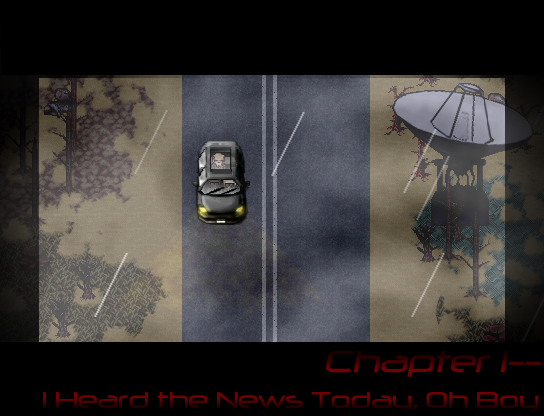
My favorite part of this map is actually the sound, but unfortunately I cannot screenshot that; it looks better in motion anyway, so I should probably seriously consider looking into video capture software.
ashley please remove the entirely unnecessary PRESS RETURN TO INTERACT image, why is it even there
also I'm guessing we can tell that we are sprinting because... we would be sprinting. So, why is that there?
ELIMINATE CLUTTER.
also I'm guessing we can tell that we are sprinting because... we would be sprinting. So, why is that there?
ELIMINATE CLUTTER.
LockeZ

I'd really like to get rid of LockeZ. His play style is way too unpredictable. He's always like this too. If he ran a country, he'd just kill and imprison people at random until crime stopped.
5958
author=Craze
ashley please remove the entirely unnecessary PRESS RETURN TO INTERACT image, why is it even there
Making an "interact" icon appear when you stand in front of an object that can be interacted with is something that's been done by almost every game since FF9, and I for one super duper appreciate it. There are very few things I hate more in RPGs than checking every tile in the game trying to figure out what I can search or interact with.
Similarly, I'm guessing the sprint indicator is there to tell you when you *can* sprint, not to tell you when you *are* sprinting. If you can always sprint and it really is just there to tell you that you're sprinting... uh, then yeah, I do agree with Craze, a little silly. I guess if you press a button to toggle sprint instead of holding it down to sprint, then that's slightly justified, but still also slightly silly.
Hello all so I updated the Eden Gate page for those that are interested: http://rpgmaker.net/games/3598/
Now I have a question which screen looks better in terms of the save menu.
Old:

or
New:

Now I have a question which screen looks better in terms of the save menu.
Old:

or
New:

LockeZ

I'd really like to get rid of LockeZ. His play style is way too unpredictable. He's always like this too. If he ran a country, he'd just kill and imprison people at random until crime stopped.
5958
I prefer the lower one, I feel like the tiled background looks awkward when you can only see that much of it.
In other news, Lotus, stop making us all look bad!
In other news, Lotus, stop making us all look bad!


