


THE SCREENSHOT TOPIC RETURNS
Posts

The point has been made. Kind of beating a dead horse there, Lib! Are you posting that just because it was Max asking the question?
***
Here, have some screens.
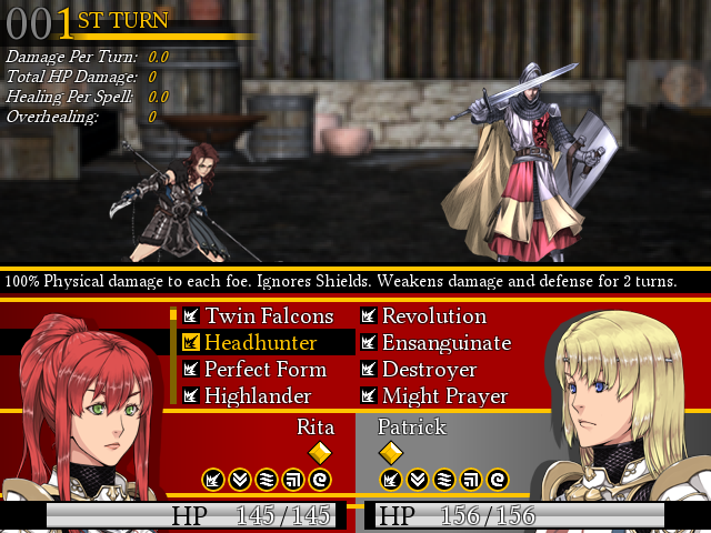
Mostly playing with hud improvements and clarity. The "Damage per Turn" stuff is toggled off by default but I use it extensively for testing. good shit, op
***
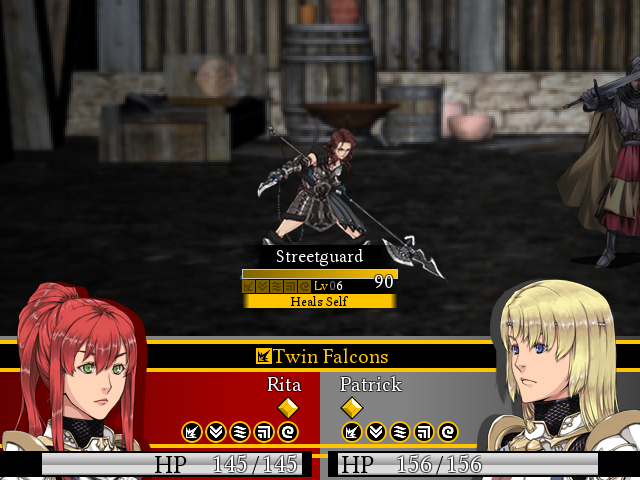
Here, have some screens.
Mostly playing with hud improvements and clarity. The "Damage per Turn" stuff is toggled off by default but I use it extensively for testing. good shit, op


ooh joser I like the colors a lot!
I'd recommend a single boot for the escape icon, like this.
If you can find a good bitmap font, then I don't imagine that your hud would be too hard at all, actually.
I'd recommend a single boot for the escape icon, like this.
If you can find a good bitmap font, then I don't imagine that your hud would be too hard at all, actually.

author=Liberty
""Terrorism" comes from the French word terrorisme, and originally referred specifically to state terrorism as practiced by the French government during the 1793–1794 Reign of terror. The French word terrorisme in turn derives from the Latin verb terreō meaning "I frighten". The terror cimbricus was a panic and state of emergency in Rome in response to the approach of warriors of the Cimbri tribe in 105 BC. The Jacobins cited this precedent when imposing a Reign of Terror during the French Revolution. After the Jacobins lost power, the word "terrorist" became a term of abuse. Although "terrorism" originally referred to acts committed by a government, currently it usually refers to the killing of innocent people for political purposes in such a way as to create a media spectacle. This meaning can be traced back to Sergey Nechayev, who described himself as a "terrorist". Nechayev founded the Russian terrorist group "People's Retribution" (Народная расправа) in 1869."
Hello history.
Use the damn word if it fits, Craze.
wallaby darned
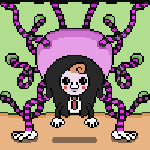
@Lou, top of page: Where'd those enemy battlers come from if you don't mind my asking? They're pretty cool and they look kind of familiar but not really...
They're from the same pack as the portraits, mostly. The helmed fighter is a default graphic, I believe.

author=LouisCyphre
The point has been made. Kind of beating a dead horse there, Lib! Are you posting that just because it was Max asking the question?
No, I posted it because it was interesting and I figured if Craze was still thinking on it, it'd come in handy to know. I hadn't read the posts that came between, unfortunately, though I don't know why it matters that Max posted it or not. There's no issue between us as far as I know - some things we disagree about, others we're on the same page with, so... not sure what you're trying to imply. I'd have answered the same whoever had said it - words and writing are of interest to me and I thought it was an interesting discussion.
Sorry if you thought otherwise...
That aside, the pink is a bit too bright when contrasted with the light blue of the MP text. It clashes a little. Maybe if it were a little more pastel in colour or if the blue were a bit less saturated?
The layout is good, though. One question - do the status windows stack in some way? If not, why not move it right to the edge of the box? It looks a little odd as it is.
Good luck coding it~ >.<;
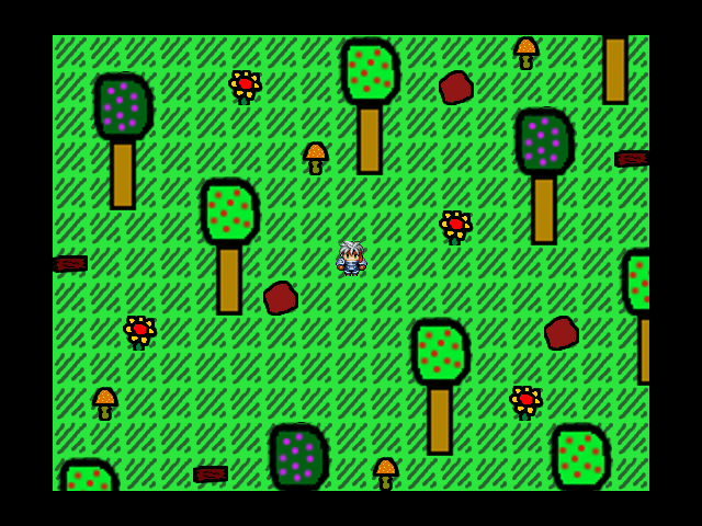


I feek like the trees might look better with thinner trunks or larger canopies. Are you going to make your own characters?
LockeZ

I'd really like to get rid of LockeZ. His play style is way too unpredictable. He's always like this too. If he ran a country, he'd just kill and imprison people at random until crime stopped.
5958
That's horrifying.


LockeZ
I'd really like to get rid of LockeZ. His play style is way too unpredictable. He's always like this too. If he ran a country, he'd just kill and imprison people at random until crime stopped.
5958
But... then it gets arranged like this on a compass
"Never waffles eat soggy" doesn't make any goddamn sense! What a useless mnemonic device. Go with "Never wank elephants sideways." Which is also very useful advice, if you ever are in a compromising position with an elephant and are trying to devide if you should jack it off, and if so, in what direction you should move your hand.
Wait, what were we talking about? I got distracted.
     Never

Waffles   Eat

     Soggy
"Never waffles eat soggy" doesn't make any goddamn sense! What a useless mnemonic device. Go with "Never wank elephants sideways." Which is also very useful advice, if you ever are in a compromising position with an elephant and are trying to devide if you should jack it off, and if so, in what direction you should move your hand.
Wait, what were we talking about? I got distracted.


Hm... you might want to try imgur or your locker (hover over your name in the top bar and hit the locker link there. It's your own personal online storage on the site.)
The site you're using isn't working. >.<;
The site you're using isn't working. >.<;
author=Craze
I feek like the trees might look better with thinner trunks or larger canopies. Are you going to make your own characters?
I'll probably eventually make my own face sets and sprites for this. Damn I wish I had mad skills like Unity or someone like that.
author=Liberty
Hm... you might want to try imgur or your locker (hover over your name in the top bar and hit the locker link there. It's your own personal online storage on the site.)
The site you're using isn't working. >.<;
Link was incorrect, thank you.
LockeZ
I'd really like to get rid of LockeZ. His play style is way too unpredictable. He's always like this too. If he ran a country, he'd just kill and imprison people at random until crime stopped.
5958
I like it being darker, but I don't know if I like it being green.
Yeah I prefer the darker version.
It suits the rest of your game's visuals better (as far as I can tell) than the washed out white one. There's a lot of dark green in your other screenshots so I think it's consistent.
It suits the rest of your game's visuals better (as far as I can tell) than the washed out white one. There's a lot of dark green in your other screenshots so I think it's consistent.
I'm gonna throw my vote on the darker pile too.
Also, damn, that is a pretty title screen, though.
@Chrsitamoose: I'm not exactly sure what's going on there. It's pretty boring and empty for a house and your 'custom' resources look like you just made a coloured square and tiled that around. Unless you mean the little blobs of what I think might be snow?
Why is there snow inside a house in any case? It just looks like the base of a room. I'd recommend checking out a few mapping tutorials but it'd be a good idea to actually add things like furniture and the like to the house. At the moment all I'm getting is a roofless shack with nothing in it... unless that's what you're going for?

