THE SCREENSHOT TOPIC RETURNS
Posts
It looks okay, if a bit sparse. In addition to adding more trees, plants and other objects, I would add more patterns of grass and water to break up the monotony of the large areas of identical textures.
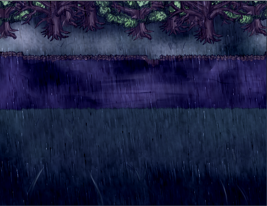
Oh, and since it's a new page, here is another battle screen, this time from an 'odd' area:

I haven't actually settled on this battle look by the way; I'm thinking about customizing the menu so it looks a little less generic (though not TOO less generic, as that would defeat the purpose).
Oh, and since it's a new page, here is another battle screen, this time from an 'odd' area:

I haven't actually settled on this battle look by the way; I'm thinking about customizing the menu so it looks a little less generic (though not TOO less generic, as that would defeat the purpose).
@NicoB: I would have just used the second floor tile as the main tile and used the first floor tile as a distinguishing tile. In fact, of all versions, I like the second the best.
@Thiamor: Why is there so much empty space? As it stands, it's just sort of a big, formless green area. Try to imagine each tile being placed on purpose and see what happens.
@Thiamor: Why is there so much empty space? As it stands, it's just sort of a big, formless green area. Try to imagine each tile being placed on purpose and see what happens.
Again. It is a work in progress. Wanted to see how it was starting off. I've already added much more depth to it, and some more space filler.


I hope you realize that those 'bushes' are meant to be tree canopies.
Screenshot (is ACTUAL screenshot:)

Screenshot (is ACTUAL screenshot:)

@Thiamor
The extra details are already adding a lot, but as SorceressKyrsty already pointed out, the canopy as bushes looks a little odd. You may also want to cut down on the walkable area by making the water area larger, since vast open areas naturally look empty even with a lot of detail.
@SorceressKyrsty
It looks much nicer and more polished. I'm not sure why the ground is brighter near the trees, since the trees would naturally cast shadows, and why the tree leaves are so bright and fluorescent. The trees themselves look very nice, though they don't seem to connect with the ground.
success! i have now spent valuable time populating this office which will possibly be in the possible intro for possibly no more than 10 seconds. hurray for me

that blue carpet is too much
it reminds me of my dog

that blue carpet is too much
it reminds me of my dog
I swear this is what people who do big projects will be like. In a big room like that working on some big RPG Maker game. :P
(In short, nice screenshot, lol.)
(In short, nice screenshot, lol.)
author=SorceressKyrsty
I hope you realize that those 'bushes' are meant to be tree canopies.
Except for the small island in the bottom right, it actually works and looks good. I have to give the guy kudos for how it worked. The problem I see is in color, not texture. The dark green foliage doesn't blend well with the grass tiles and deep grass.
author=Mr.Nemo
success! i have now spent valuable time populating this office which will possibly be in the possible intro for possibly no more than 10 seconds. hurray for me
that blue carpet is too much
it reminds me of my dog
Looks cramped, properly just me, there are no security cameras. Really.
the offices i've been to have been pretty cramped. but you're right about the security cameras, i totally forgot those. thanks
oh i forgot
my dog wasnt blue
oh i forgot
my dog wasnt blue
LockeZ

I'd really like to get rid of LockeZ. His play style is way too unpredictable. He's always like this too. If he ran a country, he'd just kill and imprison people at random until crime stopped.
5958
There are six foot walking spaces between the desks. How is that cramped? That's actually a little spacious for an office, if anything. You're just used to seeing crappy RPG Maker buildings with 5x5 tile areas full of empty floor.
Is this a custom tileset, Nemo? I'm guessing no, because it looks too good. If the answer is yes then I want to hire you and/or sleep with you.
Is this a custom tileset, Nemo? I'm guessing no, because it looks too good. If the answer is yes then I want to hire you and/or sleep with you.
the tileset was made by dajhail over at rpg2knet a long time ago
i put in some extra theodore furniture since i didnt want it to look like duke nukem rpg. and then i editted some myself. making everything from scratch when there's plenty of fairly unused original resources to work with seems like a lot of work for an rpgmaker game... then again, i spend all my time on this project editing spriteposes and such (same as always that is) instead of mak gam :(
i put in some extra theodore furniture since i didnt want it to look like duke nukem rpg. and then i editted some myself. making everything from scratch when there's plenty of fairly unused original resources to work with seems like a lot of work for an rpgmaker game... then again, i spend all my time on this project editing spriteposes and such (same as always that is) instead of mak gam :(
author=Mr.Nemo
success! i have now spent valuable time populating this office which will possibly be in the possible intro for possibly no more than 10 seconds. hurray for me
that blue carpet is too much
it reminds me of my dog
I don't think it looks cramped, as opposed to what somebody else posted. You may want to consider adding a shadow below the horizontal beams. Also, some desk fixtures cast shadows below them but some do not (table in the top left). I would consider getting rid of the support pillars in the hallway too. Though, I am nitpicking since overall it is more than acceptable.


