


THE SCREENSHOT TOPIC RETURNS
Posts


author=Nightowl
@NOACCEPTANCE772 I have no absolute idea what's going over in that game. No offense, but it looks like it was made by a brainless 5-year old satanist high on every existing drug.
Really cuz a "Brainless 5 year old" wont be able to make a game + he can sprite and
all that cuz a human being cannot function without a brain +If he was high on everything he'll be dead the moment he intakes all those drugs + If he was high he can't do anything right with the game + the killing nuns part is not to fill your heart with the pleasure of killing some kind old women,it's due to story line + I'm not a satanist.I have more kindness than anyone of you!(LOL!JKS)
The graphics are mixed and I can barely distinguish anything from the messy screenshots.
What?I'm sorry,you can try coming back with better glasses next time.

@NOACCEPTANCE772 I wasn't really asking an essay of how a brainless 5-year old kid couldn't live.
As Saileriu said, you should not act like that when responding to criticism. While most of my post was just saying that "No offense but it looks like it was made by brainless 5-year old asadasasdas" you should've had a little nicer attitude when I said that "It's hard to see what's going on and the graphics are mixed."
Instead of some nice response, you just tell me to buy glasses. That is not the way to go.
While I don't know if you focus more on grammar while writing dialogue for your game and less on forums and such, judging by your current posts' grammar, you should probably focus more on writing if your games' dialogue look like that.

@NOACCEPTANCE772:
Oh, okay, those screens kinda make my eyes bleed.
I'd have to say the first screen is the best - the background image is dark and sombre and doesn't detract from the action that's taking place in the foreground. You have to take that into consideration when making battle backgrounds. The problem is that the sprites are horribly mis-matched.
Also, please tone down the red in the battle hud. It's far too distracting. Try making it a darker red so it doesn't stand out so much. You want the player to be able to easily see the information they need without getting distracted by the shiny brightness.
The rest of the screen shots are hard to tell what's going on because of the background standing out too much and making the screens look busy. If you can't tell where the characters are at a glance then that's a problem. Maybe change the battle floor (orange) to a grey colour so it doesn't stand out so much against the rest of the background.
Another thing - just because you can have 8 enemies on the screen doesn't mean you should - especially when their sprites are that big. It only adds to the confusion. Maybe try the battles with a blank background first and if that looks too busy you need to rethink your sprite choices a bit, because as they stand they're a bit too confusing.
Not trying to beat you down or anything but if the player can't tell what's going on in battle then it's hard for them to win it. And you want them to win it so that they progress with the plot and beat the game. The challenge is supposed to be in the actual battle system, not in trying to make out what's going on. And don't think this is a new maker mistake, either. There are a lot of people out there who over make their systems. Clear and concise with a bit of bling on the side is best. It's the difference between a cheap hooker and a sophisticated lady.
Hope this helps makes the negative comments you've been getting a bit clearer (without the negative) and if you need help just ask.
@Everyone else: Let's try to be nicer to the new people, yeah? Not that I can talk at times, but a little explanation (almost) never did any harm.

author=Darken
I find noacceptance's screens awesome in a campy sort of way. Reminds me of an angelfire doom fan page from the late 90s.
<3
I agree. I mean, you could say they're "technically bad" but I don't think you can really apply that to something so... Extreme.

It is really a mistake to attempt to apply the same standards of creativity, quality, and even behavior to NOACCEPTANCE72 and his body of work as you would any other creator. I'm just saying, he's clearly a bit...different. (And you can use that as a page clipping/quote if you want, NA72.)
Anyway, here are five screenshots. Each one of them is a link to another 35 or so screenshots that I won't clog the thread by posting here at this time, but that I wouldn't mind comment on.


Anyway, here are five screenshots. Each one of them is a link to another 35 or so screenshots that I won't clog the thread by posting here at this time, but that I wouldn't mind comment on.
author=Nightowl
@NOACCEPTANCE772 I wasn't really asking an essay of how a brainless 5-year old kid couldn't live.
As Saileriu said, you should not act like that when responding to criticism. While most of my post was just saying that "No offense but it looks like it was made by brainless 5-year old asadasasdas" you should've had a little nicer attitude when I said that "It's hard to see what's going on and the graphics are mixed."
Instead of some nice response, you just tell me to buy glasses. That is not the way to go.
lol yes, the way to go is to write out an extremely offensive post, say "no offense," and continue not giving any helpful advice
srsly, l2selfawareness
gj Liberty, you win for actually trying to help him
author=Nightowl
@NOACCEPTANCE772 I wasn't really asking an essay of how a brainless 5-year old kid couldn't live.
As Saileriu said, you should not act like that when responding to criticism. While most of my post was just saying that "No offense but it looks like it was made by brainless 5-year old asadasasdas" you should've had a little nicer attitude when I said that "It's hard to see what's going on and the graphics are mixed."
Instead of some nice response, you just tell me to buy glasses. That is not the way to go.
While I don't know if you focus more on grammar while writing dialogue for your game and less on forums and such, judging by your current posts' grammar, you should probably focus more on writing if your games' dialogue look like that.
author=SaileriusWhat attitude?
That's not a very good attitude to take when responding to criticism. :x
I was laughing bout the fact that somebody would take that such battles were created because I was high and I'm 5(I'm 16) and I'm a satanist who goes WHAHOOWEE to the sight of nuns dying.
I also find it funny bout how you people think I download these sprites or I'm the master of spriting* even thou I was into spriting for just 4 months.
*By master of spriting I meant by how you people think I can make graphics that match the backgrounds.You saw how the backgrounds look,right?
author=Max McGee
I'm just saying, he's clearly a bit...different. (And you can use that as a page clipping/quote if you want, NA72.)
Different like in retarded or Insane?
I think you're a perfectly normal person : if I just stated that I liked the top left one, it was to give you a hint, : I know you're going on the wild side, but does the wild side HAVE to go with somewhat incoherent images ? cannot it be more in the elements chosen than the exterior aspect of the overall picture?

author=NOACCEPTANCE772
Different like in retarded or Insane?
No, I think is trying to say that your way of designing a game is different.
Seriously some people here are too full of themselves.
author=NightowlLook who's talking.
@NOACCEPTANCE772 I have no absolute idea what's going over in that game. No offense, but it looks like it was made by a brainless 5-year old satanist high on every existing drug. The graphics are mixed and I can barely distinguish anything from the messy screenshots.
http://img809.imageshack.us/img809/7141/fergus.png
But NOACCEPTANCE772, if someone actually gives you a really well-elaborated critique you should really show interest in it. (Liberty's post as example)
@legion
i'll look at those screens more in-depth later because i like the style (though if it's too open-ended or customizeable it could be a massive turnoff)
but one thing i notice is "firewood recieved" when he's looking at a log. "received" implies that it was given, imo found items should be "obtained" or something similar. it's a pet peeve of mine because i see it all the fucking time. your a good writer so you'd probably appreciate that.
anyway here's a map from my game that i uploaded to use as an example in a conversation in irc might as well post it.

I definitely like the style. Although it appears that it would be bigger than one screen, so it would scroll. A scrolling map implies (in my opinion) that artificial borders shouldn't exist. The style you are using should be reserved for single-screen maps.
Even in the 2D zelda games, when a room was bigger than one screen. In the older ones, it would do the typical zelda map scroll when you touched the edge. In the newer ones, it would occasionally scroll as in any other game and it always made a vein in my head pulse. It didn't seem right.
Even in the 2D zelda games, when a room was bigger than one screen. In the older ones, it would do the typical zelda map scroll when you touched the edge. In the newer ones, it would occasionally scroll as in any other game and it always made a vein in my head pulse. It didn't seem right.
yeah the original plan was to only have single-screen maps with that style. the big influence is paper mario (ffffuck i love paper mario). unfortunately once i got started i realized that rmvx's really small window size made it pretty unrealistic to make every map only one screen, especially for the style of the game. i try to keep all my maps on the smaller size though and most of them only scroll either horizontally or vertically.


@Nessy
Hard not to make a decent map with those tiles.
However in the bottom right there is a tiling error with the darker green grass. And I really don't like the way the dark grass blends with the cliffs. It appears deeper and lusher than the green grass (particularly with the way it's being used) yet it doesn't creep above the cliffs. The cliffs sit directly on top. I would make a quick edit to the cliffs to include some blades of the dark grass sticking up over the cliff bottoms.
Also that dirt/path graphic tiles horribly. I'd remove that light coloured highlight and perhaps make it a transparent 'detail' tile that you can use over top sporadically.
LockeZ

I'd really like to get rid of LockeZ. His play style is way too unpredictable. He's always like this too. If he ran a country, he'd just kill and imprison people at random until crime stopped.
5958
@Max McGee:
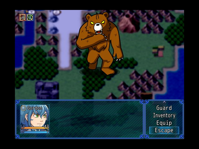
Is... is that pedobear in the second screenshot?
Is... is that pedobear in the second screenshot?
author=LockeZ
@Max McGee:
Is... is that pedobear in the second screenshot?
Nah. He's not going to fuck you, he's just going to fuck you up. : )
but one thing i notice is "firewood recieved" when he's looking at a log. "received" implies that it was given, imo found items should be "obtained" or something similar. it's a pet peeve of mine because i see it all the fucking time. your a good writer so you'd probably appreciate that.Well he's actually splitting the log, not just looking at it, but while sound design and mechanics reflect this, graphics don't as of yet!
Anyway, that's an interesting semantic point and I'll think about it. I don't like "obtained" as much but I don't really know why. Technically "harvested" would be the most accurate. I suppose I could also go with "Got firewood!".
I'm not at the point in development where I standardize the language used in my messages. That's a fairly low priority for me but it IS something to think about.
nessiah
your greens are way too lime, the brightness clashes very poorly with the browns in the cliffs. the purple shade in the cliffs doesn't work as well as you want it too—purple tints are GREAT! i'm a huge fan of purpling shadows. but it doesn't fit very perfectly where you're using it.
the cliff walls are really interesting. the texture—and more specifically the bottom looks like tree bark and not rocks. the bottom looks like roots.
the leaves on the trees are excellent and stick out as such, the colors are much more polished and in an obviously different style. are they yours or did you rip and plug them in?
imo really the biggest problem here is the coloring and a significant lack of contrast: as a result it looks flat. i notice it in a lot of your work. your colors are all very bright (and bright is good!) but there's nowhere near enough contrast beween them, and then too much contrast between others, which makes the whole thing seem flat and awkward.
i'm gonna do a two-minute edit with photoshop to show you what I mean.

now obviously the brightness is your STYLE or whatever but the important thing to take away is that contrast allows for a better sense of depth—and that depth will make the map easier to understand and navigate by the player.
gl
your greens are way too lime, the brightness clashes very poorly with the browns in the cliffs. the purple shade in the cliffs doesn't work as well as you want it too—purple tints are GREAT! i'm a huge fan of purpling shadows. but it doesn't fit very perfectly where you're using it.
the cliff walls are really interesting. the texture—and more specifically the bottom looks like tree bark and not rocks. the bottom looks like roots.
the leaves on the trees are excellent and stick out as such, the colors are much more polished and in an obviously different style. are they yours or did you rip and plug them in?
imo really the biggest problem here is the coloring and a significant lack of contrast: as a result it looks flat. i notice it in a lot of your work. your colors are all very bright (and bright is good!) but there's nowhere near enough contrast beween them, and then too much contrast between others, which makes the whole thing seem flat and awkward.
i'm gonna do a two-minute edit with photoshop to show you what I mean.
now obviously the brightness is your STYLE or whatever but the important thing to take away is that contrast allows for a better sense of depth—and that depth will make the map easier to understand and navigate by the player.
gl

