THE SCREENSHOT TOPIC RETURNS
Posts
LockeZ

I'd really like to get rid of LockeZ. His play style is way too unpredictable. He's always like this too. If he ran a country, he'd just kill and imprison people at random until crime stopped.
5958
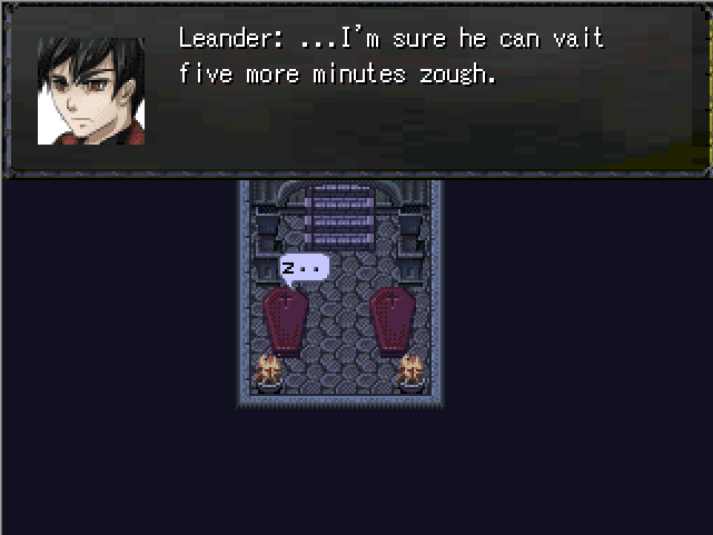
@SorceressKyrsty: The face looks okay except for the collar, but that windowskin could use some serious help.
When converting graphics to 256 color for 2K3, make sure you are creating a custom palette for each image, and not using a predefined palette. I think Gimp and Photoshop both do this by default when converting an image to indexed mode; they give you an option of basing the palette on the colors in the image, and it looks great in 99% of cases. MS Paint and iDraw don't do this, and tend to ruin your shit. Once you've got the palette working right, you can make the rest of your edits in iDraw if you prefer.
When converting graphics to 256 color for 2K3, make sure you are creating a custom palette for each image, and not using a predefined palette. I think Gimp and Photoshop both do this by default when converting an image to indexed mode; they give you an option of basing the palette on the colors in the image, and it looks great in 99% of cases. MS Paint and iDraw don't do this, and tend to ruin your shit. Once you've got the palette working right, you can make the rest of your edits in iDraw if you prefer.
That looks so beast, TDS. Love it.
author=LockeZ
When converting graphics to 256 color for 2K3, make sure you are creating a custom palette for each image, and not using a predefined palette. I think Gimp and Photoshop both do this by default when converting an image to indexed mode; they give you an option of basing the palette on the colors in the image, and it looks great in 99% of cases. MS Paint and iDraw don't do this, and tend to ruin your shit. Once you've got the palette working right, you can make the rest of your edits in iDraw if you prefer.
Because of this little tidbit of information, my opinion of you has improved slightly :D
author=SorceressKyrstynub was right
importing faces into 2k3 does turn them into cabbages
The system set should be set to a different graphic pattern.
Do what LockeZ said, but I'll also add that if you keep it at a few faces per faceset or even just 1 per faceset, you can keep as much colors as possible on one face rather than trying to split them between like 16.
Whoa, that front view battle-system rocks! I don't even like front view systems either but if they have the character graphic facing the enemy then I'm all for it.
Anyways here's some teaser videos I made for The Magnus Light.
Teaser Update
In Game Teaser(Very Laggy)
Anyways here's some teaser videos I made for The Magnus Light.
Teaser Update
In Game Teaser(Very Laggy)
Ocean
Do what LockeZ said, but I'll also add that if you keep it at a few faces per faceset or even just 1 per faceset, you can keep as much colors as possible on one face rather than trying to split them between like 16.
master race
Deckiller: i like, although i'm not sure it's such a cool avatar o_o
the red blood? is cool but it's pretty simple. i mean, i like, but it's a fantasy rpg logo with a sword, what are we supposed to say
Uhm, so, an object often referred as a phallic symbol, goes trough the letter 'V', and there's blood on its tip. Yeah...
Ha! I'm just kidding (or am I?), the logo looks nice. =P
Ha! I'm just kidding (or am I?), the logo looks nice. =P
Noob? Nah, but if you're going to use cool tools and start making logos it's worth knowing the 101 of image formats! As for the logo:
Pretty much sums it up. It's the definition of mediocre, it isn't bad but it isn't inspired either.
author=Craze
the red blood? is cool but it's pretty simple. i mean, i like, but it's a fantasy rpg logo with a sword, what are we supposed to say
Pretty much sums it up. It's the definition of mediocre, it isn't bad but it isn't inspired either.
LockeZ

I'd really like to get rid of LockeZ. His play style is way too unpredictable. He's always like this too. If he ran a country, he'd just kill and imprison people at random until crime stopped.
5958
Just needs a swirly background behind it
author=alterego
Uhm, so, an object often referred as a phallic symbol, goes trough the letter 'V', and there's blood on its tip. Yeah...
Ha! I'm just kidding (or am I?), the logo looks nice. =P
Oh my! I didn't even.
Also, I'm fine with the "definition of mediocre" for my first logo :D Actually that makes me happy because it means I don't totally suck...just reliant on clip-art and gradients and other newb things.


